Hey all, I'm working on a fashion-related logo and wanted to get some feedback.
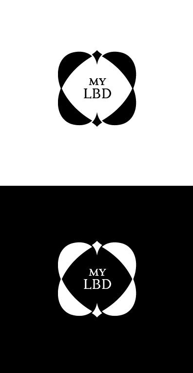
This is for a site called "I love my LBD" (little black dress). It's a blog documenting street fashion, shopping, etc., but with a friendly tone and based around the idea that anything you feel comfortable in can be your "LBD".
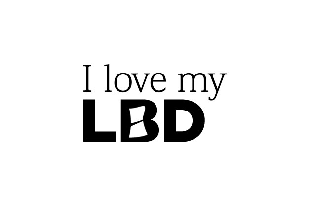
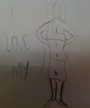
We wanted something clean and typographic with a bit of a fashion feel to it, I had the idea of integrating a dress shape into the B and like that concept (if I can get it to work, I realize it's very rough right now and doesn't necessarily read yet). I like the slab serif for "I love my" although I'm not set on that typeface (particularly as it's really pricey), Gotham for "LBD" works ok but I'm very open to other alternatives.
So, thoughts? Does the basic concept work? Any suggested tweaks on the dress form itself? Thanks!