
http://www.macworld.com/article/145383/2010/01/verdana.html
Mostly fleshing out more weights and condensed versions.
The price had gone up too! ;-)
http://www.macworld.com/article/145383/2010/01/verdana.html
Mostly fleshing out more weights and condensed versions.
The price had gone up too! ;-)

Verdana condensed looks pretty good.

I dig Verdana for what it is- but $370 - $598 is a lot and there are about a hundred higher ranked typefaces on my 'to buy' list.

It would certainly be great to have weights
between the Regular and its so-called Bold.
hhp

Eeee, how many weights should there be between regular and bold?
Cheers!
Well, that's not a Bold, that's a Black! Anyway I do think a
Demi can be very useful even in a system with a modest Bold.
hhp

I don't get it. It's still a screen font, right? Who needs all these weights and widths for lo-res screens? Why does every typeface have to have thirty or forty variants these days? Inflation, just like in literature. And films. Quantity is the new quality.
BTW David, why was one given to you and the other to Steve?
> Who needs all these weights and widths for lo-res screens?
Anti-aliasing.
MacOS for one forces it on you (although in crappy quality).
> Quantity is the new quality.
That's sort of true.
Often character coverage trumps basic quality these days.
hhp

On behalf of myself and all the web-safe fonts (I'm sorry that Courier New couldn't be here tonight), I want to wish Verdana all the best.
Going pro, imagine that.
You know, when we first start out in this business, all fonts dream of a professional career. But Verdana, you really did it!
You must have one heck of an agent, pal. Heh, heh, heh, heh.
Seriously, lots of luck and don't forget to stop by every now and then to say hello to your old friends in the font folder, okay?
Fondly,
Tahoma
Quantity is the new quality.
If only half of designers pay for fonts we might as well sell twice as many to make up the difference!
>Well, that's not a Bold, that's a Black!
The step from regular to Bold in Verdana prime was tailored for low res. i.e. there was a extra specially large jump to make sure, (on
Windows), that the rendering there would show it, or if aliased, there would be a large enough jump for a whole pixel.
We put one step in between for other kinds of rendering, among other things.
>Who needs all these weights and widths for lo-res screens?
Who needs all those different rendering options? Who wants to use horizontal scaling? Who wants to look thin or fat? The who's abound. ;)
> Quantity is the new quality.
Cliche is the genius.
Cheers!

> It would certainly be great to have weights between the Regular and its so-called Bold.
Hrant, did you even look at that waterfall graphic accompanying the linked article? There’s a very nice Semibold right between the two.
Okay, here: I got permission to provide a better sneak preview (better than that fuzzy jpeg with the MacWorld online article). These are still Betas, still in development.
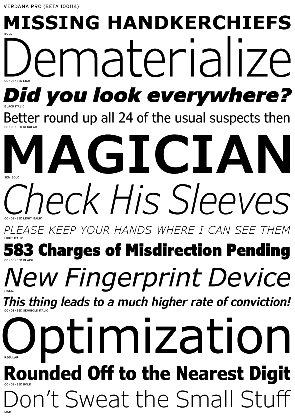
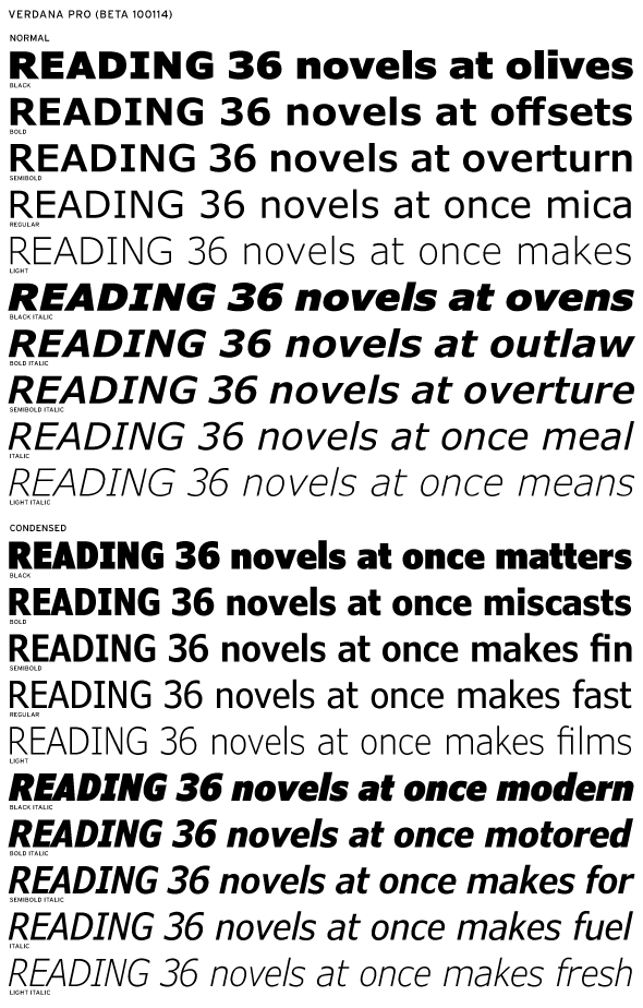
> The step from regular to Bold in Verdana prime was tailored for low res.
Well yes, I know that.
That's what made the "Bold" in effect a Black, which
makes it great that you added a real Bold in between.
Kent: Yes, I certainly did look - but maybe I was unclear
before; when I said "that's not a Bold, that's a Black" I was
talking about the original Verdana.
hhp

I applaud the effort of posting as Tahoma. ;o)
The article says they are being tweaked for print also. But at this point, Verdana is so overused (on the web of course), I'm not sure many would want to get the Pro version. Maybe in another 20years, if computers come with larger font libraries and the embedded fonts take off on the web.
Interesting to know the same dude did Georgia and Tahoma. I've always felt Tahoma was a cross between Verdana and Arial, or basically a tighter Verdana with less letter spacing.
In fact Tahoma came first, but it was spaced too
tight, so they just loosened it - voilà, Verdana.
hhp

I'm waiting for a pro version of Trebuchet.
> Kent: Yes, I certainly did look - but maybe I was unclear before; when I said "that's not a Bold, that's a Black" I was talking about the original Verdana.
Yes, I understood that.
Your first comment opined that it would be great to have weights between Regular and Bold. I confess that I was unclear whether that was meant as an endorsement of the new approach (which includes a weight between Regular and Bold), or whether your use of the plural ‘weights’ was a criticism of the new scheme (because it does not include *multiple* weights between the two).
DB seems to have understood the comment in the second way, asking you how many you think there should be. Your response seems to imply that his interpretation was right — although, I’m further uncertain whether your use of the term Demibold means that you think there should be another intermediate weight different from the Semibold, or whether you’re using that term interchangeably, or whether maybe you mean a Demibold should fall between the Bold and the Black weights.
So, I offer the waterfall to see if you do indeed think an extra weight should be added between the Regular and the Bold (in addition the Semibold).
Just to be clear, the Bold in the Pro development is the same as the original Bold.
I think:
- Almost always a weight between a Regular and Bold is great.
- Some Bolds are so dark two would be nice. What to name them? Well, the Bold should be called Black, then you'd have naming room for the others!
- Verdana is borderline.
hhp

Having a version of Verdana that is meant for sizes other than small is neat. I think it's a great IKEA, I mean, idea :p
I'm REALLY excited about the idea of having a Georgia Pro too. Despite it's relative prevalence, I think that Georgia is such a nice typeface. Expanding it into a more dynamic family might make this Scotch Roman really get the attention it deserves.
@s0me0ne
Verdana isn't overused on the web. It's underused. Arial is overused.
I guess I think its overused, because I never use Arial for the sites I make.

@aluminum
yeah, i thought Tahoma's post was funny too.
@david berlow, kent lew, or whoever knows...
I'm left wondering exactly what the purpose of Verdana Pro is. It seems to very much be a reworking. It's a new family based upon and strongly resembling the old. (Correct me if you don't see it this way.)
In the wake of the IKEA episode, is it a proof-of-concept for a font that can work equally well onscreen and off?
Will it be available to license for linking with @font-face?
Will it ship with the next version of Windows and be licensed by Apple and therefore join the ranks of the "web-safe" as is Verdana amateur?
Verdana and Georgia aren't just fonts, they're a brand of font in and of themselves, with connotations attached that it appears the Pro versions don't have.
Or will they?

Verdana is a great font for use on screen. But in print it just looks like a font that's made for use on screen. Same with Nokia font, one or two pixels narrower. It's just hard to make type to fit in a grid.
Ask Philippe Grandjean and the grid of 2304.

I hope Georgia Pro includes the hybrid figures that came with the original version of Georgia in addition to the current old style figures and the lining figures that will presumably be created.

Verdana condensed black FTW!
>I'm left wondering exactly what the purpose of Verdana Pro is.
An expansion of a successful font family is uncommon for a leftist to wonder about.
>I hope Georgia Pro includes the hybrid figures...
No, but speaking of figures, there is an issue I promised to raise here:
Each of these families came originally with different default figures, old style proportional with Georgia, tabular lining with Verdana. To maintain compatibility, they are staying that way.
Indesign, e.g. will then offer two other sets of figures to the user, for Georgia; lining tabular and proportional figs, Verdana; old style and lining proportional figures.
The issue is, that there is no label in InDEsign for what the default figures actually are, the user will have to know.
Is that okay?
Cheers!
> I'm left wondering exactly what the purpose of Verdana Pro is. It seems to very much be a reworking. It's a new family based upon and strongly resembling the old.
It is a reworking. It’s not a “new” family; it’s an expanded family. Not “strongly resembling” the old, built upon the old.
As far as I can tell, the four original styles remain essentially unchanged (weight, proportion, shape) except for the addition of glyphs, kerning, and OT features.
Much of the intention is outlined in Ascender’s press release announcing the project (you may need to filter the PR-speak):
http://www.ascendercorp.com/pr/2009-09-08/
(Incidentally, the expansion was undertaken in advance of the Ikea flap. That news story just prompted the announcement, not the development.)
Answers to your other questions will probably have to wait. I’m not involved in the brief or the development or the licensing. I’m just privy to Betas in order to develop specimens for FB.
Oh, and: what about the hinting now, and the screen rendering?
hhp
@kent,
Thanks for the explanation of what, it seems, Verdana Pro is. What it eventually does, we'll see, I guess. (I don't think I'll be springing for it, just to compare.)
@davidberlow
Brand extensions almost never work out. If anything, they almost always end up diluting the brand image of the original in the minds of users.
At least that what I think Ché Guevara would have said.

At least that what I think Ché Guevara would have said.
Extending the Cuba brand to Bolivia certainly didn't work out.
@jh
Au contraire. There was no brand extension, they just introduced in a new locale. True, it didn't do too well, but it sold more Ché posters than ever before. And look what it did for Mandy Patinkin's career just a few years later!
Political failure, followed by commercial success on Broadway. Go figure.
(I could try to run with a comic setup like that, but let's let it go...)
There is an interesting piece on the Harvard Business Review blog that I think may hold some insights for the business of fonts in the years to come:
The iTunes Effect and the Future of Content
And it relates to the discussion about weights on this thread.
Mark Jamra of Type Culture and I were talking at TypeCon. A couple of months before that I had bought a single weight of a particular font from Type Culture. He told me that it piqued his curiosity because it was unusual. The usual thing was for somebody to buy a complete family.
Now, I'm basically interested in using fonts within browsers, so what the heck am I going to do with all those weights? Hell, with some fonts, I even like the browser-synthesized italic better than I do the created one.
Anyway, as time goes on, expect to sell more singles and less albums. Seems to be a trend.
rich
>Brand extensions almost never work out.
Oh. Well, maybe... you'll know what I'm talking about later, as usual.
Cheers!

Regarding the price I think it's reasonable. Isn't a Font Bureau font usually selling for $40? Well 20*40=800. The prices announced here for the whole family are still a considerable discount, consistent with Font Bureau pricing. Thing is, even if they made the whole package for $80 no one is gonna buy it unless they need it! You don't go below a certain price. That will only lower the value of the product, that's a golden rule in retail :D
I think it makes perfect sense to be expanding the Classic Internet Headline Typefaces now that services like Typekit are about to take off.
About to! A big problem is still the fact that most computers connected to the internet don't have an effective anti-aliasing engine (i.e. Windows XP: Although ClearType (Microsoft's Anti-Aliasing) can be voluntarily turned on and will make Headline typography look considerably nicer, you get things like radio buttons malfunctioning and other bugs) but I think that under the rough condition of aliased type, Verdana Condensed is likely to look less ugly than FF Dax or other 'print typefaces'. This is why that's a great time to be releasing this type family.
David Said:
The issue is, that there is no label in InDEsign for what the default figures actually are, the user will have to know.
That should be okay this is the case for all fonts right now, isn't it?

Verdana
Tahoma (Verdana Condensed)
Nina (Verdana Compresed)
http://new.myfonts.com/search/name%3Atahoma+OR+name%3Averdana+OR+name%3A...
>Thing is, even if they made the whole package for $80 no one is gonna buy it unless they need it!
Wow, now there's a concept.
>That should be okay this is the case for all fonts right now, isn't it?
Ya, but I'm a big fan of "okay is not OK." There should be some way of indicating to the user what kind of figures the defaults are.
>Oh, and: what about the hinting now, and the screen rendering?
Verdanas place as a good rendering screen font is not dependent on hinting, (thank goodness).
Cheers!

>Verdana
>Tahoma (Verdana Condensed)
>Nina (Verdana Compresed)
Not really - The main difference between Verdana and Tahoma is the space between the letters. Nina is a narrower variant.
Plus Tahoma came first.
hhp
@ PabloImpallari
All three of those are very explicitly designed for low resolution bitmap display, for which they are fabulous, but NOT for "display" display. E.G., headlines.
@johnnydib
I think it makes perfect sense to be expanding the Classic Internet Headline Typefaces now that services like Typekit are about to take off.
Don't know what "take off" means. But I'm not getting the relevancy. Is this set going be offered through Typekit?
BTW, I've wondered about something: The Bolds of the MS Core Fonts
were really dark because of the hinting practicalities, right? So how
did Trebuchet get away with having a "normal" Bold?
hhp

Hmmm...bold, semi, and light look really tasty! Wonder how much just those three will cost eventually.
> So how did Trebuchet get away with having a "normal" Bold?
Vinnie could probably answer that. My guess - hints.
Cheers, Si
So Trebuchet has much heavier hinting than the others?
hhp
>The Bolds of the MS Core Fonts were really dark because of the hinting practicalities, right?
What?
>Vinnie could probably answer that. My guess - hints.
What?
>So Trebuchet has much heavier hinting than the others?
WHAT!?
Cheers!
Hrant observed that Treb bold is less bold than Verdana bold. However it sticks with two pixel stems through the same range of text sizes.
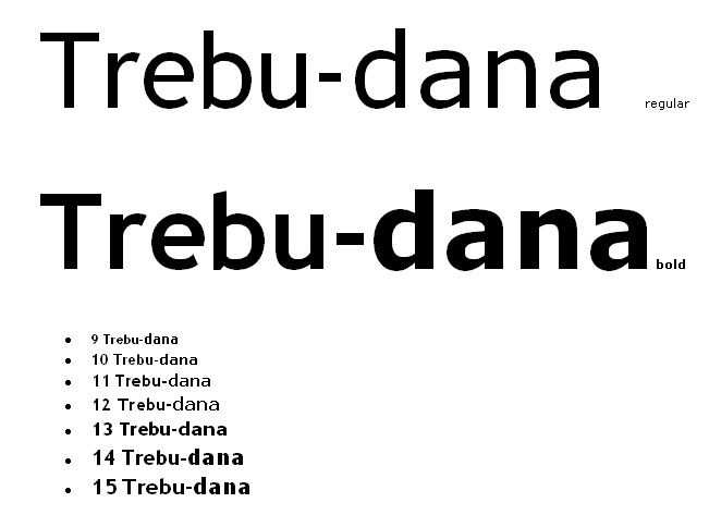
My 'splantion was a guess. Vinnie would be the best person to ask.
> Treb bold is less bold than Verdana bold.
Exactly. I'm talking about the outlines. And since the bitmaps
behave comparably, I'm wondering how Trebuchet "got away"
with having a "normal" Bold.
The reason different hinting seems like a plausible explanation
is that Verdana's Bold is too dark in order to make the hinting
easier, right? At least that's what I remember reading back in
the day - and it makes sense, doesn't it?
hhp
Captured from web.archive.org on 29 Jan 2014. view this capture