Typophile

Tonsure Script

Tomi from Suomi

This is something I originally made more than ten years ago, so in that sense critique is a bit late. And I've already submitted this to MyFonts server, so it's too late in that sense as well.

This is a script with no logic. It is ugly, and should have no place in typographic world. But I like it.
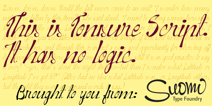
Here's a pdf, and I know it's ugly:

AttachmentSize
Tonsure.pdf114.55 KB

It seems that attaching pdf's is still a problem…

Let's face it! I know designing script types is a hard sell, but this one makes the cut-
seriously!

Make sure people know you designed this thing when you first started... :-/

hhp

This script has a point to make: in digital age you do not have to follow the rules. This ugly font proves that.

I'm not seeing the connection.
To me rules result in ugliness half the time.

hhp

Let me put it in other words: just because we have the technology, it does not mean that we use it for the best of our abilities. See?

Assuming I understand you correctly: yes!

The essential post-modern nature of type design is
something I've been increasingly preaching over time.

hhp

this is probably the best thing youve made mate!! hahahaha

Thanks, Murray-

To be honest, I can not think this one as my best work. I've done better.

Have you?

That was bad English: How about you?

Captured from web.archive.org on 5 Aug 2014. view this capture