Typophile

Priori Acute

cdunitz

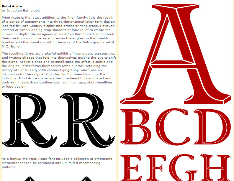
Well... what do you all think? Priori Acute is a new addition to the Priori family. I have a client I'd like to create a logo with it for...

I love it and it fits their business perfectly,just curious about your thoughts on the font itself?

AttachmentSize
priori_acute.jpg261.2 KB

Very cool.
When did this come out?

The only issue you might have in a logo is the gaps. If/when the logo is small enough they'll become noise - so might need to -carefully!- enlarge them.

hhp

Weird, I also came across this font last week!
I find the 3D contours of B and left-hand R a bit problematic. Something not right to my eye.

I find the 3D contours of B and left-hand R a bit problematic. Something not right to my eye.

It's not your eye. It's M.C. Escher! ;-)

Wow, this is great stuff. Now I want it too.

Not use how recently it came out, I stumbled upon it searching for a look for this particular client.

Yes, I think the contours so make you think a bit, which can be good or bad - depending on who's doing the looking I suppose.

But I seriously have the hots for it and if the client doesn't go with it, I'll have to figure out some other way to use it.

Captured from web.archive.org on 13 Oct 2013. view this capture