
What do you see here?
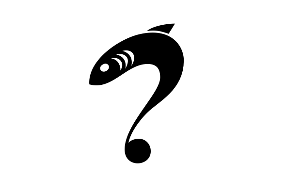
It's not supposed to be a "logo" per se, more like a keyvisual/character sort of graphic for a web site, but I need to quickly check what it "reads" as.
Thanks!
What do you see here?
Thanks!

A fish and a question mark for me.

Idem.

It says: "Fish meat of questionable age."
hhp

fish that can balance on beach balls...are coming.
fishy questions

Naucrates ductor?
Great! Thanks guys. Supposed to be a questionfish. Questioning fish. I'm a bit tired of speech/thinking bubbles so wanted to check if I can do fishy body language… Wasn't sure if that question mark is clear enough.
That fin is too small isn't it? Something's off about this critter…

Fish and a musical note or a question mark.
> Something's off about this critter…
Perhaps that its head looks like that of a whitefish, but the fin is from the shark. Also the fin sits way too far back on its spine.

Kinda eelish to me.
The triple gill gives it a sharkish quality too.
Maybe the fin could be longer along the body, and further up on it?
Ah. Hmm… it shouldn't necessarily be a specific kind of fish, it mostly just needs to be recognizable as an animal that could potentially live out in the open sea.
Are these better?


I like the revisions you've made. The question mark reads as such, and next to it the exclamation does as well, but I'm not sure if it would on it's own - it might just look like a strange fish swimming north. Will you be pairing them with type?
"Will you be pairing them with type?"
Yes, mostly. They don't need to be super-readable – they're supposed to be somewhat illustrative – but I'm happy if they manage to communicate that they «say» something besides being fish.
BTW, these would be used on the same web site, probably repeatedly; so whoever sees the exclam fish would likely have seen the question fish before.
Definitely see the fish/question mark clearly. For the exclamation mark you might make the connection to the dot thinner, or make it connect straight, as exclamation marks don't generally have curves -- may help it read better.
For the exclamation, what if the dot is the fish?
hhp
The right-hand new logo reminds me of the Penguin Classics cover for The Master and Margarita.
>it shouldn't necessarily be a specific kind of fish
Could it be a Mysterian?
Hrant, like this? ;-)


Fishy... is that you?
To recap: The questionfish (on its own, without the exclamfish) is now forming part of the visuals for this new blog about plastic pollution. The type, obviously, posing as the pollution, and the questioning fish as himself.
Short form icon (for use in Twitter avatar, buttons/t-shirts & the like):


i like it as a t-shirt graphic because i'll assume it's going to be used in a much larger scale. one concern on all other mentioned applications is size. you will lose detail/focus on the question fish. love the mark though. =)
Thanks. Yes, it gets a bit fuzzy at smaller sizes. I've tried to keep the mark modular/flexible, so the fish and the type (of which there are four grades of «coarseness») can also be used individually, as well as both in combination, depending on context/media/size etc. For instance in the favicon we ended up going with just the fish. I hope it's working out :)
Very nice.
hhp

I see a cross, or a person in the "a" :) Anyway, I like this question mark on it’s own and I like the polluted type, but I don’t think they that well work together. I think the full version with colour only obfuscate the mismatch in shape that is obvious in the b/w icon version.
Thanks Hrant.
Frode, mismatch in shape? Interesting – and I'd be curious how/where you see that, because honestly I don't. If you mean that the fish is sharper / more detailed / more clearly defined, then yes, but to my eyes that doesn't make them mismatched (not in execution; not any more than a fish with anatomical details would have to be different from semi-dissolved floating junk).
And funny that you see the cross in the "a": It's in the font, and I was going to remove it because I thought it was too obtrusive/visible, but the client liked it as a semi-hidden mini-reference to the fact that this blog is written from a specifically Swiss perspective. :)
I get the same feeling I get when two fonts are not different enough to contrast well. I’m not sure how to explain it any better. Have you tried making the fish/question mark more abstract (pieced together from shapes similar to those dissolving blobs)?
And another thing: How come the question mark is superscripted?
I think the fish is lovely, but it just floats around there with no visual connection to anything except the colour.
And it’s not big enough compare to the other elements to be an obvious logo either.
I agree with Frode about the mismatch. And the header with the waterline complicates it further:
water=3-d, realistic
fish= 2-d, graphic/iconic
lettering= 2-d, abstract/biomorphic
I'm left confused: are we to think of the fish being in that water, and reacting to that stuff?
Did you try sharper edged pollution?

I like the fish punctuation. I like the type treatment for pollution. But both are very strong visuals and seem to be a bit much when put side-by-side. I think each would be stronger on its own.
As for the fish punctuation...just a thought...what if the dot was a drop (of water). That'd allow you to disconnect the fish and might make it a tad more readable as a punctuation mark on its own.
To be clear: this thing is final, it's live, and I'm really happy with it (and so is the client), so I'm not expecting to make any changes. I do however appreciate the discussion; I'm aware that I'm breaking some conventions with this.
The fish is not: «a logo»; and it's also not a piece of punctuation that happens to be shaped like a fish, sort-of matching the style of the rest. That's primarily a fish looking at that crap and wondering. He's also shaped like a question mark, because he's wondering. (The fish could maybe be described as a «mascot» for the blog, if a word is needed.)
Piecing the fish together from junk would be wrong conceptually. The fish is inherently something else than the junk. They still inhabit the same design space, at least to my eye. The friction between them is the friction that must exist between fish and junk, which by the way isn't always clear-cut: For instance, fish eat this micro-plastic trash (when it's red or orange) because they think it's shrimps.
So I don't think the 2 elements can really co-exist quite «harmoniously» – not even contrasting enough to be nicely harmonious again! This entire thing is meant to be slightly off-harmonious at second glance. There is micro-friction, and there are little contradictions, and that is deliberate. It's part of the message.
To me it does work, just not exactly the same way as such logos/graphics often do. And if it were more conventional, more clear, more balanced and comfortable (not that I honestly believe it's that jarring!), I believe that might well make it prettier, but likely also worse at conveying the message I need it to convey.
I agree, piecing the fish together from junk would be wrong. Apart from that I second Darrel and Criag.
Another completely unrelated issue you might want to look into is how the gills and the eye look like two cartoonish eyes when the maskot is so small.
Captured from web.archive.org on 19 Oct 2013. view this capture
