Typophile

Bitstream Century 751

ncaleffi

I have come across this interesting variaton of Century, which I don't recall having seen before:

http://www.identifont.com/find?font=century+751&q=Go

http://www.fontshop.com/fonts/downloads/bitstream/century_751/

Named Century 751 and designed by Rudolph Ruzicka in 1953, it is said to be "Bitstream's version of Primer." There's a connection to the Fairfield shapes, but I wonder if anyone has any info or sample of the typeface "Primer", or if anybody has ever had the chance to use the digital 751. Thanks!

Nicola —

Primer was Ruzicka’s response to a commission from Mergenthaler Linotype to design a textbook face along the lines of Century Schoolbook. It released in 1953.

I haven’t used or inspected the Bitstream digitization.

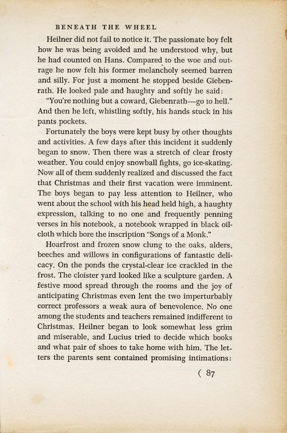
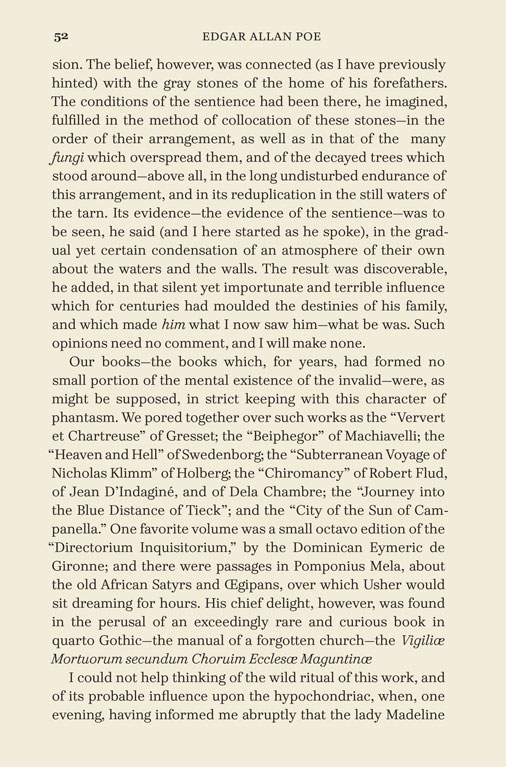
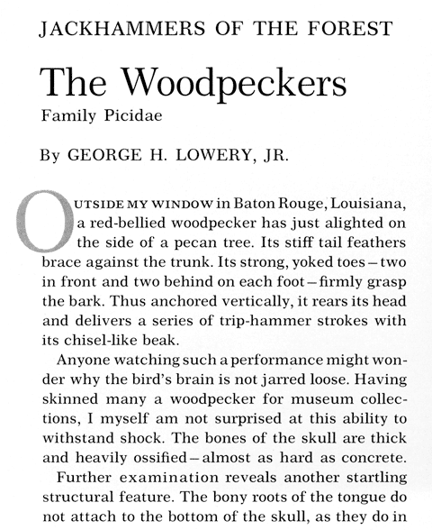
I have a couple books in my collection which use Primer. Here are two images for you (not to scale). Note that the first example uses the short descenders in text, whereas the second uses the long descenders.


[Song and Garden Birds of North America. Washington, DC: National Geographic Society, 1964]


[Beneath the Wheel by Hermann Hesse (Michael Roloff, trans.). New York: Farrar, Straus and Giroux, 1968]

Century 751 was included, along with a wide selection of other Bitstream fonts, with the Corel office suite at one point, so probably many people have it on their computers. The proportions are like those of Century Expanded, but in addition to being lighter, it has a larger x-height.

Century Schoolbook is heavier than Century Expanded, and has a lower x-height - as well, the lower-case letters have a normal shape instead of being somewhat condensed. My suspicion is that Century 751 is intended for use at small sizes in newspapers or classified advertisements and the like, as it has some of the important characteristics of a legibility face.

EDIT: However, the examples given in Kent Lew's post don't match the impression I got from the Bitstream version; they show Primer as being very suitable as a beautiful book face.

The "Bitstream" font "Century 751"

see www.sanskritweb.org/cdrfonts/Century751_BT.pdf

was a ripoff clone of "Primer"

see www.sanskritweb.net/forgers/cdrfonts.pdf, page 57

made by Carter, Berlow et alii by ripping off this font

see the 1982 Linotype Typefaces catalog

At that time, Linotype had Roman and Italic, but not yet Bold. Therefore, the Bitstream outfit could not yet rip off the Bold version of "Primer", which was digitized by Linotype in 1987. The ripoff cloners of the Bitstream outfit should have waited a few more years.

For more details see www.sanskritweb.org/cdrfonts

Is this type (the one in Beneath the Wheel - Primer?) available for purchase? It's a lovely face and seems quite readable.

Christian, the Primer typeface featured in Kent Lew's books samples is a metal typeface, and unfortunately a faithful digital version is not available. Bitstream's Century 751 is a "lighter" version, also missing small caps and old style figures, and, generally speaking, very weak if compared to the original source (there also seems to be a digital version by Linotype, named "Primer", but I couldn't find any info or sample). At very large size, for titling and display purpose, Century 751 seems to work, but not really as a body text (I can send you a sample page to show you, if you're interested). What strikes me more is Primer's shapes linking to the Transitional heritage, Baskerville among all, which it makes different from the "strong" look of Century.

A couple of years ago there was some interest in a new digitization of Primer, and I think this typeface deserves it - you can check an interesting discussion in this thread: http://typophile.com/node/34046 But, as it often happens with this kind of type revival, the marketing request isn't strong enough.

On another level, and speaking of Century, there's an interesting version made in recent years by Mark Simonson, named "Grad" - very different from Primer, and with a very idiosyncratic italic, but it looks like a nice, working digital Century for setting books:

http://www.marksimonson.com/article/102/introducing-grad

ncaleffi:

> cite>there also seems to be a digital version by Linotype, named "Primer", but I couldn't find any info or sample

Here is a sample drawn from the 1982 Linotype Typefaces catalog mentioned above:

http://www.chillingeffects.de/temp1.jpg

This is the Primer font that was ripped off by Carter, Berlow et alii.

Linotype's digitizing was made with the IKARUS system, as stated in the 1984 Linotype catalog, and apparently Carter, Berlow et alii ripped off these Ikarus font files and sold them as "Century 751" ("Copyright by Bitstream"). Since Ikarus files of "Primer Bold" had not yet been made by Linotype at that time, Bitstream could not rip them off.

We have mats for Linotype Primer from 6pt - 12pt at Linotypeseting.com

http://www.linotypesetting.com/images/specimens/primer.jpg

At least one modern digitization which I've seen is anemic and would not be recognized as Ruzicka's design.

mjb | interrobang letterpress / linotypesetting.com

• a nice, working digital Century for setting books
Isn’t John Downer’s Paperback an excellent variation on the same theme—just more complex and sophisticated?

Not a Century, but something I've been developing.

Nice, James. I may have to rethink the direction I’m taking with my Primeresque exploration.

Captured from web.archive.org on 23 Jan 2015. view this capture