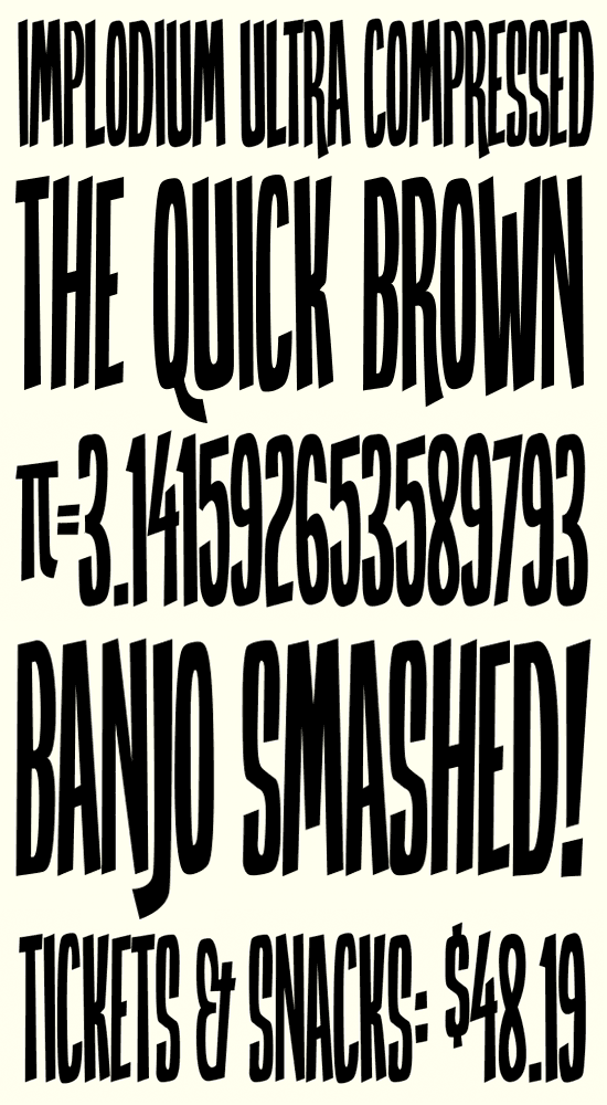
Hey, so I've had a love for typography for years, but have just started getting into designing fonts. I bought a copy of TypeTool for Christmas and I've been itching to get started. My first font idea came from a CD cover I designed for a Christmas present this year. I wanted to have the word "SMASH" in a cartoony, ultra-condensed font that would take up the whole cover, both horizontally and vertically. I couldn't find anything out there that was compressed enough for this job, so I ended up drawing my own type for it in Illustrator. When I started thinking about designing my first font, I figured if I couldn't find anything like this, maybe there will be someone else looking for a font like this to fill a design need so I thought I'd flesh it out and see how it took. I'm quite surprised with how much I'm liking it.
However, I wanted to post it here to see what some more experienced type designers have to say. As I said, I'm a beginner, this is my first font, but I would like it to be very professional. I'm in the midst of designing all of the standard glyphs, and I'm considering putting it up for sale on MyFonts, although I'm not sure if it's of good enough quality. There's a few characters I think might need a bit of tweaking, but I thought I'd see what everyone here thinks. So, what do you all think of it? I'm eager to hear your input.
Thanks in advance!