
I was flipping through Eye Magazine the other day and really liked the sans used for the bold headlines. Anyone know what it is? THX
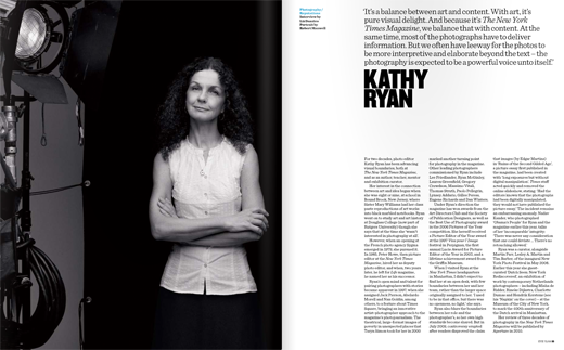
I was flipping through Eye Magazine the other day and really liked the sans used for the bold headlines. Anyone know what it is? THX

Do you have a larger sample?
Unfortunately, no. I could only find that one example online. I was hoping someone here has a subscription.
It’s Champion Gothic (Middleweight) by Hoefler & Frere-Jones.

What you need to do is keep flipping until you reach the very last page with the credits, and in the second column from the left, right underneath the paragraph with "Contributors this issue", it reads:
"Typography"
Proforma Medium, Helvetica Rounded Bold,
Clarendon Regular, News Gothic Regular
and Bold, Display typeface for Eye ##:
<the name of the typeface and foundry>
:^)
Captured from web.archive.org on 19 Oct 2013. view this capture