Typophile

(x) blackletter recommendation - Old English {self (Steffen H)}

Steffen Heidemann

Hi there,

attached you can see a blackletter typeface.

As i am not very familiar with blackletter typefaces i was hoping someone might be able to 1) identify the typeface itself or 2) identify the historic origin or 3) make a suitable suggestion for an alternative or even a suggestion for any beautiful blackletter off-parameter.

As said i am not familiar with those folks myself. I know about a book called Fraktur mon amour which i unfortunately do not have though.

Thanks for reading,

regards, steffen

AttachmentSize
tp_typeid.jpg8.03 KB

double post.

Well.. shame on me. Is this the super-easy one? Old English?

Now if anyone has a favorite blackletter..

Regards again, S

Blackletters are a world apart. There are so many historical* forms and revivals, but also modern takes, from superfamilies** to hispanic street gangs' lettering.

What kind of project are we talking about?

* http://en.wikipedia.org/wiki/Blackletter
** http://www.stormtype.com/typefaces-fonts-shop/families-98-moyenage

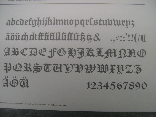
This one is close to it, I think:

The (poor) picture is from the lead character set.

Manuskript Gotisch
Bauersche Gießerei, Frankfurt am Main
Erstguß 1899
Hausschnitt

Here is ONE exampel of the digital font:
http://www.dafont.com/manuskript-gotisch.font

Georg
_______________________________________________
„Ich bin ein Preuße, kennt Ihr meine Farben...“

Hi Steffen,
your sample is Old English by ITC (or Letraset respectively – these versions seem to be more or less identical.

Old English is based on a blackletter by William Caslon (England, ~ 1760). Other foundries had their own versions of this style, like the Manuskript Gotisch that Georg has shown above. At the beginning of the 20th century, Morris Fuller Benton designed a version for ATF.

More information about the history of Old English typefaces can be found in this Linotype Font Feature.

Today, there is a number of digital ‘Old English’ fonts:
Monotype’s (and Mecanorma’s) is pretty wide and loose.
The URW version is lighter, with the ‘i’ dots shifted a bit to the right. It has the long s (ſ) as default.
Bitstream’s version is called ‘Cloister Black’ and can be easily distinguished by its sporns on ‘b’, ‘h’, ‘k’.

Furthermore, there are numerous ‘spin-offs’, e.g. Avebury Black, an ultra-black and wide display version by Jim Parkinson.
F

For alternative suggestions:
well, it depends what you’re aimng at, of course …

Wilhelm-Klingspor-Gotisch by Rudolf Koch is a classic Textura beauty. So is Goudy Text, although it is more normalised – see its ‘d’, ‘h’, ‘z’, ‘A’ etc.

Fleischmann Gotisch is a festive baroque rendition. Sinkwitz Gotisch is rather dynamic and lively – both are revivals by Ingo Preuss. František Štorm’s Plagwitz with its strong vertical stress or Karlgeorg Hoefer’s economic Notre Dame are also charming.
F

Captured from web.archive.org on 14 Oct 2013. view this capture