
Hello Typophile community!
Although I've been a visitor to Typophile for a while now, this is my first actual post here. I was hoping someone could help identify the typefaces used in this gig poster:
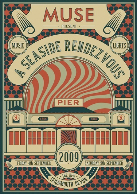
I'm pretty certain that the word 'MUSE' is in Futura, or a similar geometric sans. However, I can't figure out the rest of the type on the poster. It looks to me like the words 'A SEASIDE RENDEZVOUS' are in some kind of Western/Circus style font? I've tried using 'What The Font' and 'Identifont', but neither of them brought up successful results.
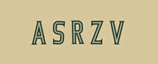
I've singled out what I considered to be some of the more distinctive letters in the hope that this will make them a bit easier to identify:
I originally thought that the rest of the info on the poster was all in the same typeface as 'A SEASIDE RENDEZVOUS', but looking at it closely I think that the rest of the information, such as the dates and the location, and the words 'MUSIC' and 'LIGHTS', are actually in a third typeface. The serifs on '2009' seem different, and the 'M' clearly has a contrast between thick and thin lines which isn't present in the typeface for 'A SEASIDE RENDEZVOUS'. I know the type on the jpg is all quite small and may be hard to identify, but I think the best chance is with the unusual descender on the uppercase 'G', found at the bottom of the poster. I can't think of any typefaces where I've seen a 'G' like that before, so hopefully it will be the key to solving the problem.
If anyone knows what either of the typefaces are, or any similar ones, it would be hugely appreciated.
Thanks in advance,
Matthew Young
MY MY MY


