Typophile

>>> Type ID Pop Quiz V2.5 - Intermediate Level

This thread ran to 4 pages of replies and only one was recovered, so replies are missing.

Florian Hardwig

This is how it works:

  • A complete glyph is published in the Type ID Pop Quiz.
  • Try to identify the typeface. To win, you need to name both the typeface and the weight.
  • Show off your knowledge by casually mentioning additional trivia, like who designed it, when and by whom was it (first) published, and other cool stuff to impress your fellow Typophiles with.
  • The winner produces a new challenge -- a complete glyph, black on white background, presented in a 288 x 288 pixel square, including a R204G000B00 1 pixel border.
  • The person who posts a challenge can't win the next game.

In case of any disputes, Mr Bald Condensed or me will act as judge, jury and avenging angel of wrath.

If you think this is a little too difficult, maybe try the Entry Level Type ID Pop Quiz first. Too easy? Go to the Expert Level Type ID Pop Quiz.

Good luck everyone, and have fun. ;^)

With respectful thanks to the originator of this utterly useless but highly entertaining waste of time, the often imitated but never duplicated Cheshire Dave.

(continued from here)
Bart (barthak) wrote:

Here's a new one, if anyone is still watching this...

The roughness is because I do not own the face ( it's not the cheapest of fonts ) and the website doesn't provide a bigger sample.

It’s the ‘G’ from TEFF’s Burgundica, probaby the X075 grade.

damn, thatt was quick

Well, Bart tends to choose type from his neighbourhood for his challenges and if he says the font in question isn’t the cheapest it must be either from TEFF or DTL and since it’s obviously a blackletter typeface it was quite easy ;-)

Hehe, I know, I was lazy ;) I'll pick a tougher one next time.

Well done, Jan, your turn!

Thanks Bart.

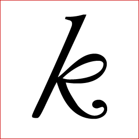
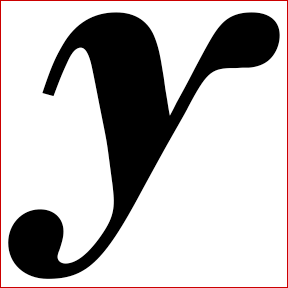
Here’s one of my favourite italics:

Oh, that should be Garamond MT Italic. Wicked slant!

Absolutely correct (and wicked), Nina. Your turn.

Thanks Jan!

New glyph:

That's really, really close to the Greta Grande small caps n.

Wow, you are also really, really close!!

Haha. I don't know why I thought about small caps before I thought about weights.

Is it Greta Grande Bold N?

:-) It's actually the Medium "N"!
But you're too close for the next turn not to be yours. :-)

Thanks!

Not sure if this is too easy, but I only learned of this typeface a few days ago and am already completely enamored of it.

Freight Serif ?

No, although my affinity for Freight is well-documented haha.

PL Barnum Block?
(Probably wrong, but hey, a good guess)

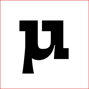
Let’s get this going …
Is it the µ from Farao Black by František Štorm?
F

Florian got it. Nice!

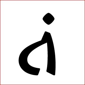
Okay, here we go again:

To make things easy an inverted interrobang?

Yes, that’s correct! As one would need to properly typeset Spanish interrogative exclamations, like ‘‽Qué Cabrón‽’
I guess that narrows the options down drastically, no? ;-)

Is it Vesper Regular Italic? The slanted dot gives it away. There's a nice article about it on ilovetypography.

Michael: well done! Without any further hints – call me impressed. Your turn!

Thanks.

Here's my attempt.

Too obscure? I look at this font for hours everyday, but that's probably no consolation.

The construction is similar to the one of Lucida Console.

Yes, it's a monospace font, hence my staring for hours at it everyday while coding. The construction of this glyph is very similar to Lucida Console as Riccardo says, but the designer indicates that it was actually inspired by the equally nice Consolas by Lucas de Groot.

I know this font.

Are you building up suspense?

I just hope someone else comes up with the answer!

Riccardo's too lazy to say that it's Inconsolata by Raph Levien
http://www.levien.com/type/myfonts/inconsolata.html

:-)
Actually, I was too lazy to think up some glyph for the quiz! ;-)

Here's a new one:

Er yes, you were right by the way, please post a new glyph.

Sorry murphy.md, didn't mean to be rude! :-/

Hehe, don't worry about it. Although I believe I know what this font is. Shame I can't say...

You got it, Marcelo.

ok :-)

Have fun!

Ooh I know it.

Hehe...

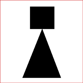
Is it an upside-down exclamation mark?

Yes, Michael.

Is it Constructivist Square by P22?

Aaah! no, sorry, it's really close but is not it. It's 3 years older than Constructivist Square.

Then it's Epokha by Colin Brignall. Right?

That's right! Nicely done Michael, your turn.

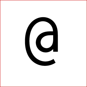
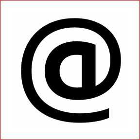
Ok, another interesting @:

No takers? It's a very recent font: 2009 in fact.

Captured from web.archive.org on 10 Jan 2015. view this capture