
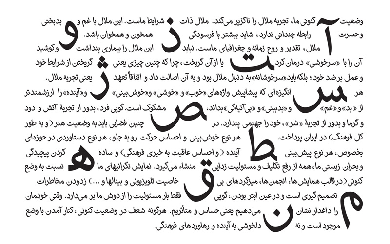

Are you looking for a critique of this font?
hhp
of course with pleasure :)
My first reaction is that the glyphs look mostly pretty solid. My second reaction is that some of the glyphs look horizontally squeezed. Also, the spacing needs a good deal of work.
hhp
Captured from web.archive.org on 3 Jan 2010. view this capture