Typophile

The Font Effect...

Christopher Tim...

I am proud to announce that this February I will be presenting a portion of my graduate research at the Fourth International Conference on Design Principles and Practices in Chicago. I will be presenting a paper I wrote (co-authored by my supervisor, Professor Raymond Klein) titled In search of the font effect: the effect of conflict upon reading and naming typefaces serially. This will be my first conference presentation.

For more information you may visit the conference website where they have posted a preliminary schedule.

Thank you and happy new year.

Great stuff - go get 'em.

Full proceedings to follow, I hope?

BTW, Larson presented something along these lines (although
quite lightly) during ATypI's Mexico City conference in October.

hhp

I look forward to reading the paper, Christopher. The abstract made me laugh as I realised I can now add to the portmanteau of ‘readerability’ the superiority of reading ability to ability to name typefaces. :)

Congratulations Christopher!

The talk that Papazian cited is certainly relevant to your research. Lewis & Walker built upon the Stroop effect by showing that word recognition is improved when font characteristics like heaviness match words that carry the semantic characteristic of heaviness (rhinos are heavy, while rats are light).

Lewis & Walker: http://www.psych.lancs.ac.uk/people/uploads/PeterWalker20061116T111653.pdf

Collaborators and I have built on Lewis & Walker’s research by showing that other kinds of characteristics built into fonts also can improve word recognition when paired with words that carry that semantic characteristic. For example a font can range on formality from formal to informal. People are faster to recognize formal words in a formal font and informal words in an informal font.

I have tentatively proposed this as the key difference between serif and sans serif typefaces.

Kevin: People are faster to recognize formal words in a formal font and informal words in an informal font.

Can you tell whether that is due to positive reaction in the case of matched form and content or to negative reaction to mismatched form and content? I know that if someone sends me a cognitive psychology paper typeset in Hobo I spend a lot of time thinking 'Why the heck did they use such an inappropriate typeface?' instead of reading the text.

Kevin, it's nice to see a number of good people working this interesting
and fruitful angle. Even if some of the work is duplicated, it helps type
design look good.

(BTW, you can of course call me Hrant!)

hhp

Hmm. I am not sure how this could be applied. One could, I suppose, give a computer a dictionary, and have it pick a heavy typeface for heavy words, and an informal typeface for informal words.

Oh, of course. If one's goal is not to improve recognition and readability, but to slant someone's perception of a text, one could choose a typeface that best suits the words you wish to emphasize.

Oh, dear. I had hoped this research had the potential to be used for good instead of for evil.

A kitchen knife can be used to make a salad, or to kill.

hhp

Bringhurst and many others have said that you need to read the text you are setting before selecting an appropriate type. My study confirmed this observation. The style of the font needs to match the style of the content for the best reading experience.

The finding also means that studies of legibility are not leading us towards one font to rule them all. Many fonts are necessary in order to match many kinds of content.

John: Can you tell whether that is due to positive reaction in the case of matched form and content or to negative reaction to mismatched form and content?

In order to answer that question you would need words that are 1) consistent, 2) inconsistent, and 3) neutral with the font being presented. My study and Lewis & Walker only used consistent and inconsistent words. That would be an interesting next step.

Congratulations, Christopher!
In light of seeing several TypeCon font naming contests, I am sure your presentation will bring both a smile and an education to many :-)

ChrisL

edited...nevermind

@ Hudson and Larson: The best article I have read about Stroop (other than Stroop's 1935):

MacLeod, C. M. (1991). Half a century of research on the Stroop effect: An integrative review. Psychological Bulletin. 109(2) 163 – 202.

Regarding "Can you tell whether that is due to positive reaction in the case of matched form and content or to negative reaction to mismatched form and content?"

MacLeod (1991) describes what he calls a "congruency effect." In this section he cites several studies, most of which were colour naming tasks. One conclusion was that time to name congruent stimuli was indeed faster than time to name incongruent stimuli. However the difference in time between neutral and congruent stimuli was less than the difference between neutral and incongruent stimuli. I do not have access to their data to attest to the statistical significance of their findings. Overall, an excellent read for anyone interested in anything Stroop.

There is one thing that casts at least some doubt on such research: being given many seconds to absorb and react to visual stimuli is not something congruent with immersive reading. Note for one thing how there are mountains and valleys between reading silently versus out-loud.

hhp

Christopher, Macleod's congruency effect is certainly interesting, but I think we need to be careful in extrapolating from simple visual or property congruence (e.g. heavy vs. heavy; rhinoceros vs. squirrel) and more abstract, culturally engendered associations such as formal/informal. I'd want to see evidence that the same kind of congruency effect accounts for the latter and not a higher level aversion to incongruent form and content.

One of the reasons that I found the study that MS sponsored on ‘personality’ in typefaces problematic is that most of the keywords used were ones that we've been trained to associate with certain styles of typography by their use in advertising. So typeface ‘personality’ seems to me a self-reinforcing construct: the more times people see Didot used in fashion magazines, the more likely they will be to associate Didot with ‘elegance’. And of course, if you are asking participants to select keywords from provided lists, rather than to explain the associations they make in their own words, one is filtering out a lot of potentially interesting variance. I'm the guy who'd be describing Didot as decadent :)

I'm doubtful that congruence at this level of abstraction functions in quite the same way as simpler visual or property congruence. At the very least, the associations involved are more nuanced and variable.

@johnhudson

I spend a lot of time thinking ’Why the heck did they use such an inappropriate typeface?’ instead of reading the text.

Oops. I guess I better re-think this, then:

@Richard Some investors take themselves far too seriously. You might be doing them a favour.

> Some investors take themselves far too seriously.

If I give you my money, I damn well expect you to take it seriously.

:)

Aaand how did that go, Chris?

It was the most exciting experience I have ever had. Chicago was amazing. I actually had the chance to give my talk twice as I was chairing a session and the speaker didn't show up.

I danced with an old lady in the jazz district, listed to opera, checked out the gallery and got hustled by shoe-shiners for 20 bucks.

When I have time, I will make a presentation/documentary/journal that I can give to the departments and upload to share.


Here's the view of Chicago from 95 stories up as we ate diner in the the Signature Room.


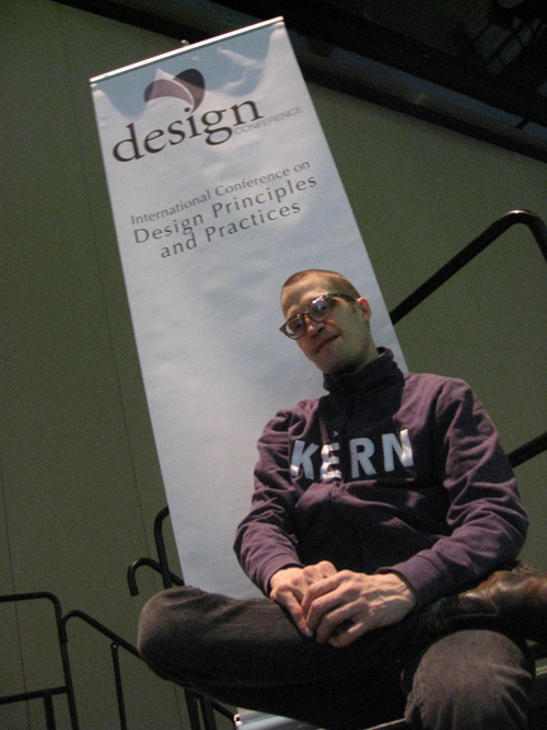
And one that a conference organizer snapped of me (I know, we've all seen the shirt before. Not a huge Veer fan but it was a gift and a nice prop with Helvetica underneath — also a gift).


In the meantime I have to write and make this pesky eye-tracking equipment cooperate with me.

More to come…

I'm not sure that shows the dominance of reading.
Certainly, if the question is put in text "what typeface is this?" the answer, in words, may well be what the text signifies. However, flash the subject "Helvetica" set in Times, and then ask him to choose which typeface it was from a selection of various "a"s in different typefaces. I suspect he would choose Times, not Helvetica. "Read and identify," not "read and name."

Has anyone re-done the Stroop test in a similar fashion?
That would be, flash the word "black" in red, and then have the subject pick the colour from a palette of square swatches.

Beyond a pointed rebus-concept headline, the idea that type may match the semantic meaning of text is banal.
Self-referentiality, in which text refers to its own appearance, is a parlour trick, an art gallery amusement, a game of double entendre, nothing more. Ceci n'est pas une pipe.

Nonetheless, I do love the concrete poetry of type specimens.

@ Nick: I don't know of such a study. Your idea would make for an interesting experiment. For a great review check out:

MacLeod, C. M. (1991). Half a century of research on the Stroop effect: An integrative review. Psychological Bulletin. 109(2) 163 – 202.

In it he references Tecce and Happ (1964) who did a card sorting/matching task that comes close. I still have some final edit's to do before I upload the manuscript. I will notify the group when it is ready.

Does anyone know how to make a link that downloads a PDF?

It only works if you initiate the thread and only on the initial post. Otherwise, post on your own site and link.

You can now download the manuscript. Comments are welcome.

http://readthetype.com/papers/

Thanks, Christopher!

I danced with an old lady in the jazz district, listed to opera...

I've listed to opera a few times, but only after drinking quite a lot. Sober, I'm able to remain upright through everything except the Ring Cycle.

I must admit that Wagner tires me, as well.

Chris, if it tires you imagine how it tires the performers. A friend of mine plays bass with the Met and and when the Ring is performed he is playing almost non-stop for about a week!

It's official:

Dean, C. T. & Klein, R. M. (2011). In search of the Font Effect: The effect of conflict upon reading and naming typefaces serially. Design Principles and Practices: An International Journal, (4)6, 401–420.

After over 30 rounds of attempted revisions the journal still couldn’t figure out how to use the provided high resolution artwork and I was so fed up that I just sent it to press as is. I hope to have a version with the proper resolution artwork posted on my site in the near future. The one that is there is not current.

If you wish to download the paper from the publishers site ($5 USD):

http://designprinciplesandpractices.com/journal/publications/

If you have any questions, don't hesitate to contact me directly:

typographer {hat} gmail.com

Congrats, and thank you.
(Now I need to make the time to read it...)

hhp

Thanks, Christopher, I just ordered mine.

And if it gets moved I believe this is a perm link:

http://ijg.cgpublisher.com/product/pub.154/prod.515

I just learned that this paper has been purchased 21 times since its publication. According to some of my colleagues, this is a big number for such an obscure field. Who knew?

Captured from web.archive.org on 20 Aug 2013. view this capture