Typophile

Have $300. Suggestions for a font family?

bstrom

Hi folks, new to the forum, but consider myself a neophyte type snob (that is, still a beginner, but I am a type nut nonetheless).
I am a student, and purchased the Adobe Font Folio (academic), so I already own such faces as Helvetica, Avenir, Univers, Futura, etc etc,plus the faces that come with OS X and Adobe CS4.

What I lack is a really complete slab-serif family of fonts. I am thinking that purchasing a good slab-serif font would be a really useful addition to my library, so I am currently considering Jos’ Museo Slab family or H&FJ’s Archer. I see Archer everywhere, however, and I don’t want to invest in a library that could soon be ubiquitous/overused (if it isn’t already...)

Other faces I’m considering: Gotham, Verlag, some nice brush scripts like Alpine Script... maybe a combination of fonts. However, I can only afford spending up to $300 on fonts. I see the merit in getting one high-quality family (or at least a subset of a family) and learning how to use it really well.

I’d really appreciate your feedback!

Hi, Brendan-

If you are looking for a slab serif family, you could take a look of my Suomi Slab Serif. It has six weights with italics. From MyFonts. This is shameless self-promotion, but there you go.

Actually came across your Suomi Slab family, Tomi. A source of inspiration! I will consider it, and I thank you for replying.

Just wanted to say that I’m very pleased you’re considering Museo Slab.

Your timing is very good: slab is the new black.
(Hmmm, or are you simply following a trend? :-)

If you’re not in a huge rush, I would suggest waiting just
a little bit: there will soon be a very nice one coming out.
It’s warm, well-crafted, covers 50+ languages, and the
italic is impressively progressive.

But really, first we need to narrow things down: what flavor of
slab are you looking for? There are kiddie ones, industrial ones...

hhp

If you buy a slab serif for $160 or less and have $140 left over, and want a nice serif, consider Whitman by Kent Lew.

8 styles for for $140.
http://new.myfonts.com/fonts/fontbureau/whitman/buy.html

A few of my favorites, good luck!
Vista Slab
Apex Serif
Jubilat
The Serif

BTW, if you want a really oldschool one,
in my book Egyptian 505 can’t be beat.

hhp

I think Hrant is on target in asking what kind of slab you are looking for, because they can be so different. For a happy sans you can’t do better than Museo, and a friendly one, Archer. PMN Caecilia is a humanist slab, very nice for some clean looking text. The heavy condensed weights of Dispatch look great in headlines, for which they were designed. Soho’s heavy weights are pretty, and somehow say ’magazine’ more to me. Newsy, but very stylish is Stag, which is my favorite at the moment.

I add PMN Caecilia, a wonderful and handy slab.
http://www.linotype.com/de/1313/pmncaecilia-schriftfamilie.html

I have looked through all the suggestions and I will try to answer some of your questions. I confess, I do not quite understand all the nuances between styles of slab-serif. In terms of pure subjective taste, I prefer slabs that are more geometric, with very little contrast between thick/thin strokes, which Museo and Archer seem to fit quite well. I stumbled across House Industries’ Neutraface Slab last night, and am really considering that or Neutraface No 2.

I like The Serif from LucasFonts, but it feels awfully similar to Chaparral to me, which I own, and I’m looking for building up as much diversity in my font library as possible. On my sticky note of serious considerations, I now have the following: Archer, Museo Slab, Neutraface Slab, Neutraface 2, and Gotham.

I’m delighted to see you frequent these forums, Jos! I feel like I’ve stumbled upon a goldmine of knowledge and expertise. I myself am designing a geometric slab-serif... which may not turn out to be any good, but I am learning a ton in the process. Part of the reason I want to purchase a geometric slab is for study purposes.

Be careful, it might be difficult to outgrow
something you admire once you dissect it.

hhp

I myself am designing a geometric slab-serif... which may not turn out to be any good, but I am learning a ton in the process. Part of the reason I want to purchase a geometric slab is for study purposes.

Type design can only be mastered by exercising it a lot together with looking a lot at your own and other designs. Because Museo Slab 500 and 500 italic are already free you might want to opt for Archer or something else. That way you have more material to reference to :)

Jos, you are standup. I really enjoyed reading your recent interview w/ MyFonts.

Does anyone have any opinions regarding NeutraFace or Gotham? Like I said, my choices aren’t necessarily limited to slab-serif... I’m just looking to pump as much diversity into my library as possible.

It is obviously advantageous to have a diverse library in itself, but making choices will be easier if you have a better idea of what typefaces you will need for your projects. So you may consider setting aside a typeface budget, so that when a project comes along for which you need something other than what you have in your current library, you can choose to buy one tailored for that project. You can build up your library organically that way.

In fact, I’m no longer at all sorry about sef promotion.

[img:stf_SuomiSlab_poster_6706_4847.png

GO FOR IT!

Look at some of those timid serifs, and then come back to Suomi Slab Serif for some proper ones.

For real.

Fact: Museo has tiny terifs. Another fact: Suomi Slab Serif has huge serifs. What is your preference?

Are you knocking down a door or a wall?

hhp

I think I’m doing both.

So try another one: seven weights with some serious ink traps:

Very popular in Finland.

For some reason, getting attached to alcohol:

Tomi, it is widely considered bad form to post several times in quick succession in a thread. So try to contain your thoughts to one post at a time. You may add a second post only if you have a substantial addition to make. But if you just want to add one more sentence right after you’ve posted something, use the edit button and add it to your last post; if you do it quickly enough, your post won’t even be marked as edited.

I know this is not perhaps an immediately obvious rule, but not to follow it may turn people against you unnecessarily.

Sorry, Brian-

I will keep my posts in singular form from now on.

Sentinel by H&FJ is arguably one of the most beautifully rendered and refined slabs to come about. This family improves upon the faults of traditional slabs and Antiques/Clarendons with more text weights and styles. I purchased it several month ago and swear by it when I need a classic personality with a modern bent in a particular design. And it is one of the more complete slab families out there. At under $200, you can’t go wrong.

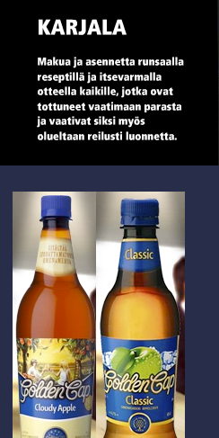
And promptly forgot samples of Karjala beer:

Sorry about this.
Drawing a logo for Karjala was an experimentnt.

Hey, forget buying fonts! With your $300 you could
make a 9.6 millisecond long movie with lousy subtitles.

http://typophile.com/node/65510

——

Hey Tomi, are your counting that Roman
numeral III as making those images on-topic?

hhp

Yes, buy Papyrus. James Cameron seems to like it.

Hrant; in Finland that III means tax number. We are very Lutheran here. I can not understand it, but that is a fact.

Thanks for all the advice, folks! At this point, I think the Neutraface family is what I’m looking for, so I’m going to save up and try to get the entire family (1, 2, and slab). The family seems really flexible.

To Jos: I fully plan on purchasing the entire Museo Slab family at some point as well. Your work has inspired me since I first laid eyes on Museo 700, and I’ve already purchased most of Museo Sans.

Good choice.

Sounds great, Brendan. And thanks a lot for the kind words!

Good picks, bstrom. Neutra’s a lot of fun for certain projects. Buivenga’s typefaces have a unique dna—in my mind, a lot of fun for motion work too.

Tomi from Suomi—...all the Finnish beer can packaging makes me think of fond trips to Finland. And makes me thirsty. Nice type.

I’d always just assumed the “III” or “IV” on beer cans like Lapin Kulta, Karhu and Karjala had to do with the percentage alcohol content. (I suppose in a roundabout taxation way, it does).

I do recall once being told, in that dry Finnish way, that the “Lapin Kulta” brand of beer translates directly into english as “Reindeer Piss.”

Lapin Kulta? Sounds like some harebrained pseudo-religion...

hhp

I does...all I know is, don’t drink the coolaid or the kulta. :)

Tomi from Suomi, that’s some of the most unprofessional conduct I’ve seen in a long time. You hijacked this forum and selfishly loaded it down with large images and essentially irrelevant self-promotion. You’ve secured your position on my own personal black list, no matter the quality (or lack thereof) of your work. True, I’m just one designer, and irritating me won’t impact your bottom line, but I would suggest exercising a bit more class in your future forum posts.

Joseph Cotten
Principal
Trend Setting Design
http://www.trendsettingdesign.com/

that’s some of the most unprofessional conduct I’ve seen in a long time

Really? You must not get out much. :)

Seriously, though, sure it was out of line, just not in some extraordinary or unprecedented way. But yeah, it’s not cool, and he should tone it down... a lot.

Cheers,

T

Brendan, I am right now reading the monumental “Adrian Frutiger Typefaces. The Complete Works”. In the discussion of his slab serif, Serifa, there is a wonderful classification of slab serifs on p. 168. It’s a classification by structure and really gives a lot of insight into the form. If you are going to work on a slab serif I would definitely recommend having a look at it in a library. Interestingly, Frutiger regards Serifa as “one of my worst attempts at a typeface.”

Captured from web.archive.org on 29 Dec 2009. view this capture