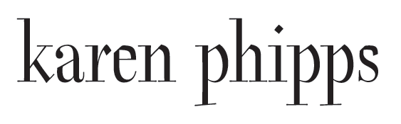
While I hesitate to use the term, for lack of a better one, I'm doing some 'branding' for a local painter (business card, web redesign, etc.). It's a bit late in the game to be posting for a crit as the client's already seen drawings and is sold on the direction -- but I'm still fiddling quite a bit, so any fresh eyes would be welcome.
Through several rounds of discussion, we've settled on this sort of mash-up of a didone and a broken script. I'm attempting to keep it from looking too obviously like a mere 'mash-up' (e.g. how I feel about Dead History). Though the 's' is killing me in that regard. And I'm dubious about the evenness of color among the a-r-e.
So any comments would be appreciated. Thanks.