Typophile

(x) One classic serif, one Victorian display font - Infidelity Pro {Michael A}, various alternatives {Mike Y}

malbright

Greetings,

Looking to ID the tiny serif (geesh, could it be any $%#@! smaller?) in this Muccatype ad that reads, "Fine letterforms & moustache twirling":
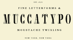
Also looking to ID the Victorian era display font used on the two tiny images of "Staehle" and "Rio".

Many thanks!

Decoro, same link as above

I think Infidelity Pro might be correct.

Cheers.

Now if we can just nail the other one ...

I searched using "1800s" at MyFonts and came up with one fair candidate that looks like a flattened version of your typeface: Flatrock from Font Mesa. It came closest to having the strange geometry of your sample lettering. Dan Solo (Solotype) also had a number of fonts recreating typestyles from this era that had a similar feeling, but not the angular "O": Riviera, Houdini, Penny Arcade and Dawson (all at MyFonts).

- Mike Yanega

Captured from web.archive.org on 2 Feb 2010. view this capture