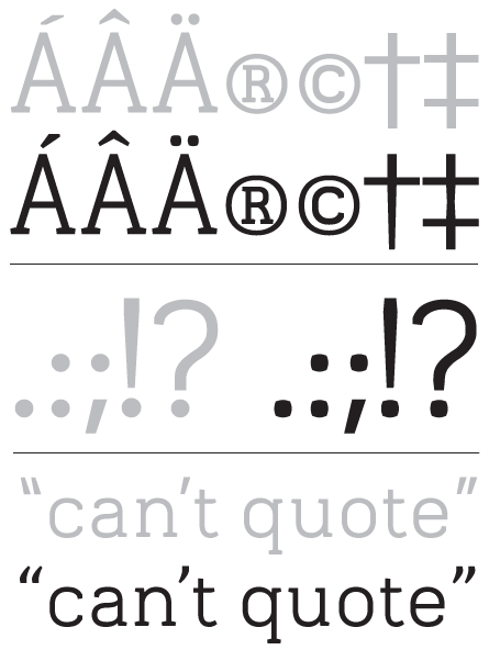
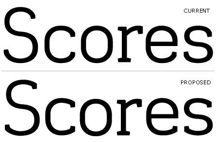
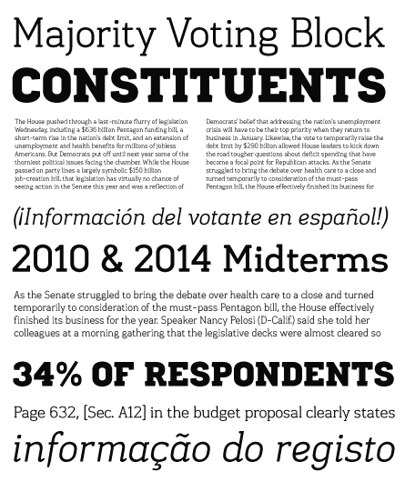
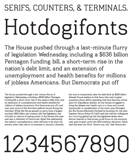
Hi all. I would appreciate your opinions on this typeface under construction. I want to create a monoline slab serif with a "DIN" feel to it, and to also be readable at text sizes. I have only given the letter spacing a cursory adjusting, so go easy there. But in the end I do see this having generous "air" between everything. Thanks.
| Attachment | Size |
|---|---|
| slab_unt_01.pdf | 574.54 KB |
| slab_unt_02.pdf | 129.02 KB |