Typophile

Lozenge Height

nina

This is what the Microsoft Character Design Standards (which otherwise I have found a pretty good guide) have to say about the Lozenge:
“Design: This is an open diamond shaped character that is commonly three-quarters of the uppercase height with the strokes being monoline.”

I just checked a bunch of fonts and the only ones I found that have the lozenge at roughly 3/4 the cap height are Verdana and Tahoma; very many are not even close.
Cap height or very similar seems to be the rule.

1) What’s the story?
2) What is this thing used for, anyway?

Cheers.

I’ve seen people use them in place of bullets, particularly on business cards in between phone numbers laid out in a single line. No idea if that’s their original purpose.

How embarrassing, I didn’t even check Wikipedia. Thanks guys.

None of those usages however seem to give any clue why these should be shorter than cap height. I wonder, do they need to specifically match any other glyphs?

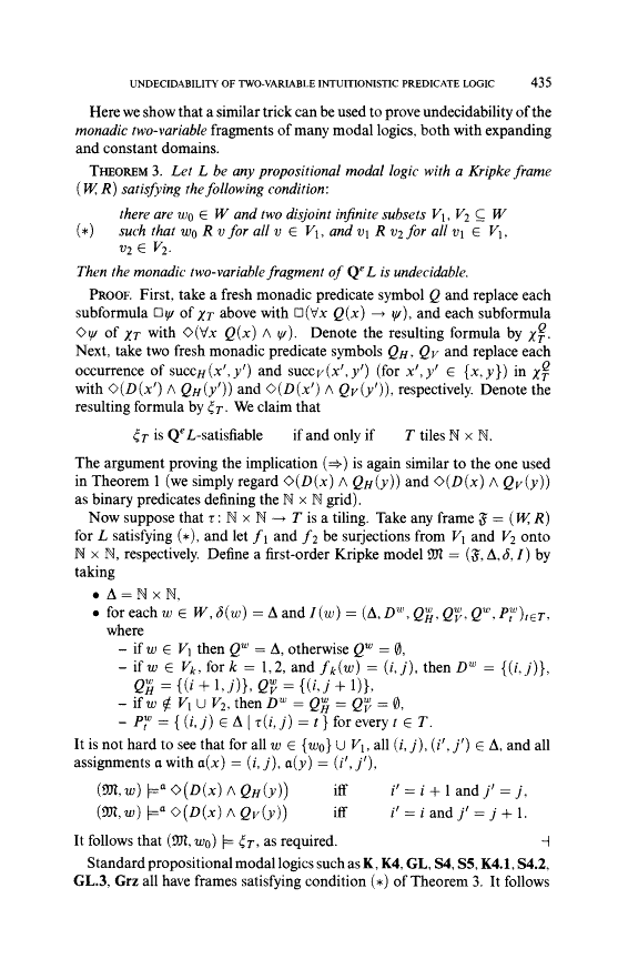
Here is a sample of how the lozenge might be used in modal logic equations.

I center it on the figure height in line with the equals sign.

ChrisL

Aargh, my eyes… ;-)

I think I’ll make mine cap height, unless someone has a good reason against it.

BTW, would the lozenge in the sample above be seen as a good design in this context? It seems quite wide.

Nina,
To me, it looks as though it was borrowed from a symbol or Pi font and out of the family look.

ChrisL

You mean like half that entire sample? ;-)
Thanks, I was wondering.

Yeah, it’s not pretty, but I thought it would show what other glyphs the lozenge might be paired with. Good luck! From that sample, it looks like a no-win situation to me! :)

Jacob, Chris is right, that isn’t the rhomboidal Times lozenge, it’s a f****** square†. What gives?

† As in: http://www.diamondshreddies.ca/

Funny :-)

But that’s why I asked – maybe mathematicians like the thing to be squarer?

(BTW: I realize that even here, people tend not to care too much about the design of the lozenge of all things. But hey, I’m making my first lozenge, bear with me.)

>I think I’ll make mine cap height, unless someone has a good reason against it.
I’ve always sized and aligned it as a multi-case character, weighted it as math.
45 degrees as the wiki says, is new to me (I never read it either).
I might have made some ’bad’ angles here and there but no one’s ever complained.

In a way, your first lozenge should be, except for a little scaling, your last, so make it good. :)

Cheers!

Thanks, I’m trying my very best with this complex beast of a glyph. :-)

“I’ve always sized and aligned it as a multi-case character”
That sounds… chameleonic. :-) Does it just mean that one needs to pay attention to making it work with both caps and lc, and numerals and everything?

@Nina — Yes, that’s basically what DB means. It should look decent in general settings, not particularly tuned to one case or the other at the expense of others. Cap-height generally works well, depending upon your overall vertical proportions and figure style(s).

Don’t know what that 45° definition is about. Seems overly restrictive and will lead to a lozenge that is narrower than most. I think two equilateral triangles abutted leads to a more reasonable model.

Don’t blow off this baby—who knows, it may acquire some new digital-era meaning, as “@” and “greater” have; some might even consider using it as some kind of random dingbat. ◊

I’m used to it being thin and tall. Otherwise it looks too much like White Diamonds Suite...

♢ <— U+2662 White Diamond Suit
◊ <— U+25CA lozenge

Please don’t tell me there’s a single conceivable instance where these two would risk being confused. Poker players’ math?

(Kent, thanks for the input!)

Hold on, are we sure that the symbol used in modal logic is supposed to be the lozenge?

I thought not, but on investigation, the situation seems a bit murkier. Wikipedia’s page on the lozenge seems to think so, for instance.

In modal logic, the modality ’possibility’ is represented by the diamond shape, while ’necessity’ is represented by the box shape. Typographic preference would be for both symbols to be square-like, and you can see this from the above example. So the traditionally narrow lozenge would not be the best fit for this symbol.

Indeed, in LaTeX, \Diamond and \Box are usually used for these symbols. \Diamond comes from the LaTeX symbol font and is a square diamond. The best match in Unicode might be ◇ ’White Diamond’ U+25C7. The \lozenge is separate in LaTeX, available from the AMS symbols package.

My guess is that modal logicians have been using the square diamond symbol without ever meaning it to be a ’lozenge’, but their similarity has led to some confusion, or at least some imperfect solutions where lozenges are substituted when a proper square diamond symbol is missing. I think Wikipedia is wrong here; I see no reason at all to call the ’possibility’ symbol a lozenge. It’s not that lozenges are traditionally narrow but modal logicians like them square, but rather that modal logicians use a square diamond symbol that is somewhat similar in appearance but is a different character from the lozenge.

Separately, in axiomatic logic, there is something called diamondsuit that is represented by ♢, the ’White Diamond Suit’ U+2662, as in the card symbol. There’s also the clubsuit, represented by ♣.

The 45 degrees mentioned on Wikipedia is extreme, possibly put in by someone who didn’t stop to consider what a rhombus with a 45-degree angle would actually look like. As Kent said, around 60 degrees would be closer to the usual values for the lozenge.

Wow.
So if I understand correctly, that means logicians might actually use the White Diamond Suit ♢ in reasonable proximity to ◇ the White Diamond? But not a lozenge in sight.
Anyway, for such specialized usage, I assume (hope) one would use a specialized Maths font?

And re the 45/60 degree debate – surely that’s also at least a little bit dependent on the design & proportions of the font, right?

oh man, this getting too crazy for me. Nick, where can I get some Diamond Shreddies in the U.S.? :)

Actually, I doubt that there ever would be much occasion to use the White Diamond Suit ♢ in reasonable proximity to ◇ the White Diamond, such being the relative obscurity and unrelatedness of the two topics even if they both fall under the broad heading of mathematical logic.

In any case, for such specialized usage, something like TeX would most likely be used, where the symbols would be entered as \diamondsuit in one case and \Diamond in the other. Then TeX would call up the right symbol font to supply these symbols. So unless you intend to make a symbols font usable in TeX, you don’t have to worry about any of this at all.

And re the 45/60 degree debate – surely that’s also at least a little bit dependent on the design & proportions of the font, right?

Of course. I mean that for typefaces of usual proportions, 45 degrees would produce a form that is uncomfortably narrow when you are used to traditional lozenge shapes.

Cool. Thank you for all the input.
Isn’t it crazy, the wealth of stuff that’s in Unicode?
I might just go outside now and make a ☃.

I still wonder how the Microsoft Guidelines came up with the 3/4 cap height thing… Maybe that is their way of saying it doesn’t *just* need to match caps.

>...45 degrees would produce a form that is uncomfortably narrow when you are used to traditional lozenge shapes.
Not to turn this into a riotous rombic romp, but,
I don’t know what you mean by traditional lozenge shape?
I think, if the general idea is to ensure differentiation from other diamond shapes, the 45 degrees at top and bottom confine to the the proper result. This glyph is not meant to be width compatible with anything but a lozenge, which by definition is uncomfortably narrow. It’s also, like all math, only somewhat weight compatible. As you can imagine, this glyph doesn’t get “ultra”, and maintain it’s vertical alignment, and it’s not alone among math signs that can only get so bold and stay aligned.

Cheers!

I don’t know what you mean by traditional lozenge shape?

Good point. I wasn’t clear about this, and didn’t think it clearly through in my head either when I wrote that.

’Traditional’ probably wasn’t the best word. What I meant was the shape we conventionally think of when we think of lozenges, and I don’t confine myself to typographic lozenges here (although a quick check through the fonts on my computer show a range of about 50 to 80 degrees, with around 60 degrees being the typical angle). Do an image search of ’lozenge’ and see what kinds of shapes turn up. Something between 60 and even 90 degrees is typical.

If we make a lozenge 3/4 of the cap height and make it 45 degrees, it will be quite small. Below, Georgia’s original lozenge is shown on the left and a 45-degree 3/4-of-cap-height lozenge that I quickly threw together is shown on the right, so you can appreciate the difference. Sure, I could have employed some tricks to make the new lozenge appear larger, and Georgia’s wide design arguably calls for a wider lozenge than usual, but I think this will do to illustrate my point.

I don’t think of the lozenge as a mathematical symbol, by the way. As I said before, I am of the opinion that the diamond-shaped mathematical symbols used in some specialized branches of mathematical logic are not typographical lozenges, but either a diamond that looks like a square rhombus or a diamond suit. Ideally, these should get appropriate typographical treatment (using special sorts for instance) and not be lazily substituted with typographical lozenges you find in most fonts.

The typographical lozenge, as I take it, is a sort of generic symbol without such rigid expectations on its shape, like bullets. So the Microsoft Character Design Standards are a rough guideline only, and the designs where the lozenges reach cap height are not breaking some inviolable rule. Its width is not completely independent of the design, as I mentioned in connection with the Georgia sample above. Note that the Microsoft Character Design Standards also state that the advance width of the lozenge should be proportional to the design.

I assume the 1st loz isnotaloz, and you know the 2nd loz is small cap ht? The Microsoft Character Design Standards may state that the advance width of the lozenge should be proportional to the design, but I assume that as another thing, advance width.

Cheers, and now to the plows, where we sow the seeds of footing! ;)

I assume the 1st loz isnotaloz, and you know the 2nd loz is small cap ht?

The first lozenge in the sample is indeed the lozenge included in the font Georgia, if that’s what you’re wondering. Or were you questioning whether Georgia’s lozenge was a true lozenge or not? Before this thread, I wouldn’t even have thought to question that...

The second lozenge has exactly the same height as the original Georgia lozenge; it was mechanically modified from the original glyph only in the horizontal dimension to make it narrower while maintaining the same outline width. I have marked the sample below to show that this height is indeed around 3/4 of the cap height. Georgia has a large x height compared to the cap height, so this does turn out to be close to the small cap height. Maybe I should have chosen a different font, but I only picked the one serif font I assumed everyone was familiar with, being the font used for Typophile and all.

Now, on the 45-degree business, it seems that at least one technical definition of the lozenge is that of ’an equilateral parallelogram whose acute angles are 45 degrees’. The definition comes from MathWorld. It is immediately followed by the statement, ’Sometimes, the restriction to 45 degrees is dropped, and it is required only that two opposite angles are acute and the other two obtuse’.

I did not know about this 45-degree requirement before. And to repeat what I said before, I think in popular usage no such requirement is in force, so that a range of 50-80 degrees is typical. Perhaps whoever put in the 45-degree requirement for the typographical lozenge on Wikipedia had the stricter technical definition in mind, assuming (wrongly, I think) that this also applied to typographical tradition.

>...assuming (wrongly, I think) that this also applied to typographical tradition.

What typographical tradition?

Cheers!

What typographical tradition?

Touché! The lozenge has a really long history as a character in computer encodings, but I wouldn’t be surprised if it did not have a long history as an actual printed character before that.

I mostly remember it from either Luden’s or Smith Brothers. ;-)

ChrisL

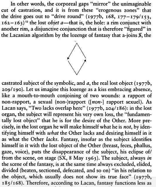
Unfathomable psychoanalyst Jacques Lacan borrowed the lozenge (alongside other algebraic notations) to diagram his theories of desire. From Mikkel Borch-Jacobsen, Lacan: the Absolute Master:


Does that clarify? ;-)

Oh, nuts, not really ;-)

ChrisL

Hey Craig, what a cliffhanger! :-|

Heh, sorry Nina, if you want to read the next line (which makes it all perfectly clear) you’ll have to look it up yourself!

Craig has been slippin’ and sweepin’ the ice too much again ;-P

ChrisL

Captured from web.archive.org on 3 Jan 2010. view this capture