Hi there,
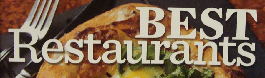
I am having a bit of trouble identifying the two slabs in this picture.
"restaurants" seems to be a typeface very similar to Clarendon, but the lower case "t" is quite different.
"BEST" also seems to be a different face altogether, but the former is driving me crazy.
Any help would greatly be appreciated.
Thanks!