Typophile

Terminal Sans

A3

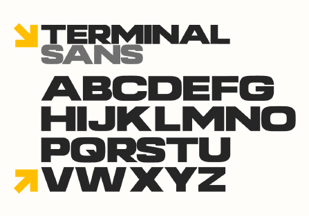
Hey everyone this is my first attempt at making a font (been doing it as a learning experience) so any critique would be greatly appreciated. I've been a huge fan of eurostile and microgramma for a while so I attempted to take a more futura/gotham inspired take on the font. I'm half-way done with the lowercase and numerical characters. I also made the weights much heavier and kind of centered around the concept of a type to be used in airport signage.

Any tips on how to make the font better/change characters to suit the concept more would be appreciated.

AttachmentSize
terminalsanssample.png24.7 KB

It's a good start. Your diagonal weights are all over the place: X, Y, upstroke of K are super heavy, and the middle of Z is light. I like your Q concept. V and W would fit into a standard microgrammoid but I feel they need to join more solidly at the bottom to fit into your "futura/gotham inspired take" (I'm pretty sure I understand how you mean that). Judging the curves will probably require getting a closer look.

I also made the weights much heavier and kind of centered around the concept of a type to be used in airport signage.

Maybe I didn't understood what you actually mean but, as far as I know, airport signage isn't so heavy:
http://www.designworkplan.com/design/airport-signage-photo-inspiration.htm

That said, I like the typeface. Maybe you can try to make the middle stroke of the S more horizontal, in order to slightly enlarge the counters.

Hey thanks for the critiques! Definitely will help with developing the font. Yeah I know its a bit bold for an airport style type but I have personal fondness for fonts like gotham ultra. Will post updates later. Does anyone know of a font that's kind of inbetween Bank Gothic and Eurostile?

Thanks for the tip man, that's a fantastic font.

Ah any tips on the new rounds? Thought I'd move away a bit from the squareness of eurostile to something a little bit more miedinger-styled.

I like them! They're also "fresher" than the old ones.

Like the new round forms.

I'm looking forward to seeing how this one turns out.

Captured from web.archive.org on 16 Apr 2015. view this capture