
Hello,
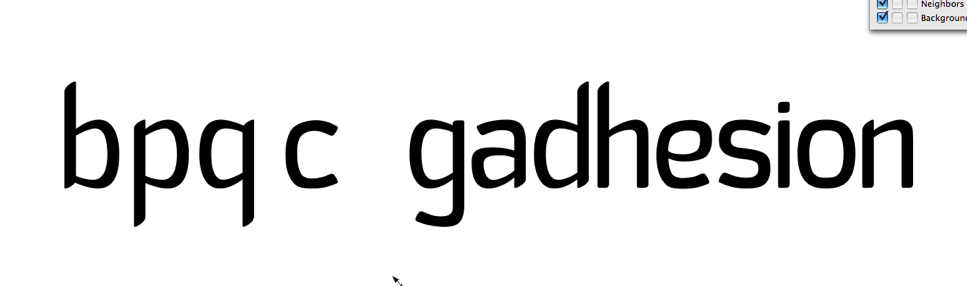
I´m doing a new typeface for my final typography class, here´s an image with a sample... and i would like some critiques to keep going with my design.
Thanks
Hello,
I´m doing a new typeface for my final typography class, here´s an image with a sample... and i would like some critiques to keep going with my design.
Thanks

I'd definitely say keep going with this.
Looks like you haven't decided on a variable-width or constant-width style. The c, s, o and the tails of the g and e are constant-width, and the rest are variable-width. I think the variable-width looks better.
The top of the vertical in b, d and h, and the bottoms of the p and q seem like they should be flatter.
Captured from web.archive.org on 14 Apr 2015. view this capture