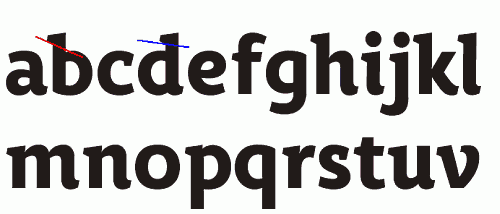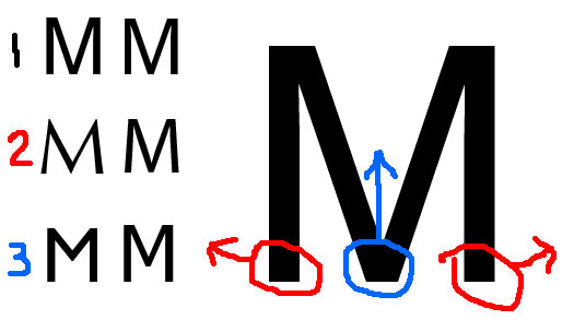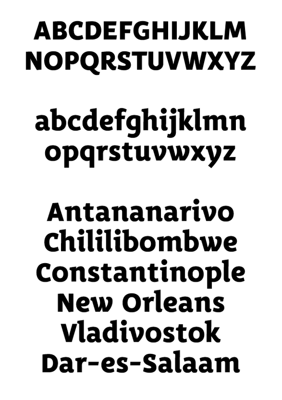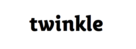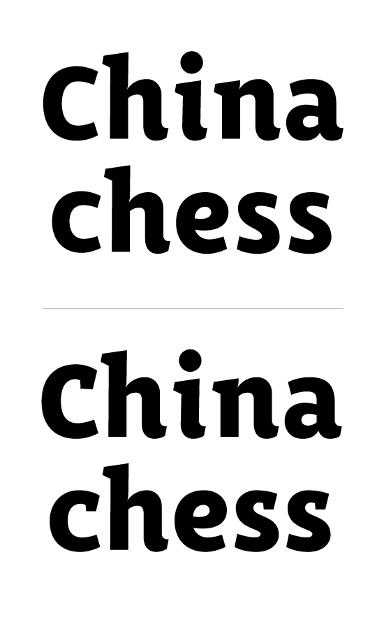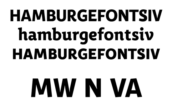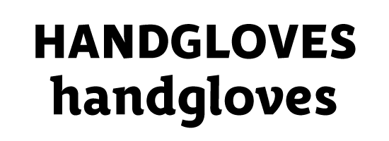
A while ago, I posted a logo for a youth magazine. The logo eventually got turned down, but I felt the idea for the letterforms were to good to abandon and started sketching out a full typeface. The structure is inspired by cursive designes, something I believe must have been the idea behind Lucas de Groot’s The Mix — as I found the serif placement of his design very similar to mine. This structure sometimes seem to interlock letterforms perfectly – other times make a mess out of the spacing. I’ve not yet drawn the alternate glyphs I have in mind (cutting down, or cutting off serifs), as I want some good opinions on the basic alphabet. The typeface is intended for display use.
I’d love your criticism.
Edits:
12/10: Follow this link (1,4 mb PDF) for a text setting example.
| Attachment | Size |
|---|---|
| specimen01.pdf | 237.36 KB |
| specimen02.pdf | 206.78 KB |
| specimen03-1210.pdf | 94.42 KB |
| specimen05_1215.pdf | 220.16 KB |
| specimen06_1215.pdf | 423.27 KB |