Typophile

Designing a wine lable, no idea what to use

Greenstarcandy

Although typeface intrigues me, I’ll admit, I do not have an eye for it. My strength lies mostly in illustration. I’m working on a wine label for a computer graphics class and I can’t figure out what to use for the name.

Feel free to critique the heck out of the design itself while your at it, I’m more than open to it.

Hello.
Helsinki has a cold weather, right? Could you describe the characteristics of the product? It helps to know that...

I recommend a site where you can watch and analize more wine bottles and the font used on the pack:

http://lovelypackage.com/category/alcohol/

///Gerardo Ruiz Babsia///

Try Museo, it’s pretty awesome and should compliment the Illo style – and two of the weights are free.

http://new.myfonts.com/fonts/exljbris/museo/

“Try Museo”

Nice...

///Gerardo Ruiz Babsia///

Shopping locally might be a good approach. Sami Kortemäki lives in Helsinki and is a founding member of Underware. Liza or Dolly could work beautifully on a wine bottle.

There’s an i missing from the top “Helsinki Finland”.

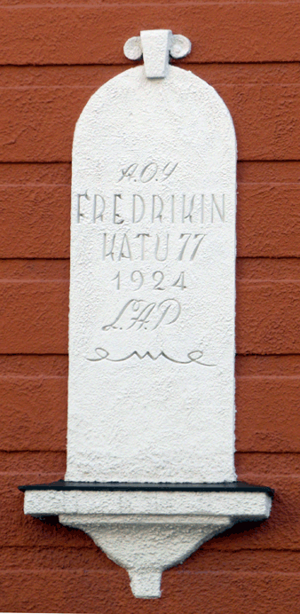
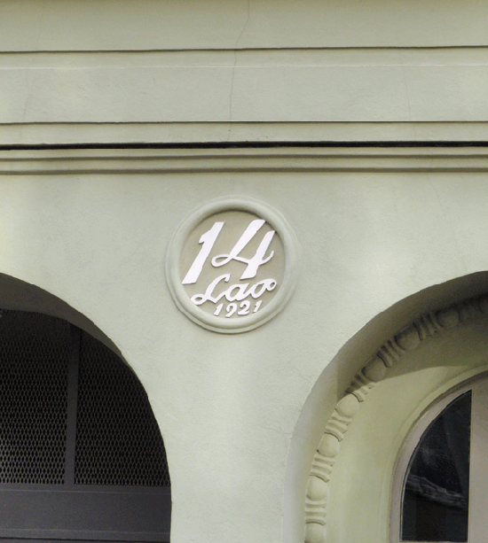
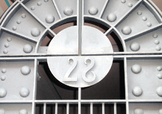
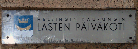
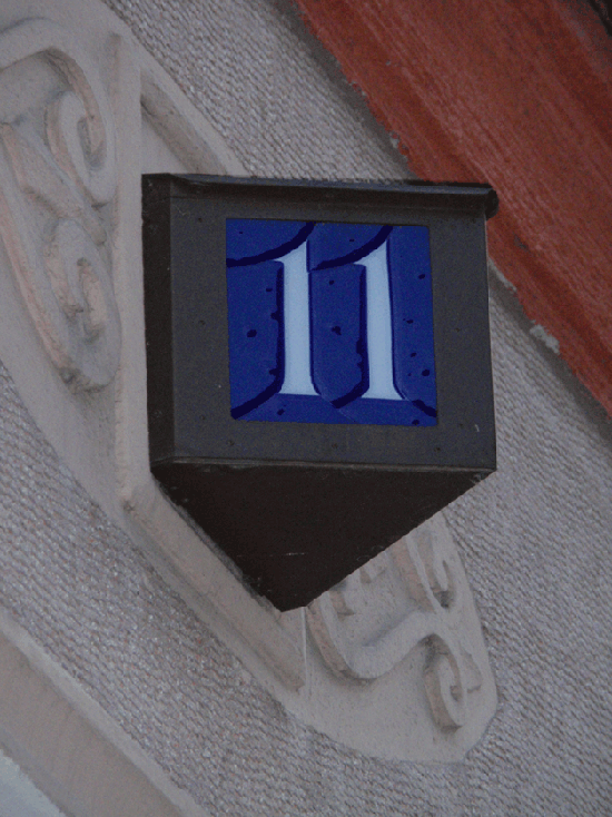
As a Helsinki born Finn I don’t get my home town feeling in the lable. The official city of Helsinki these days is all Helvetica, but there’s also plenty of Jugend/Art Nouveu in the old buildings.

Here you can find some pictures from the city:
http://taivasalla.net/english/

The global warming hasn’t made it possible to grow grapes here just yet, so my guess is, that your wine is made of berries :)]

Mili likes wine :)

///Gerardo Ruiz Babsia///

Captured from web.archive.org on 3 Jan 2010. view this capture