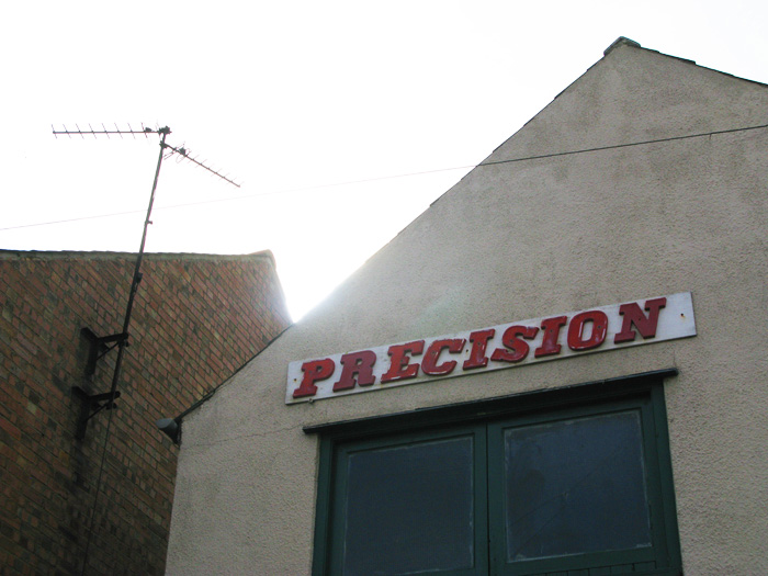
Maybe it WAS good... that is until it was given to a slacker on a ladder to slap those letters up.

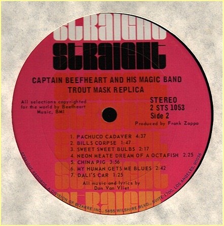

More Typoantonyms:
Connectie, found by LettError
Finer Points in the Spacing and Arrangement of Type, on the H&FJ blog
Venetian, from Hrant
Antiqua, seen by Dan
ha ha..
well it loox like perfection is not easy!
More typographic irony:
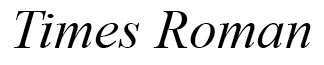
ha ha..
your killing me, Nick!!
Great find..
: )


Well, he said to “Get the L out.”

“Finer Points in the Spacing and Arrangement of Type, on the H&FJ blog”
LOL. Type spacing fail.
http://vi.sualize.us/view/sketch/df8a9721eca38df2c2d19c75fdd0bd08/
Captured from web.archive.org on 3 Jan 2010. view this capture