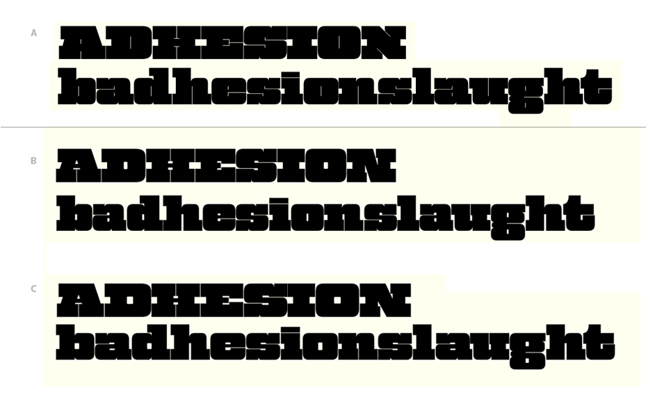
Here's the deal. I'm pretty happy with A. I'm trying to design a weight lighter and I'd like some guidance on which approach works better. The main difference between B and C is that C's counterspaces are wider. Proportionally, which one of these is better? Right now, these heavy designs are for display, but I might progress to designing lighter weights with a more text-friendly approach. Backward huh?
Also, comments on specific glyphs would be greatly appreciated.
| Attachment | Size |
|---|---|
| badhesionslaught.gif | 42.69 KB |