
I'm working on a new Wordmark and need some feedback on readability. Please can you tell me what you read/think when you see this?
Many thanks
Mark
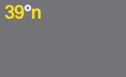
I'm working on a new Wordmark and need some feedback on readability. Please can you tell me what you read/think when you see this?
Many thanks
Mark

39 degrees north

Ditto.

If it's a wordmark and the rectangle is part of it, the type is too small.
Generally I think that logos with straight type in simple geometric shapes are underwhelming, however nicely set and coloured.
All, Many thanks for verifying the readability. It seemed a fairly obvious read to me, but you never can tell. Thanks for the input Nick, I agree with your point. The wordmark would not be contained in this shape, I was just trying to get an approximate weight of the colours I was working with for the future Identity.
I was reminded me of No.6:
http://typographica.org/001009.php
Ha! That's a great post Nick. Actually, it may not be so clear from the jpg I uploaded, but I set this in Akkurat, not Helvetica.

I see "39 degrees north" as well, but that should be an uppercase /n/ if you are to follow an established notation. Otherwise /n/ looks odd. Readable, but odd.
Epsilicon - thanks for the comment. I totally agree and had pointed that out to the client. They seem to prefer the general aesthetic of this to the Uppercase version.
but I set this in Akkurat, not Helvetica.
Congrats, you outsmarted yourself.
The Saville sign and logo was set in Arial.

I also think it's odd in lower case if it's supposed to stand for North.
To me, this reads "n°39" backwards (i.e., "number 39").
Thanks for all your comments. How about this?
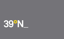

@ markduk: What type of design do you do and who are your (desired)clients?
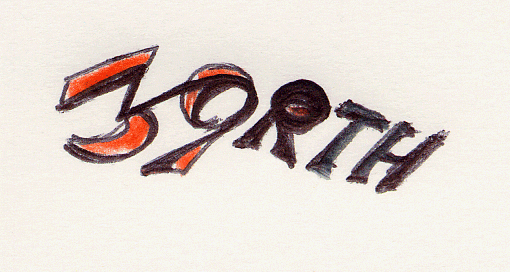
to me it is:
Nobe
upside down
Progressing slightly. What do you feel is working better? As to Christopher's question - this may become a wordmark for a creative studio who deal with fashion, tv, pr and ad agencies.
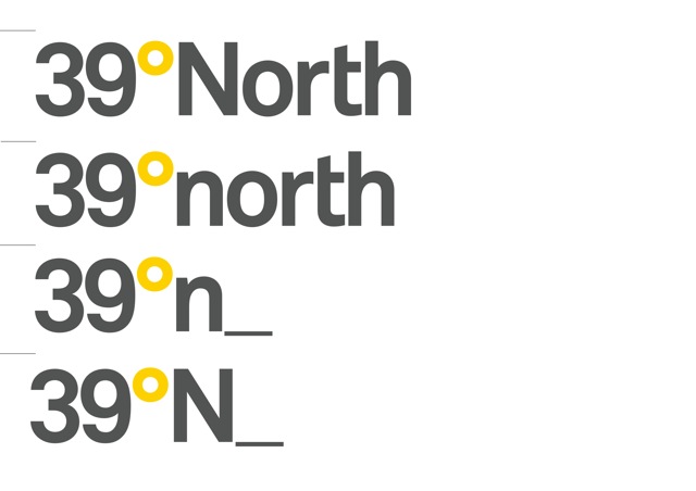

Personally, I don't like the underscore treatment: its thinness contrast too much with the stroke uniformity of the rest.

Don’t know, if that is inspiriting. It was just an idea. Maybe you can try a font, that is more geometrically constructed, and use the the degree as O.

Is the underscore supposed to represent a blinking cursor? If so, you need to use a monospaced font. Otherwise, a vertical bar would be needed for the cursor.
Have you considered replacing N with an up arrow ? As in, you know, a "North is that way" kind of arrow.
@ markduk: Can you explain the meaning behind the words "39° north?" Regardless if it's a letter (n,N) or word (north, North), why were these words chosen? For example, "That's where their office is located."
Regarding the underscore, if the clients are fashion, TV, PR and ad agencies, then I would consider the underscore to be inappropriate as it is an obvious digital reference and speaks more to software and high tech.
The custom "t" in (n)North is a nice touch should you choose to stay with the full word.
Captured from web.archive.org on 11 Oct 2013. view this capture