Typophile

Need a CRITIQUE, for a new logo

takach

Hello all, I’m getting close to finishing a logo for a venture capital firm which specializes in something called cleantech ventures, basically this means they are raising funds for technology based start ups who are making advances in the alternative energy industry. My client’s tastes are on the conservative side and after designing a lot of logos, we’ve finally narrowed it down to one, but there are strong opinions on the color across the divide between designer and client. I attached an image which has the logo in two color palettes and I’m hoping to see what you think is the better option. Also, which color has more energy, or communicates the idea of energy more effectively? By the way, I’ve presented them with many non blue options, the final has to be some sort of blue... THanks for the help.
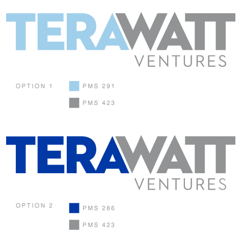
I’m guessing you like the top version, the client likes the bottom? I do think you need more space in between the “A” and “W”. I think 291 is too soft, but 286 is too vivid. Maybe something in between?

I like it. You need to either match the spaces in AWA or join the W to the A. You also need to keep the weight of the A strokes the same. The color in the former is more pleasant but too light, the dark blue in the latter reeks of old Wall Street in a way that doesn’t suit our times or the business.

Nice logo. I agree with both. A color in between the two blues would convey energy and still be a sophisticated design solution. Also does need a hint more space between a and w.

Thanks for some fast replies. The strokes of the “A”’s are slightly different, their sort of mirrored letters so the that the side which faces the “W” is a little bit different than the outer stroke. Somewhere along the line I thought this would be a good idea but I guess it’s just a bit distracting. Thanks for bringing that to my attn.

I do agree that on my monitor the 291 is too light, the pms swatch comes across better. I guess I should either need a more accurate rgb value or I might need to go a bit darker if staying light is an option...

A bit clumsy on my part, but maybe something like this:

BTW, do note the much more clever spelling.

hhp

@hrant, I did suggest that spelling early on, its a very subtle pun, they didn’t really get it unfortunately, but I agree that 2 R’s are better than one. But I’m not really sure if the idea of making every letter collide is really the right direction, right now some are touching in order to keep the word tightly kerned, and the word is split into the syllables very deliberately, since it’s already kind of a mouthful.

More than having things collide, what I was shooting for was making the “TER[R]A” sort of a negative space thing (I was just inept at the rendering). One benefit of this would be to totally avoid the problematic diagonal separating “AW”*. Another benefit would be that you’d only need one color while still exhibiting a boundary between the two parts. BTW, do you think they’d go for a hyphen? Not necessarily textually, just visually - like in the Microsoft logo.

* Hey, have you tried simply making them share a diagonal stroke?

hhp

put more space between A and W. You may want to do something about that blue too, your close.

I have one more question to ask, why do you all hate the closeness of the A and the W? The whole point was to create tension b/t the two halves of the word, and I’ve shown it to a few designers who appreciate that element. So what exactly about it do you just hate so much? Thanks for all the help.

To me it’s a technical issue. The smaller the logo is reproduced, the more risk that any small gap will turn into “noise”.

hhp

Maybe it’s just me, but I always see two joined sans serif Ts as capital Pi.
Is that a legitimate concern, or only to Greeks and font developers?
(I have the same problem with As that have no crossbar, hence I read the KIA logo as “KILL”.)

Th “V” in “Ventures” is almost lining up with the middle space in the “W” above. I think, either line it up and make a diamond or reposition it so as not to suggest one.

…
-=®=-

to me it is just uncomfortable. Tension is interesting certainly...but the subject does not quite lend itself. The titles for a Hitchcock film yes... Generally we always want to create harmony as designers. I think a slight adjustment would do it...close is good it is just claustrophobic

I agree with Chris Keegan about the spacing between A and W

and you have cut a little of the right side of the A, which to me is slightly annoying

otherwise I think it looks neat! and I like the softer blue better than the internet link-blue

Captured from web.archive.org on 12 Dec 2009. view this capture