
What font would you use for a bakery logo. I'm wondering what others would find well for a bakery.
Thanks
What font would you use for a bakery logo. I'm wondering what others would find well for a bakery.
Thanks

Motter Corpus.
hhp

Depends on the bakery don't you think? There's all kinds of 'em.
With the last bakery I did a logo for I was going to use Delicious, because it worked - and the owner was amused by the font's fitting name. In the end, I used another one that worked even better. Fontin, also by Jos Buivenga.
Before that I used Garamond for the name (Grainfields) and some hand-lettered blackletter spelling out "Das Brot" in a banner under a sheaf of wheat.
…
-=®=-
Heres what I came up with, feel free to comment.
Thank you.
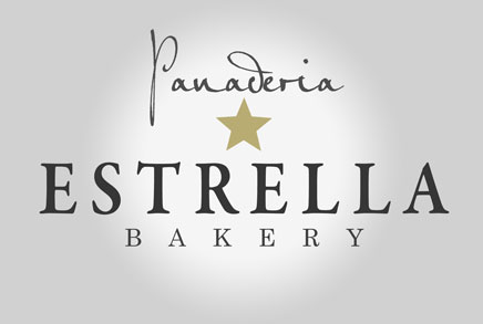

Doesn’t panaderia mean bakery?
I can comprehend, why hrant has proposed Motter Corpus, but I think, you should find a font, that "matches" with the kind of bread – a German bread is very different from an US American bread or a French bread.

The spacing is odd in 'Panaderia': look at the wide space in 'na' and the narrow space in 'de'.
Also, I find the spotlight effect concerning. What would it look like on plain white?

That looks like a very upmarket bakery. Is it?
(That logo would make me personally think at least twice, and check my purse, before stepping inside.)
-arno
yes it does mean the same thing, in Spanish. The target market is the Spanish market. matching the font with Motter corpus is a good idea to match the 'baked' puffiness.
-mrMoto, I agree with the oddness
-altaira, It is not an upmarket bakery [yet], most likely I will do a redesign (does the handwritten make it seem an upmarket bakery ?
Thank you all for your help and [in my defense, i have not yet officially taken gd courses :P, I'm an architecture student but enjoy very much to do gd as well.]
I have found my inspiration.
http://www.aiga.org/content.cfm/freshly-baked-us-students-brand-a-mexica...

Yes, that looks high-end, and you may want to start over with the type. I have to say though that the star form is right on for a bakery!
"It is not an upmarket bakery"
Then I think you need to open up your search again. It's not just the handwritten thing that looks posh, you've got it all: centered alignment, a star in gold!, classy serifed, tracked-out all-caps. And that gradient. It does look good, just potentially too high-class. – Motter Corpus is a good suggestion in terms of earthiness / puffiness I think; find a font that smells like fresh baked country bread. :-)
Also: If you have the word "Bakery" in 2 languages, you may want to set those so that the 2 words also look like they have the same function. This way it looks like "Bakery" is the "subline", but "Panaderia" looks like, dunno, the signature of the founder or something.
Or bake letters for inspiration. Maybe you can make the logo from scratch without using an existing font. I just remember the numbers, that my mother had baked on a few of my birthdays. At least I would ask the bakery for a few of their breads. Motter Corpus is heavy and relatively cornered. It would match to bread like this or this, but not to a light baguette.
I didn’t mean, that the typeface has to look like bread. The Antiqua of your sample also would match to bread, although it does not look like bread. But it would match to French bread, not to German bread. I just see, that you have used two different Antiquas in your sample. I meant the one, which you used for "Estrella".
I'm seeing beer right now.
(But some of that undoubtedly comes from my sojourn in Barcelona.)
Anyway, as has been asked: what kind of bread?
Or, in actuality: what kind of [desired] customer?
Because the customer is not the bread.
hhp
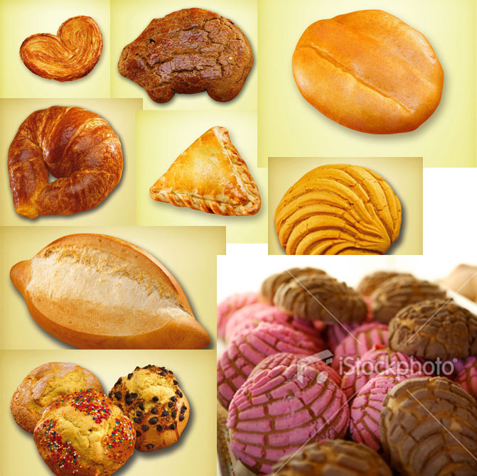
I will consider the redesign without an existing font and I'll let the shapes, colorful palettes.
The quote from the article I posted previously "The decision to develop the project into the identity for a “panadería” became obvious when the students started buying and eating bread as part of their daily routine while in Mexico."
This is also true for migrants in the area I reside. Buying bread as a daily routine is accustomed in their country of origin and when it became available [just within the last 5 years] it was evident the tradition was not lost and their routine would not have to take a plunge. The desired customers definitely love their morning [and evening] bread with hot chocolate or other traditional beverage.
The foreseen bakery is small [not fancy] but its attempt it to stand out from the other established bakeries [ a few in other townships but none in the township it will be established], but the goal is not to step over the boundary and over the customers comfort zone. The migrants are costumed to simple [decor] and anything [logo identity] that resembles their small town hand lettered signs and bright colours. The focus is not on the fancy or strange. The main goal is between the cross breed between a small coffee shop feel with a "panaderia". The more home-town feel the better while keeping it well designed.
And as I write this and see my previous design, I now think, If I was one of those customers, I would not walk in there to buy my morning [evening] bread :)
thank everyone, i will work on a redesign and post for comment.

Cooper black: tried tested and true

candy script from alejandro pena! i love this font!
In the spirit of unbridled creativity,
Troy Vera
Kingdom Graphics
http://www.kingdomgraphics.biz
Yahoo IM: kingdom_graphics
Skype: kingdom_graphics
I'm really feeling that candy script.
The origin of the the script also has many more great selections.
http://www.sudtipos.com/home
Captured from web.archive.org on 15 Nov 2014. view this capture

