Typophile

Opinions ??

shoesoffnrun

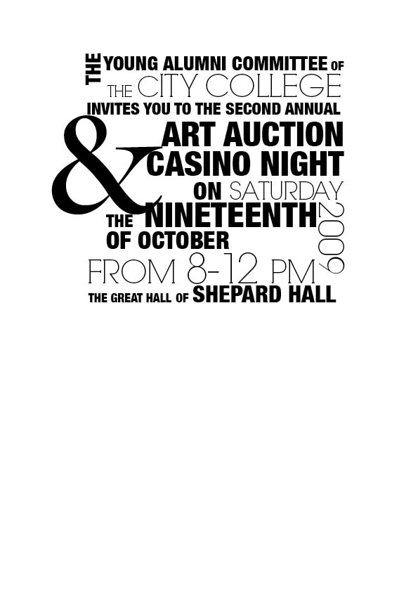
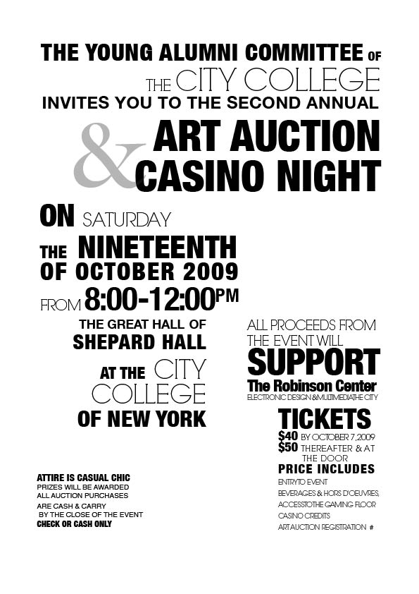
Hey I'm a design student trying to redo all my projects for my final portfolio. You were all there once so try to sympathize lol. So if you can just look at this and give me some feed back i'd appreciate it more then you would know.

Do you think I should reverse the information to the opposite typeface. serf- sans sans - serif

also do you think my hierarchy is right? I did it by whats important to me. But I'm not 100% sure if that's correct.

Thanks !!

AttachmentSize
FINALINVITE.pdf73.88 KB

Do you think "and" is the most important thing in that whole invitation?

good point i just like the way the ampersand breaks up the composition

Patricia, can you upload a jpg of this work, I think people who don´t have the same typefaces installed as you don´t see this pdf as you intended.

I don't think so - I don't have at least one of those fonts, but the PDF looks correct.

Yes, sorry, the pdf was fine.

This review comes from an amateur... but I would add more size contrast to this, make the small texts smaller and the big texts bigger. Then I would remove the overlapping parts (&) and the holes (above the 8-12 pm etc).

I think my biggest criticism is still your lack of grid.

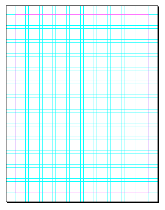
Start with a document that is something like this:

Then use it! Check out this article on grids and spend a little time on this website.

A poster that uses type somewhat similarly can be seen here.

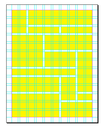
Make invisible boxes that fit together with even spacing for all your words and use things like tracking and size (and condensed or bold or extended fonts) to fill those boxes. Not exactly like the image below, but you kind of get the idea..

Don't be afraid to break your grid! That is a great way to create interest or focal point.

Oh, and if your instructors have not taught you about grids, be sure to ask for it! Grids are like rules.. and rules are meant to be broken. But you have to know the rules before you can break them.

I hope that is helpful!

evan

http://www.evanmade.com

@ Patricia

It is not enough, that your work looks different from classical typography. The white rooms just look like rests. But they are very important. If your square would be a room, but not a plane, I would get a panic attack. Like Miro I am also amateur.

But I’m not 100% sure if that’s correct.

This means, that you were not able to exclude, that it is correct?

@ Evan

Grids are like rules.. and rules are meant to be broken. But you have to know the rules before you can break them.

Rules are meant to be followed. If they would be meant to be broken, the break would belong to the rules and resistance would be an illusion. The resistance is part of one or more other rules. Everything follows rules. As harder the amount and the core of rules are to define, as easier they can be confused with chaos. Chaos is the chorus of all rules. If you are in unison with the chaos, the chaos permits you to recognize and emphasize one or more rules. The order condenses in the selection of rules. Not tooooooo bad for two hours of sleep.

@ Evan

No doubts, your post is useful!

Thanks guys... back to the drawing bored... again!

One idea. You can use a 20% greyscale on the ampersand to reduce its impact without reducing the size. My eye flies to the gaps of whitespace within the shape. I doubt that is where you want the eye to focus.

Arno,

You make a good point. I guess what I am really saying is that rules are meant to be broken with rules. Hence "you have to know the rules before you can break them.". You have to know the rule you're breaking from one set and replace it with a rule from a higher set. Maybe this makes no sense.. haha.

What I was really trying to say was that the grid should be followed and broken—but broken with care.

cheers

____
 evan

hey Patricia,

Why don't you tell us more about the project?

Who is the audience for the invite? How will it be produced (is it for the web? printed? how many? etc.)?

How did you get to this point? Can you show us earlier concepts? Are there references that inspired you? How did you choose these typefaces? Why is it black and white? Etc, etc.

It could help to give you feedback which is more relevant for you.

thanks,
jarrod

To me, the problem with the ampersand isn't how big it is, it's that it is not visually unambiguous that it is there to connect "art auction" to "casino night".

But that isn't actually that serious a problem; the eye still takes it all in at a glance and the mind sorts it out quickly enough.

The discussion on the rules and breaking them is very funny actually, as 'Rules are meant to be broken' is a contradiction in terms. This introduces a new rule that says that all rules should be broken, also the rule that rules should be broken :) )
So in the end if you would follow the rule to break the rule you would be following the rule again! lol

greetings Jeffrey
infraordinaire

Well the "rules breaking" thing, as I interpret it, is "Know the rules. But also know when you are breaking them and have a good reason for breaking them." But the most important rule is: Does it work? If you break that, you're toast. :-)

Lol thanks... The project is for my type class and my type professor is a self proclaimed type guru (she has the credentials to justify it). However the entire semester has been nothing other then critiques. which is informative but not as instructive as one would hope for. The whole purpose of this project was to design an invite based on the text provided. There is text for the invite itself as well as text for the rsvp card. The entire project needs to fit within standard size envelopes to reduce cost to the "client"as well as show typographic hierarchy. I came up with going for a playing card theme because i was in Vegas at the time for the LIA Judging session( like Cann but cooler because i work for them lol). Since I came up with that concept i have evolved from using the backs of the playing cards as my "visual" element, to using the glyphs on the cards, and finally landed on a black and white drawing of the king and queen of hearts (vectorized) that I'm quite happy about. The only thing now is taking by black and white "visual" element and using it to work with my text. I thought i could do it by keeping all the words compiled in a box like I've shown you but ill admit I've never attempted a composition like that before ( and never really taught about using a grid)

hope this helps

Typography, transcendent law, philosophy, all in one thread. Fantastic.

cheers,
evan

hi Patricia,

That's great background information.

Have you pulled everything together yet? The drawing, the copy, other graphic elements you might want? If you have, please show. If you haven't, you should start now, as you should be aiming for a complete, cohesive piece that integrates everything together.

Visual research could be very helpful. Take a look at playing cards- different sets, different cards within a set etc. (There have been some interesting custom sets by designers.) Analyze the graphic language and decide what you want to try to translate to your own design.

Then show us again!

best,
jarrod

Wait a second, you are a design student, getting ready to graduate (already compiling your final portfolio) and you haven't been told about grids?

This doesn't make sense.
_____________________________________________
Personal Art and Design Portal of Ivan Gulkov
www.ivangdesign.com

Patricia,

Where are you studying? Regardless of where, don't let the classroom be the end of your education. Read read read! There is a fantastic book on grids called "Making and Breaking the Grid" from Rockport Publishers. Buy. That. Book. And read it. It's affordable and you really can't afford to go on doing any kind of design without a knowledge of grids. And tell your instructor to read the book too.

I'm with Ivan on this one.

cheers

evan

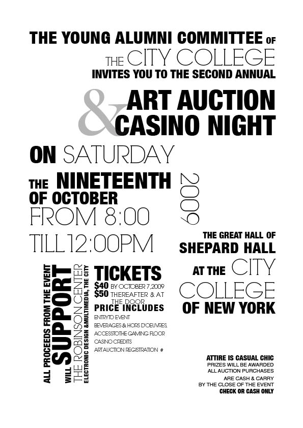
Here is the newest version. I believe i took everyone advice and everything is pretty much to a grid except for the ticket section but it looked so awkward and isolated in the grid

I still feel it's not coherent enough and the composition as a whole is too patchy. I think there is a lack of real focus points in the design. It is not clear which information is the most important, and has to be read first.

I think you've made it pretty hard for yourself working with different typefaces, weights, directions etc. It lacks focus and a clear idea in my opinion.

What can be done to make this work? I think you have to make a pretty radical change. You are working with at least four different typefaces at the moment, which don't really work together IMO. They all have very different characteristics, so this makes it hard to create coherence. I would cut down the amount of typefaces to a maximum of two. Find two that complement each other, rather than bite eachother. You can still work with different weights, but I would try working with different weights from the same family.

Now you've combined very light with very fat weights, this could be interesting, but looks messy and slightly arbitrary at the moment. You could give different weights to different kinds of information, but be more consistent, and try to find a balance between fat and light.

To make your life a lot easier I would throw out the direction changes, it overcomplicates the design and is hard to read. Also, limit the amount of information on the strictly neccesary, I think there is too much going on right now. Find out which information has 1st priority, which 2nd, 3rd etc. and build you design up accordingly.

Grids are nice things, but they only will help you find solutions, in helping you organise and balance your content. The hard work still has to be done by you though.

Keep us informed on your progress. good luck!

greetings Jeffrey
infraordinaire

I took you advice Jeffrey... i think. It's only two typefaces other then the ampersand. I went through everything again and tried to pick out the important information, and I also made it so its all one orientation. I think its working well now as separate pieces of information but i think i need to get it to work better as a cohesive group. Any suggestions.

Needs a more gradual hierarchy, which can also be thought of as a narrative. You want to guide the eye from one element to the next. This current layout causes the eye to bounce around like a pinball.

A small observation: the 'C' in City, at the top, is too small.

Yeah, it still has a lot of problems, one being the pinball issue. I think you're still doing too much, with sizes and weights and overall composition. It just looks messy, and unless that's what you we're going for, you really have to change quite a lot. It still needs to be simplified a LOT. It's very difficult too pull off a composition that works in this way, so make your life easier and the piece better by doing less. This may sound odd and boring, but I feel it's the only way forward. As this is a piece of communication, you want it to communicate, clear and simple.

I would start with an empty document, as working on the same document all the time can lead to a kind of blindness. Start afresh and start putting in one element at the time, starting with the most important parts. Try to get one element to the point that it looks and feels good, then start adding other elements. I would keep the secondary information simple in their design, without fancy type, size and weight changes.

As for the typefaces, I would really advise you to pick a different combination, as these two don't work together. If you want to work with the lighter geometric typeface, I would put another geometric typeface next to it, like futura, avant garde, serif gothic. Or if you want to go for contrast I would advise you to work with Bodoni. If, on the other hand, you want to work with the Helvetica you've used, I would just make everything helvetica, so throw out the geometrical typeface.

I hope this helps.

greetings Jeffrey
infraordinaire

I agree with Jeffrey. While it's true you're only using 3 typefaces, there are a ton of variables in your execution.

I would suggest stepping way back. Pick just *one* typeface, any one, and do the whole thing again implementing your hierarchy *only* with type size and composition.

It's incredibly random to the point where nothing has any hierarchy with anything else. One has to hunt and peck through it to really figure out what it's saying.

I also agree with the above comments. You need to have some limits. Limits help you focus, remove false crutches, etc. Go look at some posters/flyers. I think you need some observation under your belt. Don't be afraid to rip off the greats as a student. It's a great way to learn and get a 'taste' for great design.

Oh.. and don't be afraid to be ruthless. "Kill your lovelies." as Frank Chimero said.

You can do it!

evan

Captured from web.archive.org on 11 Oct 2013. view this capture