In another thread, I proposed that we might define a "book face" as one that looks good in a book without the necessity of leading - hence avoiding the presumption that only a "book face" should be used in a book.
That may not have been a good definition, since even where ascenders and descenders are long, having them touch can be confusing. It might be tweaked, to say "more than 1/2 point" or "more than 1 point" leading - although 1 point is enough to make Times Roman acceptable at normal sizes.
However, as a way to avoid the controversy about whether x-height is measured in points, as a proportion of cap height, or a proportion of the baseline to ascender dimension, it clearly has one defect. In this age of digital type, talking about whether or not leading takes place... implies that the distance from shoulder to shoulder of a type slug is a well-defined characteristic of a typeface.
To make life easier for typists writing letters in Times Roman, word processors by default do not produce the equivalent of Times Roman with no leading when that font is selected. If you select 12 point Times as your font, you will get something that looks about like 10 1/2 point Times with 1 1/2 points leading.
But this isn't even something that just came about because of digital typography.
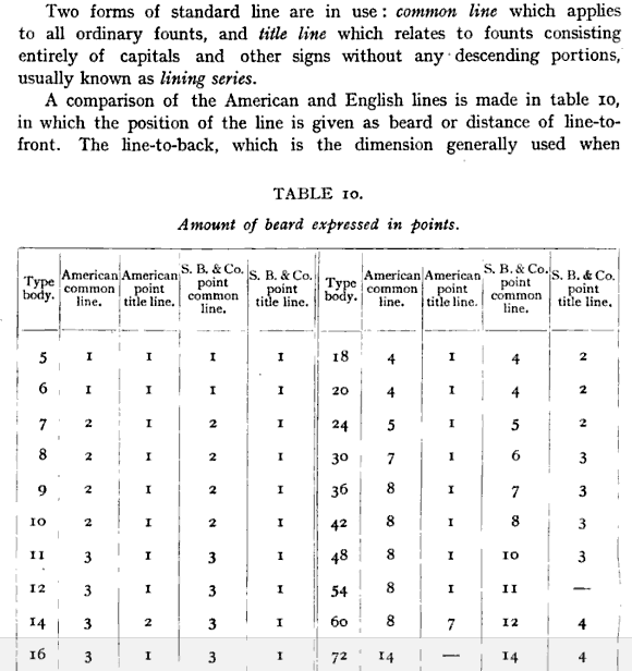
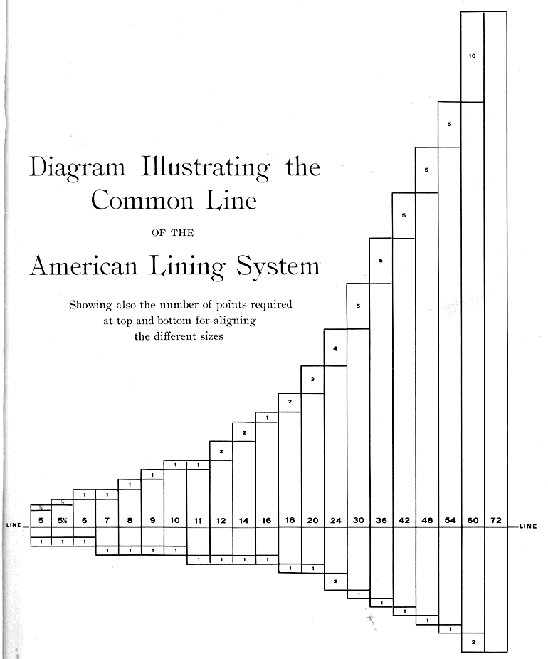
In the age of foundry type, many foundries advertised "lining" versions of their fonts.
What this meant was that there was empty space on the type slug. Normally, the ascender to descender length was just a very tiny amount short of the actual point size of the face. But lining versions of fonts allowed different typefaces to be mixed on the same line, because every typeface had the baseline in the same position on the slug.
That can be done for any typeface without changing the design simply by shrinking the letter to fit on the body both above and below the baseline. In new designs, the requirement to make all fonts line doesn't impose a minimum x-height, but it does limit the length of descenders.
One result of that was the felt need to modify Goudy Old Style from Goudy's original design to shorten the descenders. (As it is not much used as a text face, but only as a display face, these days, if they could find Goudy's original design, they should change it back.)
Another interesting thing is that originally, Times was accompanied by an alternative version for more traditionally-inclined printers, "Times with long descenders". But so that 11-point Times with long descenders would be the same size (x-height and cap height) as regular 11-point Times... the descenders now kerned off the bottom of the type slug, making leading mandatory for the typeface.
So this physical consideration appears to have meant that when a font is desired to have a large x-height in relation to point size, the descenders, rather than ascenders or cap height, are the first to take it on the chin.