
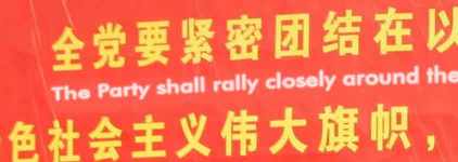
I wanted to invite comments on the setting in this photo:
http://www.flickr.com/photos/tomspender/4144315684
hhp
I wanted to invite comments on the setting in this photo:
http://www.flickr.com/photos/tomspender/4144315684
hhp

"Uncomprimising" comes first to mind.
It must have something to do with the Chinese text, visually reminiscent of fat block capitals, and the slightly enlarged letterspacing in the Latin.
Reminds me of the old days of Soviet propaganda :-)

There are a lot of examples of great graphic design in China today. But this ain't one them; it's really ugly.

The leading is misleading! ;-) It make it seems that the English lines where placed above the Chinese ones.

It appears to reveal that English takes much more space to communicate the same ideas as Chinese, and is thus harder to read if confined to the same amount of paper. Of course, in the example, this is exaggerated, because the English text has been allocated less space vertically.

I'm no expert, but it seems interesting how (1) they didn't try to make the 2 scripts equal in apparent size, but matched the length of the text instead / made the text flow in parallel; and (2) that the 2 scripts aren't in separate blocks but interwoven. The Latin seems kind of like a subtitle to the Chinese. :)
Also, the visual hierarchy is clear: The Chinese is what leads. I wonder if the letterspacing in the Latin, while certainly ugly taken by itself, isn't basically the Latin following/echoing an aspect of the æsthetic of the Chinese text.

The large word-spacing (I don't know the right word for that) seems to treat the words in english text like the 'characters' in chinese text.
But, Nina, I don't think it is to echo an aesthetic aspect, maybe it is because characters in chinese are similar to words.

I think the letter spacing could be due to using a Chinese font for the English. I tried typing out the first line using SimHei, and the result is somewhat similar to the photograph.
The Latin seems kind of like a subtitle to the Chinese
http://en.wikipedia.org/wiki/Ruby_character
What's really ugly to me is the Chinese, which is bashing you over the head with its message, as Theunis wrote.
The English is treated as a subtitle, as the message is mainly for Chinese readers.
The 'ruby' character is interesting, thanks. But this isn't it, as it is a translation, not a transliteration into, eg. pin yin.
I know it isn't properly ruby character. I was just pointing out the similarity, and one of the possible influences that make the treatment of the type presumably different from what a westerner could have made.

1. Political. In China of course the Chinese goes above the English. Separate messages would look nicer, but that ain't gonna happen. The Chinese look is designed first, then English is added in the least obtrusive manner.
2. Size: A given passage in modern Chinese will have about the same character count as the word count of its English translation (and vice versa). If you set them both at the same point size & line height, the Chinese will take approximately 1/3 - 1/4 of the physical space taken by the English text.
3. Colors. All I can say here is that red and yellow are old favorites...
4. At least they got someone to proofread the English and at least it wasn't just the pinyin (there used to be [is still?] a tradition of faux internationalization by adding pinyin to signs and book covers)
5. Fortunately the Chinese haven't yet discovered the drop shadow.
6. If you look closely, you can see that it was actually done in Futura...
So, Hrant, care to share what you found primarily "revealing" about this?
I'm still not sure what kinds of things it reveals - I could just feel it does reveal a lot! :-) And thanks to you guys for playing along.
I'm going to re-read all the comments and try to seem more useful...
hhp

6. If you look closely, you can see that it was actually done in Futura...
Really?

Makes more sense then this would :)
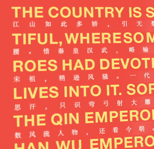

Pardon my ignorance here, but do both languages read left to right? …
-=®=-
@Russell
From what I understand, the traditional form of arranging text is in vertical lines (top to bottom) going from right to left.
When a horizontal setting is called for, it is usually right to left, but on some occasions (particularly when mixed on a page with other languages) it can go from left to right.
_____________________________________________
Personal Art and Design Portal of Ivan Gulkov
www.ivangdesign.com
In modern China, when the writing is horizontal, it's normally left to right. So my Chinese-reading wife, who's been to China recently tells me. That's also the way in e-mail etc.
Да страствует коммунизм! The style, including the palette, is Socialist Realism. It will pass.
Everything will. Including the English language for example.
hhp
Mi petegi vian pardonon?
Intch?
hhp
Yes, when Chinese is written horizontally, it is written from left to right like English. When it is written in the traditional vertical manner, then one goes from one column to the next in a right to left direction.

The style, including the palette, is Socialist Realism. It will pass.
Wait, are you including the colour scheme of gold and white on bright red in that statement? It's very much a Chinese aesthetic as I understand it, quite independent of any Socialist Realism associations.
Before Chinese began to be written horizontally in imitation of Western scripts, if you found a single horizontal line of Chinese of only a few characters in length (to fit on a horizontally-oriented sign, for example), it would likely be read right to left. This is an analogue of setting a few letters vertically in Latin
L
I
K
E
S
O
to fit a vertical space.
But yes, when you start to have actual running text in Chinese set horizontally, it's always written left to right.
Back in the early 1970s, Columbia offered an advanced (4th-year?) course in Chinese devoted to learning to read newspapers (I took classical instead). Headlines were a challenge as they seemed to run any way but bottom-to-top, and the text often used a dense argot. For Chinese, modern or ancient, context is crucial.
The modernist aspect of the "gothic" type is part of political sub-text, reinforced by the (smaller) sanserif translation. But there's whole lot more to China. Mao's calligraphy used to appear frequently, notably in the phrase 为人民服务 ("serve the people") plastered everywhere in the late 70s, when the effects of the Cultural Revolution were still strongly felt. Many of the simplified characters -- three of the five just quoted -- are in fact traditional short-hand forms widely used in hand-writing, a lot of the reason simplified chars. can seem garish in print. Computers now make it vastly easier to type Chinese, but the resolution of small screens -- I think the Chinese passed a billion text messages a day -- means traditional forms blob over.
With two-by-two square blocks of characters, you just have to try out the different possible orders to see which one makes the most sense. It may be any one of
3 1
4 2
1 2
3 4
1 3
2 4
and other orders are not entirely inconceivable.
When Chinese text is printed vertically, English terms are turned sideways. Not ideal, but the only viable possibility. As a side note, the body text is Ming, medium weight, and the quoted text is a kai (and is indented from the top).

Some of the special features for setting Japanese are explained in English in the documentation for Adobe Illustrator. A subset are available in non-CJK versions of InDesign via templates downloadable from TransPacific. As yet, no ruby/furigana -- small type above one or more characters intended to show pronunciation; for that you need CJK versions of InDesign, though regular MSWord, Open Office Writer, and FrameMaker(!) can all handle furigana (when I last checked--years ago--FrameMaker needed a Japanese operating system for this to work). Some of these tricks can be useful for laying out alphabetic text in unusual ways.
David

Yes, the English is a subtitle to the native Chinese, as it should be and undoubtedly done by a Government contractor :-)
ChrisL
Captured from web.archive.org on 14 Oct 2013. view this capture