
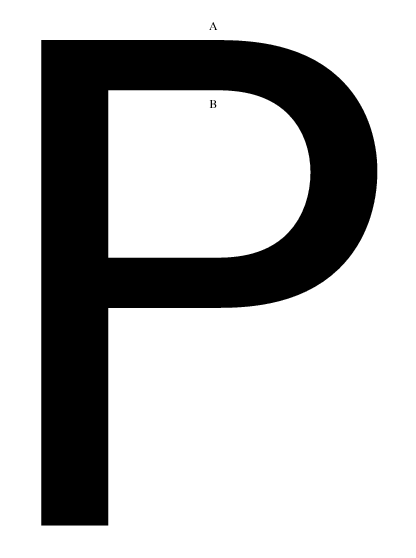
When drawing the outline of a glyph where the stroke changes from straight to curved, how should the points align? As an example, consider the points A and B in the P shown below. Should they be horizontally aligned? If not, should the inner or outer point be closer to the curved part? How much?
Thanks for any insights! It seems this issue arises in several characters, most notably U, but also B,D,P,R, and a bunch of lowercase letters.
I have also posted a pdf for closer examination that shows the points defining the outline of the P.
Best wishes,
Stephen
| Attachment | Size |
|---|---|
| P.pdf | 12.6 KB |
| outer-curve-adjustment.pdf | 11.34 KB |
| curvature-Untitled1-P-1.pdf | 14.5 KB |


