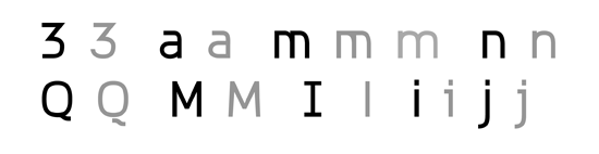
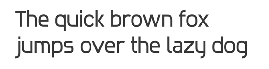
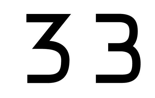
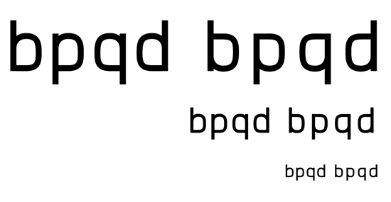
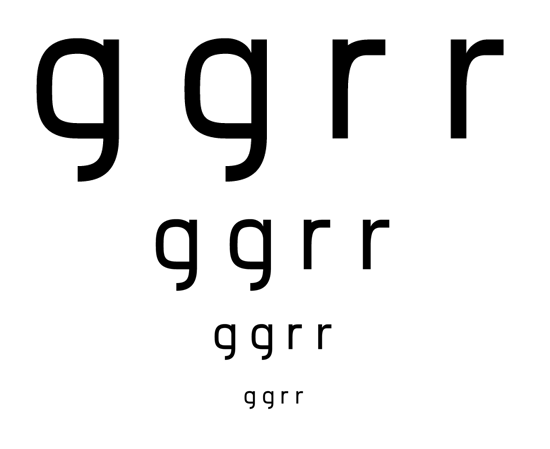
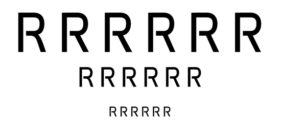
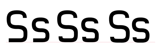
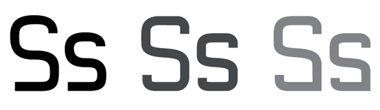
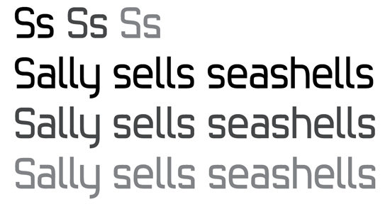
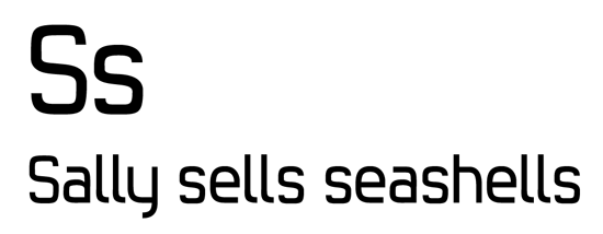
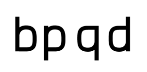
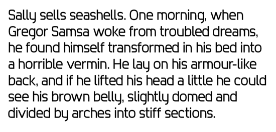
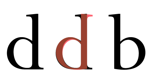
I'm looking for some feedback as I work out the details of this typeface. There two main quirks/characteristic that I think should be defining for this typeface: 1) some bowls and stems connect with one with curved stroke and one straight stroke 2) some strokes don't connect connect to the stem at all.
The issue I'm facing is where to use these quirks and how to reflect the style in the rest of the characters.
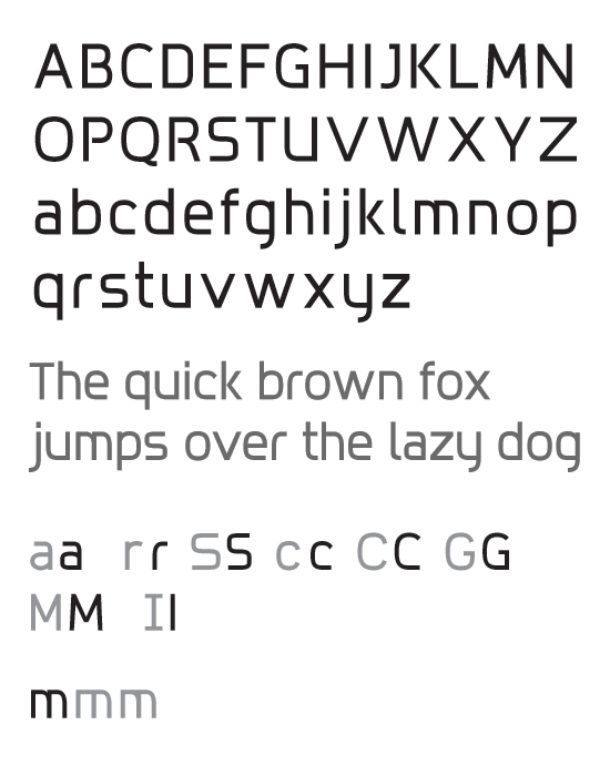
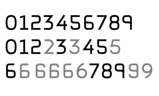
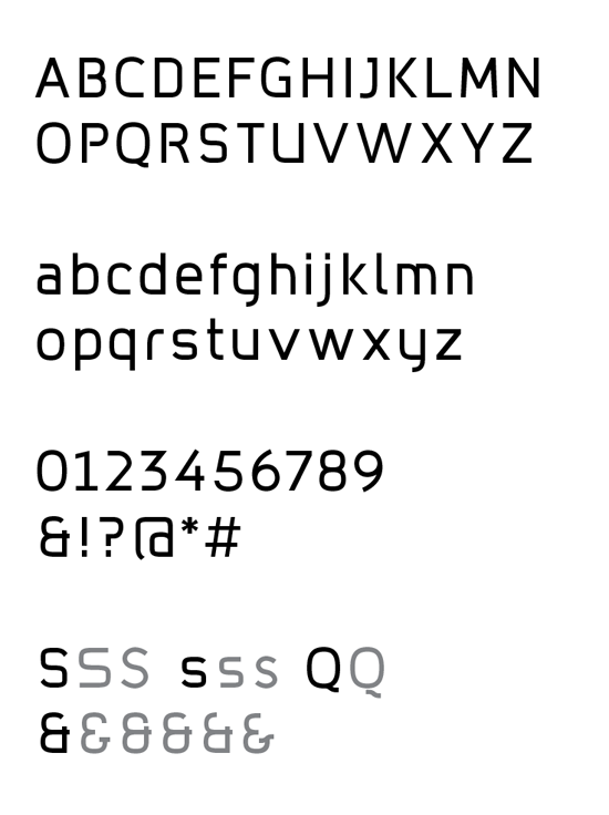
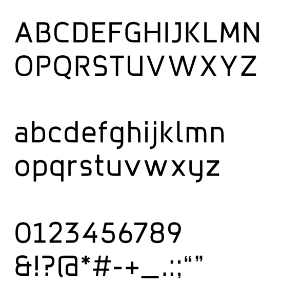
Here's the current character set:
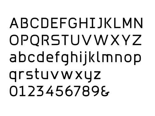
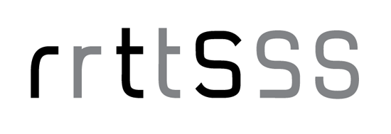
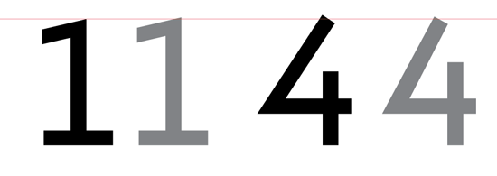
And here are the original characters with some alternate options