Typophile

Chronicle Deck Condensed with Folio Bold Condensed?

ferebee

Hi typophiles,

As a professional Mac tech person and amateur design enthusiast, I've been using Folio SB Light Condensed and Bold Condensed (samples at FontShop) for several years in all my communications. The Bold Condensed is dear to my heart, not the least because I use it in my logotype as you can see on my website, but as I find myself writing increasingly long text documents for my clients, I've grown a bit tired of the Light Condensed.

I want to replace it with something that is at once easier to read while also carrying greater authority.

In the end, I've decided on H&FJ's beautiful Chronicle Deck Condensed. Condensed because I want to economize on space particularly for invoices, which some of my fellow IT suppliers like to balloon over seemingly endless reams of paper.

So where does this leave my beloved Folio SB Bold Condensed?

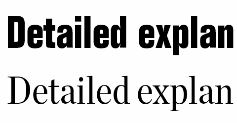
I have persuaded myself that it could combine fruitfully with Chronicle Deck Condensed Roman, as seen below, but I'm afraid that maybe I'm just getting carried away. What do you think?

Thanks for your comments.

Best,
Chris Ferebee

It's not necessarily a "classic" combination, but I'm thinking it could work rather nicely, at least if you use them for "titles" and text respectively (i.e. not mixing on the same line).
The relative sizes need some finetuning though. FWIW what I would do is take that above sample, copy x times, incrementally and very! slightly increase the point size of the Folio in these copies, print and compare.

Yes, that's something I've been struggling with. Interestingly, in the first sample above the Folio is actually set at 10.5pt vs. 10pt for the Chronicle.

Although the Folio has taller ascenders and x-height than the Chronicle by design even when set at an identical numeric point size, it just feels smaller to me. I haven't been able to balance the sizes yet; I feel pulled in different directions at once.

For comparison, here's a sample where both fonts are set at the same numeric point size.

One thing is that Folio has much narrower proportions, *and* it's a lot bolder; both these things make its counters / interior spaces much smaller. And the amount of interior white makes a big difference as to how we perceive "size" of type. You can see this by comparing a very light and a very bold weight of the same typeface at the same point size; the bold will most often appear to be smaller.
(But of course, the solution is not to make the interior white spaces numerically the same.)

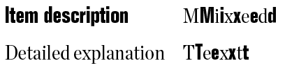
Your "MMiixxeedd" example shows exactly why I said it'll be fine at least as long as you don't mix them on one line. ;-) Do you agree that on the left side, the "Item description" looks smaller than the "Detailed explanation"? And on the right you see that's not "true"; but typography is much less about what actually *is*, than about how the eye perceives it. This is a prime example of that. :-)

So don't be afraid of going even a bit larger than 10.5. Maybe it's going to be 10.75, maybe 11, maybe even a bit more. It needs to look balanced. FWIW, I just combined a Roman serif text font (Whitman) with a bold sans (Fedra), and the "apparent" same sizes worked out as 9.5 : 7.6!

Hi Nina,

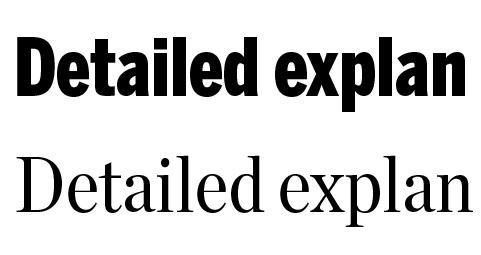
Thank you very much for your thoughtful comments. After putting down the printout many times to let my eye capture another fresh impression, it seems to me that the sweet spot is Folio at 10.95pt or 11pt vs. Chronicle at 10pt. Example below with 11pt, as 10.95pt looks identical at this screen resolution. With the size issue cleared up, I'm liking the combination better and better.

I still need to figure out what to do with the figures on the invoice template. Previously I had the last line of figures (end total) in bold, but now I think it would be visually too confusing to mix figures in Folio SB Bold Condensed with figures in Chronicle Deck Condensed Roman on the one hand, or introduce a bolder weight of Chronicle on the other, while the headings are set in Folio. Perhaps one style of figures (Chronicle Roman) is excitement enough. :-)

Best,
Chris

Chris,

I wonder a bit why no one else has been commenting* (hello people?!), but as far as I can tell from the image you posted, to me this seems to look quite good indeed! I'm beginning to really like this pairing. The best thing would be if you could show a PDF – you'll have to attach it to the first post in the thread. That could also get you some feedback on the question of the number styles…
BTW, this thread might have been a better fit in the Critique/Typography section, but I don't think that's tragic (and if some Moderator thinks it is, they can just move it I guess).

* Which might have been interesting, because font pairings aren't typically something all designers always agree on. ;-)
EDIT: As to why, I just realized it's Saturday – Typophile tends to be slower over the weekend.

Nina,

I guess you're the only professional who isn't kicking back for the weekend while we amateurs muck about in the forum. ;-)

As for the PDF, I like the idea, although I would need to rework my layouts first. Right now all I have are the old designs, based on Folio Light and Bold. However, as I understand the license from H&FJ, they specifically forbid making PDFs publicly available that embed their fonts. Only one-to-one communication of so-called "workflow PDFs" is allowed. (I'm interpreting this to mean I can send a client a PDF invoice created with Chronicle...)

In case Jonathan reads this, I will say that I would have had an easier time deciding to buy the fonts if I had been able to find a greater variety of online samples, particularly PDFs. I'm very happy now, but was a little worried that I might be mistaken in the choice I made based on the intentionally limited Test Drive tool at H&FJ.

Hi,
i don't feel comfortable with this combination, if i think of a normal repeating headlines/running text situation. I'd try something more quiet like Benton Sans compressed or condensed instead of Folio Cn Bold. Or something louder like Compacta.

I had considered Compacta, which I find a bit too jangly, or in fact H&FJ's Tungsten, which is similar but nicer IMO. But in the end I don't really see how they go better with Chronicle than Folio Bold Condensed. Can you expand on your distaste for the Chronicle/Folio combination?

However, thanks for suggesting Benton Sans! I had missed that, and it's a pretty smooth match for Chronicle, to the point where I might be able to consider mixing Chronicle Deck Condensed and Benton Sans Compressed Black on a single line - a definite versatility plus - do you think that would work?

Is the match too smooth? I'll have to think about that some more. And then return to the relative size issue, though the discrepancy seems to be less than with Folio. Here's a sample of Chronicle vs. Benton at identical numeric point sizes.

Something else about Benton is quite stunning. I don't want to redesign my logo and logotype at this point, but hadn't been able to find a typeface that could take over from Folio SB Bold Condensed in that context without losing its step.

Benton Sans Compressed Black carries the load with ease, watch. Logo on the left is based on Folio, logotype on the upper right is the current version using Folio SB Bold Condensed, and below that is a new rendering using Benton Sans Compressed Black.

I'm amazed how well it works. Previous attempts with candidates like Gotham, Tungsten, or for that matter Compacta were not nearly as successful.

I also a fan of Benton Sans. Chronicle is also wonderful, but why are you using the 'deck' size? If you are using it at small size in your invoices, I would think that the text size, with lower contrast, would work better.

Hi William,

I want to keep the page counts of my invoices far below industry norms as a subtle display of respect to my clients. Concise wording and omitting oodles of useless technical specifications go a long way, but using a condensed font lets me finish the job with style. :-)

Chronicle Text is not available in condensed, but my tests of Chronicle Deck Condensed at 10pt on a hi-res laser printer look just fine. Chronicle Display would be a different matter, I'm sure.

Considering the four "grades" of Chronicle Text, my understanding is that it's targeted squarely at newspapers.

At first sight Benton Sans/Chronicle are looking ok/"harmonic, classic", but I think you should buy one or two weights of Benton Sans to be able to layout with both. "Detailed explan" is not enough to make a decision …

The squarish, "1960s" Folio Cn Bold might be well if i imagine it set in a much larger size, newspaper style like, but here in comparable optical sizes it looks a bit off to me, a bit undecided.

BTW H&FJ mention in their "goes well with" examples that Whitney is a candidate for a combination with Chronicle (then, perhaps Whitney Cn/Chronicle Cn?).

I must really be pairing weirdly. That, or this is a classic case of "ask three designers, get four opinions"… ;-)

Re the Folio pairing, yes, the structures aren't too parallel. Yes, Benton is a more "harmonious" partner, but isn't it also more boring? (The safest choices aren't generally the best ones.) And less technical/clean. I would much prefer the old logo, too. Way too many awkward angles and curves in the new one (look at the white [i.e. orange] space).

If it looks good, it is good, as they say. A laser printer may thicken the thins, so that the result is fine.

Still, if you haven't tried the text font at still smaller size than the condensed, probably H & F-J could send you a sample.

I don't think the grades mean that it is *only* for newspapers.

Thanks Nina for showing me how to bring a measure of harmony to discord, and thanks Thomas for a brilliant suggestion that is maybe just too harmonious.

BTW, the Benton Sans goes very smoothly indeed with the Chronicle. The other online demos aren't as chintzy as H&FJ's, so I was able to try it out pretty thoroughly. Time to buy a face? Maybe so. I really only need the Compressed Black, it's just $40.

Have I decided what to do? No. I suspect I'll have to try both, and then ask my wife. :-)

Captured from web.archive.org on 9 Jul 2011. view this capture