
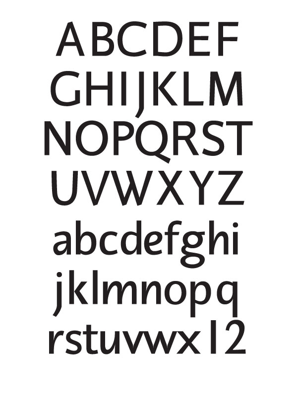
After endless agonizing and being still far from satisfied I have decided to post my first attempt at type design here.
OPEN FIRE
| Attachment | Size |
|---|---|
| ERATO.pdf | 9.5 KB |
After endless agonizing and being still far from satisfied I have decided to post my first attempt at type design here.
OPEN FIRE
| Attachment | Size |
|---|---|
| ERATO.pdf | 9.5 KB |

I like it. I especially like the use of contrast in the lowercase letters. One thing that strikes me as a little off is the capital R; the bowl stroke begins to thin as it comes down and around but is then eclipsed by the heavier leg stroke; I'd like to see those two strokes harmonized a bit more. But on the whole it's quite attractive. Nice work.
Thanks for your comments Aric
I know what you mean by the cap R it's not quite right
I was trying to base it on my R when I do it calligraphically
I'll post a scan when I get home am at work at the moment

Some small accidental slip seems to have happened to the upper left inside curve of capital O.
While otherwise well-formed, capital S is a little bit heavy.
Good work!
IMVHO, the spacing is not right at all. l are too tight, the spacing of e & i is unbalanced, they are too much to the right.
In terms of design: the g does not really fit; why did you do all these ink-gaps? what size do you want this printed? are you sure the ink gaps are consistent? there seems to be a u/n issue with the u too wide, no? the sa couple does not work, no?
Of course, I am self-teaching myself type design so I may be wrong, I am simply trying to contibute to the debate & hopefully be told I am wrong & why so that I can improve.
Thank you to Cerulean and dojr2 its great to have feedback.
The idea for erato was to see how I could make a roman
typeface with a cursive structure.
In the lowercase n, h, m, etc the junction is as low as possible
less so in the characters with bowls.
After I did this it seemed to need an ink trap so the join
wouldn't look so dark.
The spacing has been done very roughly and there are no
kerning pairs.
And dojr2 you are spot on the g doesn't flow enough but i don't want a one story
g so I will try and get this form to work.
Thanks again for the comments
In the lowercase n, h, m, etc the junction is as low as possible
less so in the characters with bowls.
i would try to harmonize these groups of letters somehow. less cursiveness (or sharp curves) for the former or more for the latter.
i like the overall concept.
Gary Lonergan
I am now wondering – as this seems to be attracting so little attention–
if it's worthwhile continuing. I though at least Hrant would have had an opinion
by now.
Sure it's worth continuing. I don't think the volume of noise generated in the Typophile critique forum is the best gauge of the worth of a font project :) If you're looking for more feedback, your best bet may be to ask some specific questions.
I wonder about the middle arm of your capital E and F (especially F). Have you tried making this arm shorter?
Captured from web.archive.org on 20 Apr 2015. view this capture