Hi All
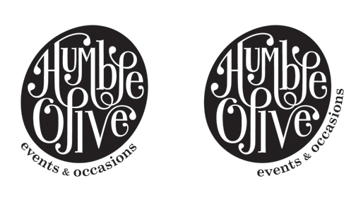
Some of you have seen this logo before; I posted the first incarnation a few months ago and got wonderful critique. I have tweaked (hopefully not too much) and am now happy to present a nearly finished version. Nearly finished because the addition of the tagline and its positioning as well as typeface choice is stumping me a bit so I would appreciate some input from the typophiles.
I like the tagline following the curve but I am wondering if this is a dated or tacky approach. I tried a version with the tag just centered underneath on two lines and I felt it just stuck out too much. On the fly I used Century Schoolbook because its weight is very similar to the lettering and it has a vintage feel to me that I hope my logo conveys. Is this a good choice? Any other suggestions? Also I realize the weight of the & is a little off, because I decided to make it smaller to match the height of the lower case. I would have to work this out later.
The background on the logo is that it is for a just-starting-out event planner who helped me on my wedding day in September and in return, I have designed this logo for her. She has seen the first version but not this one yet.
Thanks in advance!