Typophile

Infra Labyrinth - Organised Type Confusion

Jeffrey

Hi all,

I've been working on this display typeface for a while now. I've designed it for my 'Invisible Cities' project, where I intend to use it for titling, texture, ornament etc. It's designed to work as confusing as a labyrinth (and almost invisible), but still be descipherable. What do you think?
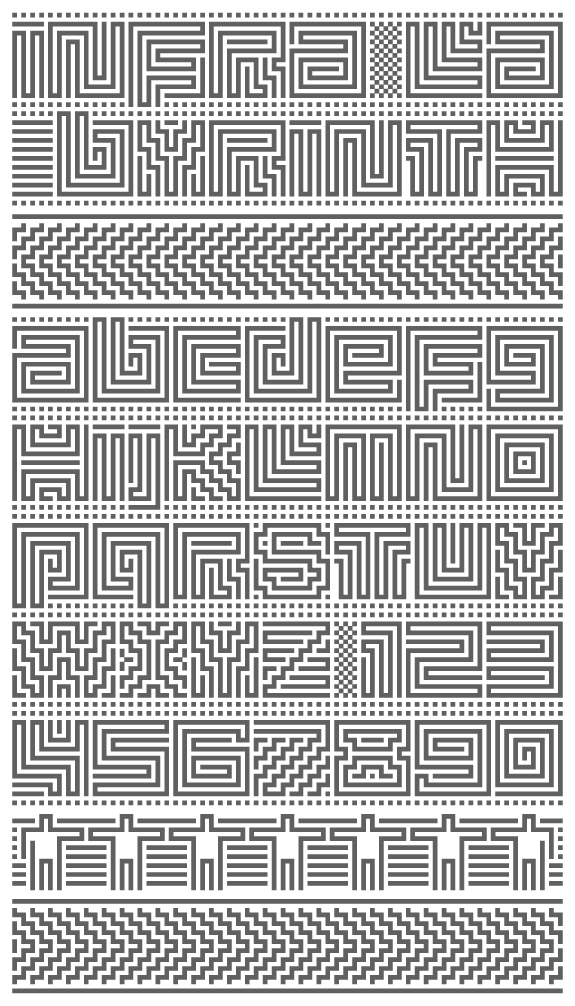
ciao, Jeffrey
infraordinaire

While the Z works fine, K, V, W, X and 7 are tough. Like the rings when you throw a stone into water.

Wow, this totally bugged out. Awesome!

Readability?... I'm not sure. Obviously, don't use it if legibility is imperative. For artsy projects, ya... maybe rework the illegibles, if you do want it readable.

For "V", I would suggest an Avant Garde-ish tilt, with the left stem being vertical. You might try vertical stems with "W" as well.

"I" should have a contained, non-open shape in center.

Overall, I would say the maze theme is great, but if legibility is a priority, on a few letters you should compromise and have some enclosed shapes.

Thanks for the comments guys!

Yeah, I guess some characters are problematic... :) I look into your suggestions. The V idea seems interesting. I guess legibility is too much to ask, but descipherability should be possible. It's probably more hypnotising than readable though ;)

greetings Jeffrey
infraordinaire

Captured from web.archive.org on 26 Apr 2015. view this capture