
Greater Albion’s latest release on Myfonts.com, Vectis, is proving encouragingly popuylar (in a sales sense) so far. We’ve just posted some new examples of the family in action here on our blog.
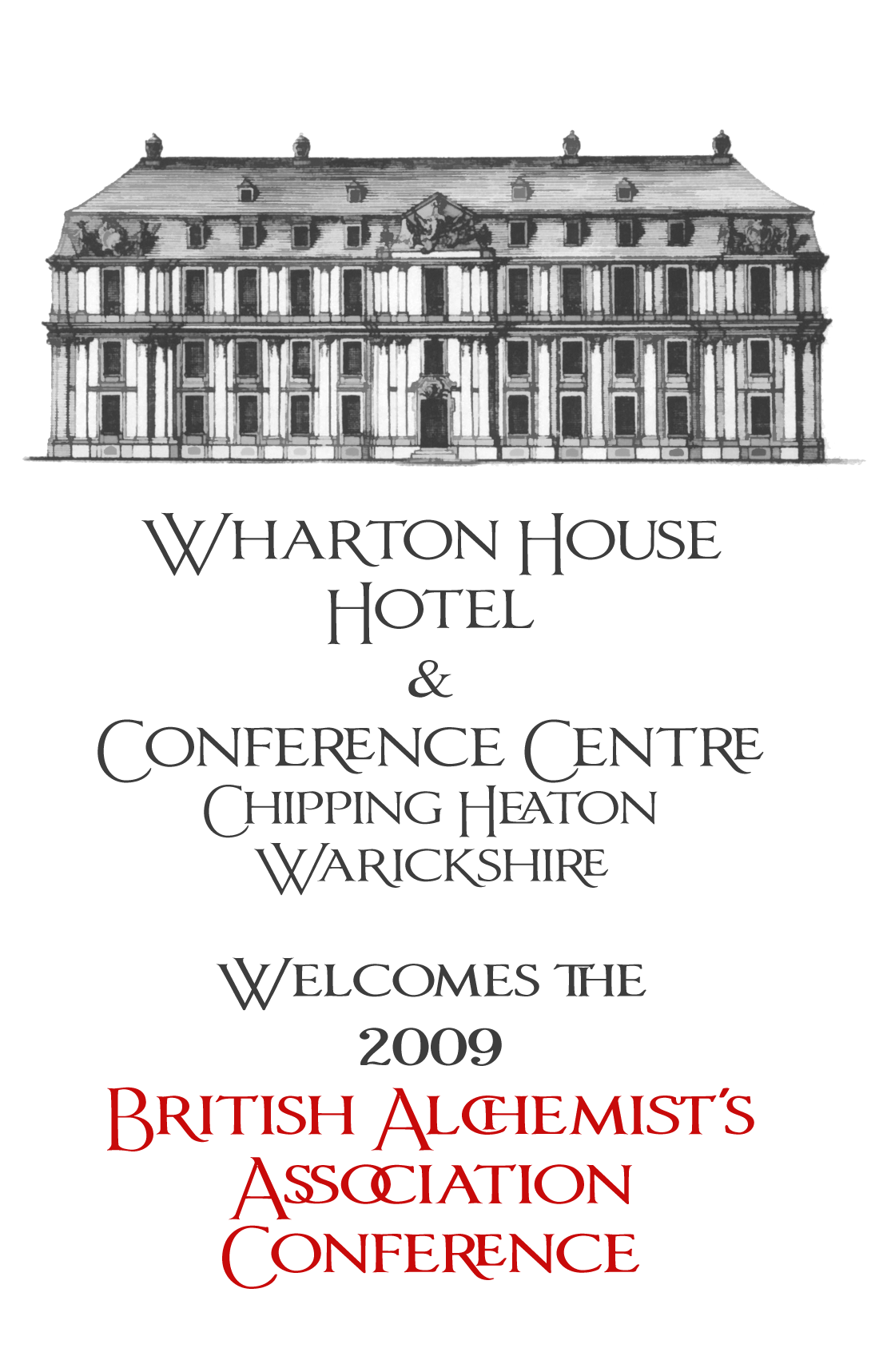
Greater Albion’s latest release on Myfonts.com, Vectis, is proving encouragingly popuylar (in a sales sense) so far. We’ve just posted some new examples of the family in action here on our blog.

The numbers don’t look like they belong with the rest.
Nick Cooke

reminds me of a much cleaned-up version of the semi recent hp ad campaign hand lettering, you know, to be vague about it :)
Jeff, actually it’s a MUCH cleaned up, expaned and re-thought version of a very old freeware release of mine-(“Imperator Roman”). Do you have a link to the HP ad campaign you mention-I’m curious and I don’t think it appeard here in Australia....
Nick, To some extent I know what you mean-I did toy with some more classically styled numerals but they seemed to lack prescence. Also had an experiement with a version of this that used Roman numeral based ligatures instead of digits.

I think it is the serifs that make the figures look different.
BTW: I’d spell that “Alchemists’ ” and “Warwickshire”. And I love village names like “Chipping Heaton” :-)
Andreas

I think it is the serifs that make the figures look different.
They also appear darker than the letters.
Ahhhh Andreas-the perils of working on these promotional pieces late at night when sleep is ellusive. It does wonders for the creative process, but it’s not so good for the typing, spelling punctuation etc. I’ll update this image very soon.....
Captured from web.archive.org on 3 Jan 2010. view this capture