
As you may have noticed from the critique section, we are digitizing Alf Becker's 268th demonstration lettering Modern Spencerian Script, from Signs of the Times magazine from May of 1954.
As a demonstration of the script for artists, it was great. For digitizing, it has been - difficult. The lower case f is a prime example. The forward down stroke is almost completely inconsistent with the rest of the lettering. This was okay for brush work because everything was adjusted on the fly by the artist. But, for creating a consistantly usable letter it is difficult...
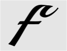
This is what we came up with as our baseline f and fits all characters, esp bhijklt.

This one is an alternate for acdegmnopqrsuvwxyz has a shorten crossbar.
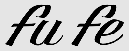
Another alternate overlapping ligatures of bhijk
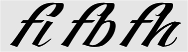
Finally, actual ligatures...
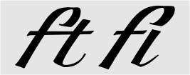
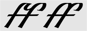
We are also considering another, scripty lower case for purists. I think that might cover all of the bases. Did I miss anything? This is just for the lower case f. How many ligatures are normal, or rational, for a script.
~~~~~~~~~~~~~
