Typophile

International equivalents to bold, italic, small caps etc.,

Si_Daniels

Most languages seem to be okay with the use of weight (eg. bold) to call out specific words or passages within body text. Italic seems to be more problematic for languages like Japanese and for say Arabic. Anyone aware of any other language-specific conventions? For example is color commonly used in some languages, or switching style (switching to sans-equivalent within serif-style body text), perhaps underlining, size changes, reversing-out, yellow highlighter etc., etc.,? Any specific examples would be appreciated.

Thanks! Si

Maybe related: As Fraktur typefaces rarely have a bold companion (and hardly ever an italic), the preferred practice of emphasis was tracking. Also common: style-switching (e.g. Fraktur with Bastarda).
In Textura typefaces, tracking was rather unusual. A bigger point size was used for emphasized passages.
All-caps was a no-no, for obvious reasons. But capitalizing the first two letters was an accepted method – not only in ‘GOtt’.

C.f. Friedrich Forssman: Satzregeln für gebrochene Schrift [Blackletter typesetting rules], in Forssman/de Jong: Detailtypografie (also to be found in J. Schalansky: Fraktur Mon Amour)

Older Greek texts frequently used tracking as emphasis as well. This practice is not so prevalent now.

http://www.flickr.com/photos/dezcom/3428338386/in/set-72157616479131055/

ChrisL

Korean and Japanese (and presumably Chinese) use dots above the character instead of italics. When the text is set vertically, the dots go on the right.

Armenian: largely because we have a floating emphasis mark that can be placed on any vowel we don't need Italic nearly as much; it's much more acceptable to have an Armenian font without an Italic. Another Armenian "issue" with Italic is that the script normally likes to be slanted...

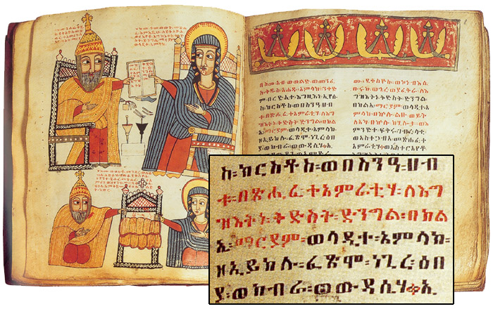
Color: I remember John Hudson saying that Ethiopian uses red like Latin uses Italics.

hhp

Thanks everyone for the input so far.

Cheers, Si

As Chris Harvey said, in Korean you can use dots above the letters. However, this is rather old-fashioned, and you hardly ever see it nowadays.

There is a rather specialized way of emphasis where a different style is used for foreign terms. This is similar to how foreign terms are italicized in English, except that in Korean, foreign proper names are also given this treatment.

The style of the basic Korean text face, the equivalent of a serif roman, is a brushy serif known as 'myeongjo' or 'batang'. In my earliest elementary school textbooks, I remember that foreign terms were set apart by the use of the 'sunmyeongjo' style, which uses the Chinese 'Song' style serifs. In many contemporary Bibles, foreign terms are set in sans serif, like this:

In older bibles, where the text is set vertically, you may see single or double lines to the right of the terms, in the vertical analogue of the underline.

However, the practice of setting foreign terms apart stylistically is very rare and I don't recall seeing it outside of those two examples. Korean uses so many foreign terms nowadays that it would be really impractical to mark every single instance.

I haven't made a statistical analysis, but I'd say using bold (most often mechanical bolding) is the most common way of emphasizing nowadays. Other schemes are seen, such as switching to sans serif, changing colour, underlining, even mechanical slanting (shudder). I suspect this mostly has to do with the options provided by the word processing software, and no universally accepted standard has emerged. In practice, in many if not most serious books, you would hardly see any instance of visual emphasis of specific words or passages at all.

… it’s much more acceptable to have an Armenian font without an Italic. Another Armenian “issue” with Italic is that the script normally likes to be slanted...

Given you’d be to incorporate Armenian into a font family which follows the (Roman) Reg./Italic scheme, how would do it?
a) make an upright “regular” Armenian and a second, slanted cut for the “Italics"?
b) make only one (slanted) Armenian into both fonts?
c) … ?

Good question! This might not be the best place for an elaboration but I'll answer it here because it might be useful for other scripts. (Plus I don't know where else I'd do it...)

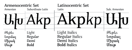
I try to balance authenticity and functionality, and the furthest I've taken this is in the "multilateral" Nour&Patria* system:

* http://themicrofoundry.com/ad/CR.pdf

Modernists hate the complexity, but I maintain that the "dialog" between scripts is necessarily complex (and you guys know what I think of Modernists :-). So basically the Armenian is slanted (because that's a good thing), the Latin's Italic is slanted the same degree, and each script has a subordinate for the other script. The Latin's subordinate Armenian is upright; it has too many serifs and the x-height is too big*. The Armenian's subordinate Latin is slanted, but it's not Italic; I actually love it, and I have a feeling it can be used to set quite long text (not too small though) but I also have to admit that it's idiosyncratic. The subordinates are "flawed", but it's actually in a way that helps them serve their master design well. This system of both parallels and hierarchies handles a very wide range of typesetting challenges. Fonts that have one cut for Latin and one cut for Armenian are almost always culturally inauthentic for one of the scripts, plus they're one-dimensional in terms of solving typographic problems.

* Sadly the crushing majority of Armenian fonts are like this.

Now, it would be nice to have an "Italic" for the Armenian. But people shouldn't see that as remotely equivalent to the need for an Italic in Latin.

The main thing I think is not to overly damage authenticity by forcing a script to adopt the typographic conventions of another script.

hhp

What is the standard way of slecting or emphasizing Amenian text? Letterspace?
_____________________________________________
Personal Art and Design Portal of Ivan Gulkov
www.ivangdesign.com

(Sorry Simon - I think I won't take this any further now...)
To emphasize words you use the floating emphasis mark. For citations you use quotes (guillemets). The tricky thing is emphasizing more than one word at a time. Historically people have used a different font for this purpose (certainly not very nice) but one reason is that besides missing italics Armenian fonts rarely had more than one weight. And that brings me to how I think text should generally be emphasized, even in Latin: a demi weight! Not dark enough to wrest attention from the reader, but dark enough to be noticed one saccade away. Typo magazine does this (still, I hope) to great effect. So I make my fonts with finely gradated weights (and my Bolds tend to be pretty light).

hhp

շատշնորհակալեմ
_____________________________________________
Personal Art and Design Portal of Ivan Gulkov
www.ivangdesign.com

>Sorry Simon - I think I won’t take this any further now.

If I were to complain about someone taking a thread off on a tangent then that would be the ultimate double standard. :-)

Բարի՛ եկար։

hhp

It’s rather easy to subordinate one script to another. But what if you don’t want to? What would be your choice if you were to incorporate Armenian into a Regular/Italic typeface containing several other scripts already? (Of course, the same question arises for more scripts: Hebrew, Arabic, Ethiopic … actually for the majority of all scripts as a matter of fact).

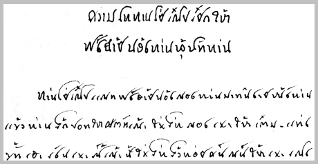
The Tai Viet script of SE Asia (used for the Tai Dam language and others) has an interesting typographic tradition. Instead of bold or italic, emphasized words are written larger, with an increase in 'x-height' and more compressed. This is reasonably common practice when writing the script. it occurs even within a paragraph, but here's a good sample of a heading.

When creating a 'bold' variant of our font, we considered creating a different 'emphasis' style altogether instead. The problem is that once the B and I buttons appeared on our word processors, the world got this idea that every font had to have a heavier-weight bold, a slanted italic, and (shudder) a sometimes terrible bold italic. We had limited time to choose what the 'bold' would look like, so we took the faster, easier, and more accepted modern choice - we added weight to the regular.

So while there are some interesting and useful written traditions for emphasis using style variations, I'm afraid they are dying out rapidly.

v

If you don't want to subordinate one script to another, clearly you don't have to. If Chinese or Arabic are quoted in an English text, one doesn't seek to find a Chinese or Arabic font that somehow matches with a Roman font.

This is usually true even in the case of, say, Gujarati, or Ethiopic, where one could, if so inclined, try with reasonable effort to make a matching font.

So one could take an Armenian font designed without reference to Latin, a Roman font designed without reference to Armenian, line up their baselines and the tops of their ascenders - and not worry even about the descenders being different, let alone trying to match "x-heights" (in the case of Armenian, the term is really a misnomer, and not just because it should be "t-height" - the visual function of that space is fundamentally different in that script).

Andreas, if by "incorporate" you imply making the scripts equal in presence (with the higher goals of authenticity and functionality) I personally believe the most one should do for Armenian and Latin is what I've done with the master designs of Nour and Patria. For other scripts you can safely get closer, but for others (think of Arabic and Latin for example) there are even greater limits.

What I'm saying is I don't believe in using formal geometric congruence as a basis for multi-script families; things like uniform x-heights can be great for display work, but not for immersive text. Scripts simply have different needs, and enforcing vertical proportions etc. in effect causes each script in a font family to have different uses! Very dysfunctional for a typographer. Look at Sylfaen for example: the Latin is a decent text font, but the Georgian is like an equivalent to Quadraat Headliner!
http://www.fontfont.com/shop/view_product.ep?id=12464

The problem with what I'm saying is that the necessary design effort goes up exponentially with the number of scripts in a system... But good design is very rarely quick & easy.

*
**
**** (ON-TOPIC ALERT! :-)
**
*
Victor, interesting. And you've reminded me about Georgian: although I don't actually know if this is any kind of convention, Georgian has one case, but two styles - one with extenders and one lining; and the latter is sometimes used for emphasis in a body of the former (which is naturally more texty).

> line up their baselines and the tops of their ascenders

That doesn't always work...

John, as you can probably tell I agree with your general view, however it is possible to be more discriminating: there are ways that two scripts can fruitfully match up, like color, and hopefully apparent size. I've tried to do that in Nour&Patria.

> “t-height”

I call it "ւ-Հասակ" (pronounced "hyun-Hasag") = "yiwn-Height". :-)

hhp

Chris_Harvey wrote: Korean and Japanese (and presumably Chinese) use dots above the character instead of italics.

The use of this technique in Chinese is practically non-existent, apart from the stray case where the book in question was translated from the Japanese. In Chinese, terms that require special emphasis are normally marked off with quotation marks 「」 like this: 「這一樣」。You will frequently encounter books printed in Chinese without a single variant in either weight or style.

quadibloc wrote: If you don’t want to subordinate one script to another, clearly you don’t have to. If Chinese or Arabic are quoted in an English text, one doesn’t seek to find a Chinese or Arabic font that somehow matches with a Roman font.

This statement is patently false if we are speaking not of necessity but of expediency. The fundamental problem of combining type (Which Roman with which Italic? Which Serif with which Sans-Serif? Which display face with which book type?) does not change when we are also combining languages on the same page and especially on the same line (as in the case of a "quote").

In the case of Chinese and Japanese, for example, quite evidently a Roman Sans-serif/Grotesk typeface can be justly combined with a Gothic[黑體] face, and a Serifed face should best be combined with a either a Ming [明體] or standard script [楷書] typeface.

The solution however it not always so easy, and requires that one know how to set type in both languages independently before attempting to combine them together!

It is true that there are still some general things one can do in choosing fonts in very different languages. As noted, there are Chinese fonts that are built from plain geometric lines, in addition to the conventional ones that are based on the traditional means of writing Chinese characters with the brush.

While I have seen a specimen of a Chinese font designed to have serifs like a Roman font, though, in general one would not manipulate a Chinese font to more closely match a Roman font. Chinese fonts, unlike Armenian ones, do not have an x-height to tamper with.

I wasn't trying to say that taste should not govern one's choice between valid typefaces for each of the languages used, so that the two might harmonize in style. Rather, I was noting that the more a script differs from the Latin script, the less there is a temptation to modify that script in ways inappropriate to that script in order to make it look more like another script, as in the example of Armenian above.

Well, for one thing it's better not to think of it as "modification". Ideally you design with the right mindframe from the start. This is possible even if you make a new non-Latin font based on an existing Latin one.

hhp

Georgian:
I remembered having an email exchange with Kamal Mansour about that script a long time ago, so I went back through my old Netscape email; it was in February of 2000, and back then apparently my grasp of the setting of Georgian was more firm, and I stated pretty clearly that they do/did as a convention of sorts use the lining style (basically looks like all-caps) in a body of extendered text, for emphasis.

hhp

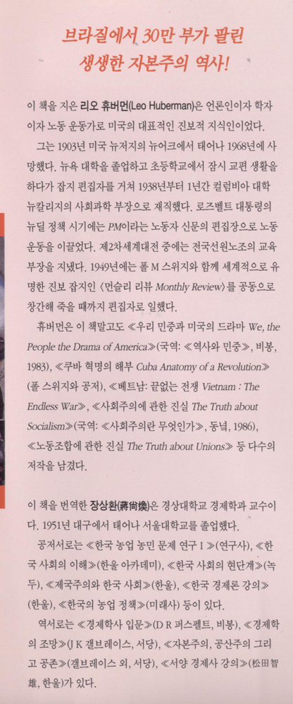
Jongseong is absolutely right, I don’t see any use of the emphasis dots in the Korean-language books I have here. However, the emphasis dots do show up occasionally in advertisement (billboards, in magazines or newspapers), and I do see the dots in pop-up text that is so ubiquitous on Korean TV. Here’s something from a local newspaper

Here’s a link to the inside of a Korean book with a number of emphasis types.
http://www.languagegeek.com/misc/emphasis/wealthOfNationsBookSl.jpg

  • Slanted (first two lines in orange)
  • Sans-serif (Leo Huberman’s name)
  • Angled brackets (throughout, both single and double)

Chris

The HTML blink tag solves all the problems of calling out a particular area of text, and works for every language on the planet.

It also solves the problem of being expected to actually read. :-/

hhp

Ideally, yes, one designs with the right frame of mind. This requires, as a most basic precondition, familiarity with the typographic conventions and fashions of both languages involved.

My emphasis was on not trying to do too much if one is not starting from this position. If one is mixing two languages, and one is not familiar with what is acceptable or readable in one of those languages, then it is reasonable to say that one shouldn't do violence to the font used for that language in pursuit of a visual harmony between the two languages.

Readability of both of the texts should take precedence over artistic goals.

Of course, the balance involved is very different depending on the application. One can distort fonts that are appearing in 48 point in an advertisement to be striking and noticeable - and so that two different languages will match - and thus creating, say, an Arabic version of Kabel or Stop or Neon is entirely reasonable there - whereas if one is typesetting an academic paper with foreign-language quotations, then of course one just takes the routine standard fonts for each language involved, with no attempt to engage in any funny business.

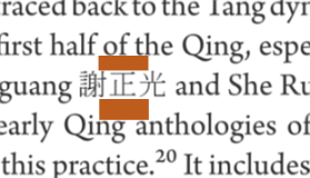
I have a suspicion that the Gothic [黑體] varieties of Chinese characters were developed specifically to be like the roman sans serif. The the normal printed characters, which are a dialectic combination of carving and brushing, appear to correspond to the roman serif typefaces, and so the development of a sans serif counterpart seems to have emerged in the early republican period in China (ie after 1911). I don't recall having seen any woodblock printed texts with gothic/hei characters. Missionary presses in Shanghai would be a good place to look, although I don't know what the situation was in Japan. Of course nowadays, books basically use a light or medium weight of Ming or less commonly fangsong for body text. Heads are done in either a heavier ming or heiti. Kai is never used for body text, but for emphasis or quotations.

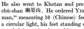
If the publication is in a roman font, then probably a ming would be safest for cjk glyphs, choosing a weight that matches the color of the English font. The Harvard Journal of Asiatic Studies did pretty well even back in 1945 (although the glyphs should be lowered to approach but not reach the depth of the descenders):

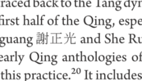
Now (2009) it uses arno pro and adobe mingstdlt:

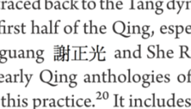
Here the characters look a little light, could be lowered, and need more space between the glyphs and roman letters. My thinking on baseline alignment and overall page color can be explained with this next image. The red rectangles need to be about the same height:

What I have in mind is something like this:

The characters may seem a little low at first, but the consistency in page balance will win you over shortly...

Disclaimer: this may be a tangent.

All official documents of the United Nations are routinely published in six languages: Arabic, Chinese, English, French, Russian and Spanish (German is the seventh, unofficial, language). Their formatting is cross-language-consistent, although different typographic features are used to interpret the structure and the hierarchy of the texts in different language versions of the same documents. Roman, italic and bold styles are used in English, French, Russian and Spanish. Upright, [back]slanted and boldface are used in Arabic. In Chinese language versions Song, Kai and Hei styles play the role of the Western roman, italic and bold, respectively. Note: bold italic, underline, double underline, outline, shadow, small caps, redline, and strikeout styles are [normally] not used in the formatting of the UN documents.

> Note: bold italic, underline, double underline, outline, shadow, small caps, redline, and strikeout styles are [normally] not used in the formatting of the UN documents.

You think we could have a security council resolution banning all of those (except bold italic) from all documents?

:)

  • a security council resolution banning all of those (except bold italic) from all documents

Predictably, ‘design by committee’ is daily practice at the United Nations. I remember having been much upset when I learned that one of the committees of the General Assembly passed a decision to have the resolutive parts of all documents (‘recommendations’) typeset in boldface. And those items are not just lines: often they are paragrahs and paragraphs of continuing, structured text.

Government bureaucracies at their finest, Maxim. I can feel your pain :-)

ChrisL

The slanted Arabic is interesting (checked out some PDFs from the UN site) – is that an "authentic" Arabic device, or basically an adaptation of the concept of italicization?

Hebrew does that too, and most people don't seem to mind.
But it's much more jarring in Arabic (which makes sense).

hhp

So is there an authentic device for adding emphasis in Arabic?

I would say the situation with Arabic is even more drastic than Armenian or Georgian, since Arabic doesn't even have anything like caps; and you can't really make it [notably] more cursive! :-/ You could use another style (like Kufi within a body of Naskh) but that's very hard to make look nice, plus it totally throws of any "atmosphere" the typesetter is [hopefully] shooting for (and the typical Latin italics actually has this problem too).

Really, a [gently] darker weight works
for almost any script, including Latin.

hhp

I thought I would do a web search for images of pages from Arabic newspapers.

Weight certainly can be increased for Arabic; as might be expected, it is done by thickening horizontal strokes mainly, instead of thickening vertical strokes mainly as in Latin fonts.

But while one sees bold headlines in various degrees of emphasis, while a heading might be in one style of printing, and a subheading in another, all the words in any one heading, and all the words in a piece of body copy, are almost always the same.

Also, I came across this:

http://29letters.wordpress.com/2007/05/14/typographic-matchmaking-project/

a page about a book about designing Arabic fonts on the basis of Dutch fonts - which ties in nicely to the topic of this thread.

Chris Harvey: Here’s a link to the inside of a Korean book with a number of emphasis types.
http://www.languagegeek.com/misc/emphasis/wealthOfNationsBookSl.jpg

•Slanted (first two lines in orange)
•Sans-serif (Leo Huberman’s name)
•Angled brackets (throughout, both single and double)

Interesting that you bring up the angled brackets. The single and double angled brackets are something of a remnant from vertical typography that is finding new life in a more specialized use.

The angled brackets 『…』 and 「…」 are identical to the forms that were used for vertical typography, except rotated 90 degrees counterclockwise. (Korean was traditionally written vertically, but in the last century has switched to writing horizontally, with the last holdouts—newspapers—making the transition in the last couple of decades.) In addition, there are also the forms 《…》 and 〈…〉 that are becoming quite common in horizontal typography (the Korean Wikipedia uses these).

These used to be just quotation marks, interchangeable in horizontal typography with “…” and ‘…’. But since the different forms are available, it is only natural that they have adopted different functions. Increasingly, “…” and ‘…’ are used to mark speech and quotation, while 『…』 and 「…」 or 《…》 and 〈…〉 are used to mark titles of works, in the same way italicization and quotation marks are used in English (e.g., Macbeth, “Hey Jude”). In the past, the same set of quotation marks were used for both quotations and titles of works, but the availability of different forms of quotation marks has made the new distinction possible.

In the link Chris Harvey provided above, the angled brackets are all used for titles of works. These days, it is very rare to see angled brackets used for anything other than titles of works, which wasn't necessarily the case even a couple of decades ago. You would probably never see angled brackets to mark quotations in a Korean text produced today in South Korea.

While looking for something else I ran into this:

It's a scan I once made from "L'aventure des écritures — Matières et formes" (Bibliothèque nationale de France, 1998). The detail (mine) shows the Ethiopian use of red mentioned above.

hhp

Nice example. That's curious – I'd wonder if that's still a convention today,* and if/how it survived technologies where using more than one color is difficult or financially prohibitive.
* And if not, what do they use instead?

In Japanese novels and magazines, those dots are indeed the most common way of adding emphasis. In manga and comic strips, katakana (the syllabary with the more angular-shaped characters) is more likely to be used as emphasis. In fact, the use of katakana parallels italics in English in many ways — emphasis, foreign words, scientific plant and animal names, etc.

On websites, brochures, signs, and other informal materials, Japanese quotation marks are often added for emphasis. The translation agencies I work for often want to carry these over into translated materials, and I have to explain that English quotation marks are purely quotational rather than emphatic and give the text an ironic effect if used unnecessarily.

On the topic of making one language look like another...

I remember reading that our present lower-case alphabet is the result of a mistake made by (those working on behalf of) Charlemagne. They assumed that the uncial writing in current use was a faithful representation of a Roman hand.

We now have authentic specimens of Roman uncial, in which a few additional letters (like N) looked like their upper-case counterparts. Given all the bold and strange things type designers do nowadays, a typeface in which "Charlemagne's mistake" is undone would not seem particularly bizarre.

But to go even farther... as we know, lower-case, with descenders and ascenders, is more legible than all upper-case.

In web searches, I did find the novel script devised for Hebrew by Hugh J. Schoenfield, author of "The Passover Plot", which provided an upper-case and a lower-case.

Other than that, though, I couldn't find a less radical approach to that which I thought would have occurred to someone. The original Phoenician alphabet - or the early forms of Hebrew writing that closely resembled it - was written with parts of the letters functioning as ascenders and descenders, so it could serve as a lower-case script in partnership with the existing square script as the upper case. (Presumably in a sans-serif version that tries to look like Helvetica or Univers.)

Has this already been done?

We're veering away from style differentiation, but hey.

Uncial: one thing I'd love to see is a font where the caps are uncial, as opposed to the conventional Ancient Roman.

Hugh Schoenfield: the caps business is useful, but overall his results were pure freak-show. Not to mention that they suffered from a serious cultural inferiority complex (aided by a nice strong shove from an apparently deeply chauvinistic Morison, in the introduction to the book).

Caps in a Semitic language: I've seen one very nice proposal for Arabic, where each letter has sort of a "roof" added to it (but a nicely executed, flowing structure).

hhp

I've encountered a font with uncials for its caps, at least in some cases. Otherwise, it looks a bit like Verona or Freehand. It is the font that had been originally used for the names of the cards in the collectible card game Magic: the Gathering. (Today, they've modernized the card format, and the font they use for this looks a bit like Clearface.)

One page exhibiting a sample of an imitation of that font is here:

http://www.ecofonts.com/download-free-font/magicthe-gathering.aspx

The font Luminari

http://new.myfonts.com/fonts/canadatype/luminari/

also belongs in this category.

Captured from web.archive.org on 11 Feb 2013. view this capture