
I found myself today doing something both nerdy and fun: I made an ffi ligature with my handwriting.
Have any of you taken from typography when you write? What types of things do you try to mimic, and has anything crashed and burned terribly?
I found myself today doing something both nerdy and fun: I made an ffi ligature with my handwriting.
Have any of you taken from typography when you write? What types of things do you try to mimic, and has anything crashed and burned terribly?

In design school I spent about six months integrating my hand with the handwriting of sixteenth century writing master Jodocus Hondius. Of course that only made it less legible, but whatever.

James Deux
You seem to have forgotten that most of what you play with typographically originated with the hand written form. Ah history, it is a wonderful thing to rediscover.
Michael

To me the coolest hand-lettering is what's called "faux type". Like this:
http://www.flickr.com/photos/48413419@N00/394523761/
hhp
Here's some more faux type:
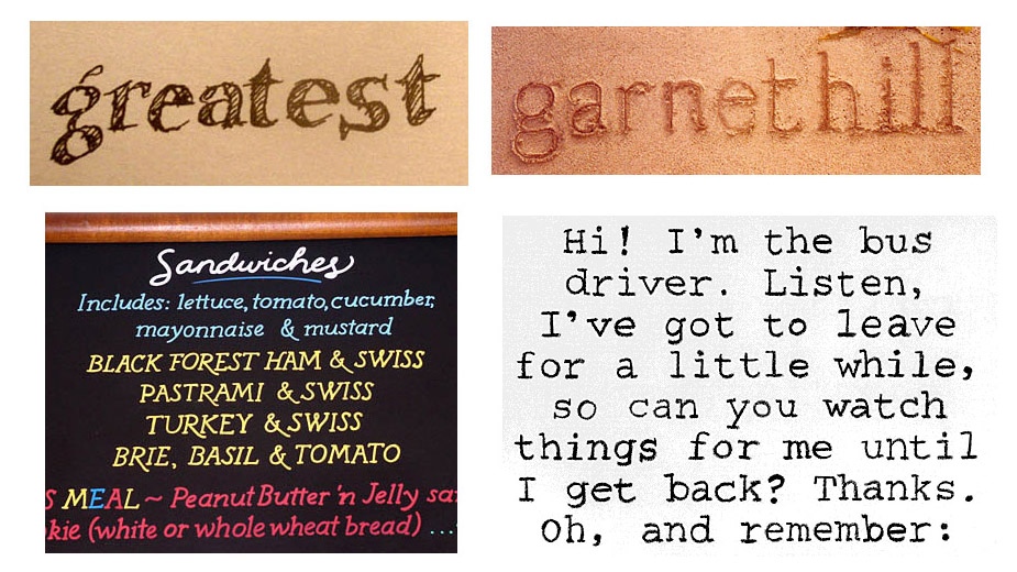
hhp

(How many of you look at Hrant's first post, and want to fix the kerning.)
:)

Don,
That was a slight of hand :-)
ChrisL
A really nice example:
http://www.flickr.com/photos/marinachaccur/4115154854/in/pool-727900@N20
hhp
@ Don
First I would want to touch it up.
It is all "lettering" Hrant, your examples are just not done with "conventional" tools. And there is nothing wrong with that.
Michael
Of course it's lettering. But the special thing about "faux type" is its intent: looking like type, not simply being some personal, spontaneous expression. And because of that it's not "painterly", it's... "builderly"? It's more thoughtful than emotional. To me that's appealing, refreshing and useful.
hhp

James, I incorporated ligatures into my writing after taking a course in calligraphy (learning how to do the cursive style of the chancery script), rather than through observing type--bitten by the pen!
So the alternative to slow and clumsy is being a nerd?!
I was bitten by Efficiency* in the womb. I ligate my handwriting -heavily- because it's faster. Plus nobody but me ever needs to read it. Just like most everybody else's handwriting in fact. (Geddit chiroheads?)

* Or was it Impatience? They look about the same in that murk.
hhp
More thoughtful than the machinations of pen/brush manipulation that is only mastered after decades of practice? Are you saying you prefer naive and dumbed down forms? Sounds to me like you prefer less than is achievable... i.e. excellence.
Michael
Nah, I just find most calligraphy deathly boring and pointless. To me
calligraphy is only useful today when it is Art - when it does not try
to be legible. Like in the work of Pierre Soulages:
http://www.passion-estampes.com/deco/affiches/soulages/soulages1971.JPG
hhp
There is a huge amount of abstract work going on that is inviting; but readability is critical in communication (commercially, and all that encompasses)... just as your passion/need for the redesign of the alphabet/type.
Michael
And if you want to communicate ideally, use a font.
(And the more text you're trying to communicate the
less chirographic the font should be.)
hhp
"And the more text you’re trying to communicate the
less chirographic the font should be."
Agreed, readability is paramount!
Then there is the headline, the title, the logo, the title, the poster etc... where more personality is required whether it is calligraphic, lettered or Faux/scribbled.
Michael
Let the communication you are trying to achieve determine the best tool to do the job rather than choosing your favorite tool and letting it do all jobs.
ChrisL
I am there Chris... it just seems that others want to incarcerate all calligraphy tools.
I have no problem using type. serif, sans, calligraphy, lettering, graffiti, scribble or snot... what ever is called for! Some are more myopic :-)
Michael
Funny, I just used snot the other day for a job--I think it was a nose job :-)
ChrisL
Chris
I hope you did not do it on the computer... it could introduce a Rhino virus!
Michael
Good thing! I sure wouldn't want one of those boogers.
ChrisL
Hey, at least you could say you were going green :-)
Oh that was bad. Sorry Chris.
Michael
Don't worry, Michael, I won't start a phlegm war :-)
ChrisL
The spelling of the word phlegm should have caused a war all by itself. Can you imagine the Sinus Wars... The Left vs. the Right until somebody else stuck their nose in it.
Michael
Wasn't that the Sinus-Soviet War, the one predicted by Nostrildomus?
ChrisL
Captured from web.archive.org on 20 Aug 2013. view this capture
