
Can anyone idenitfy this typeface is on the facade of the Kammerspiele Des Deutschen Theaters in Berlin? Even something similar would help. Thanks-
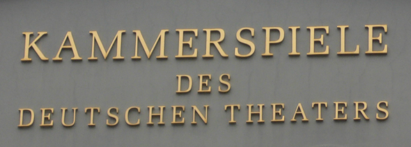
Can anyone idenitfy this typeface is on the facade of the Kammerspiele Des Deutschen Theaters in Berlin? Even something similar would help. Thanks-

I’d try melior …

Seems very close to Jim Parkinson's Azuza from 2001. However, as I look more, the counters on your lettering seem a bit more squared, like something of Zapf's.
- Mike Yanega
The K in Melior isn't the same, but I agree that the rest looks good.
- Mike Yanega
Yes, you are right, Mike. Another similar typeface would be Liberation Serif, which has a better K …
Interesting. It's part of a free font set by Red Hat. A new Serif Font Guide addition.
- Mike Yanega
Oh, as far as I know it is related to Ascender Serif.
Yes, as far as the Roman samples on Identifont, they look identical. In any case, I now have Liberation Serif in the Guide, since it was a free font and I could download the family of 4 fonts. Full sample from the Serif Guide shown below. Thanks Renko.
- Mike Yanega

Captured from web.archive.org on 3 Mar 2013. view this capture