Hi there,
Ive decided to delete the previous thread because it was just too cluttered and the images were H U G E !
So starting afresh:
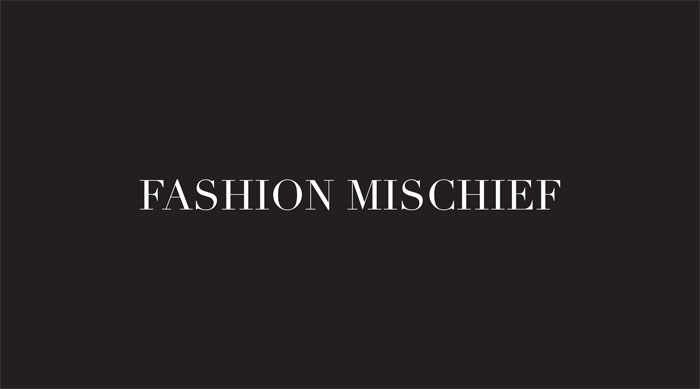
ive spoken to the client who insists on having an ‘edgy’ invite. Title was also chosen by her so i cant do much about it.
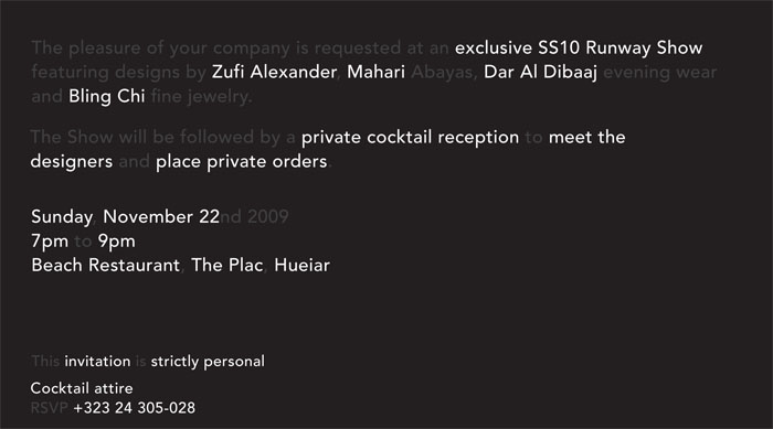
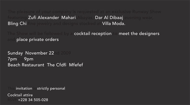
She also specified she wanted a black invite so i thought this was a great opportunity to play around with spot UV varnish.
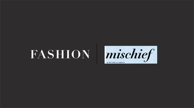
I was thinking of using Didot Elder for the title as it has devilish arrows on some of the letters which could look quite cool ( yet to purchase it), also a nice italic would be an option ( didnt nail it with my choice so far). Any suggestions would be much appreciated. something elegant and almost hand written might look cool.
I was also thnking of incorporating a graphic on the front ( that will be spot uved) which references the venue in which the show will take place.
What do u all think of the composition or the 2 options? The text in dark grey is meant to represent the type when spot UVed.
with regards to spot uv are there any rules i should be aware of in terms of the weight of the typeface ( eg. will didot work? thin strokes)
| Attachment | Size |
|---|---|
| fashion-mischief-back2-typoSHOP.jpg | 67.98 KB |
| fashion-mischief-grafic-typo.jpg | 48.04 KB |
| fashion-mischief-backtypo.jpg | 78.71 KB |