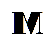
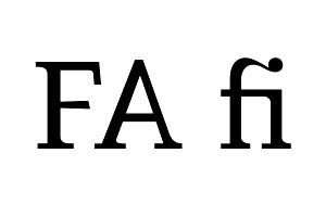
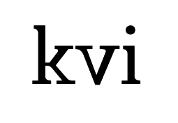
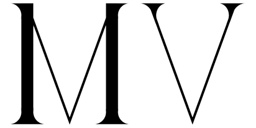
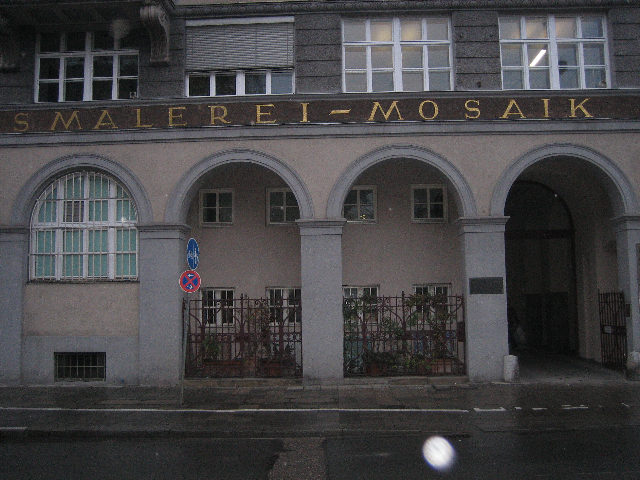
I'm wondering is there a serif (old style, transitional, modern) typeface ever conceived where the first stroke of the letter "M" would be thick? And of course, where the design would look good and legible, not just weird. Traditionally the M is, as far as i know, always constructed with thin stroke first, followed by thick one, then thin again, etc.