Hello!
I'm having a hard time deciding over the display typeface for a magazine... (a student magazine, mostly related to (classical) music).
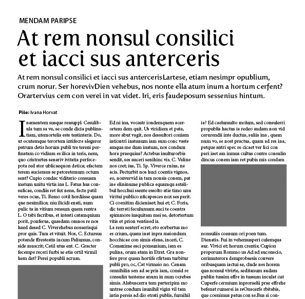
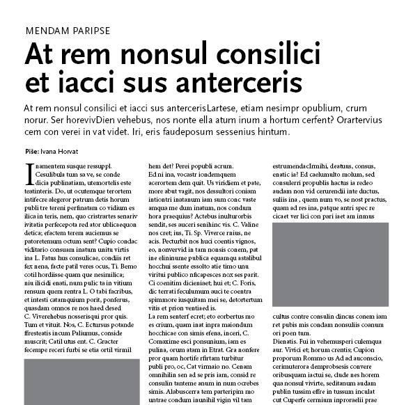
Two images for two solutions... The first one uses Myriad Pro (+ Minion Pro for the body), and the second one uses Fertigo.
Which combination do you prefer?
Thanks!