
Hello everyone,
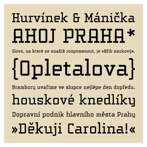
I am working on a typeface inspired by the historic (?) street name plates I`ve seen when I was in Prague for a few days this summer. I loved the tectonic charm of the letters which often seemed to be handmade and based on a very simple grid.
So when I was at home again, I wanted to create such a typeface for myself. (I just had too :)
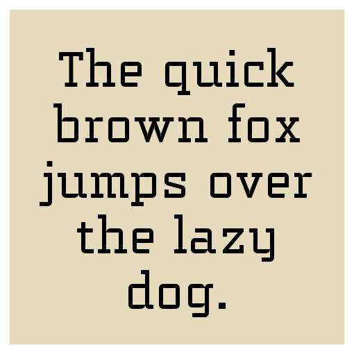
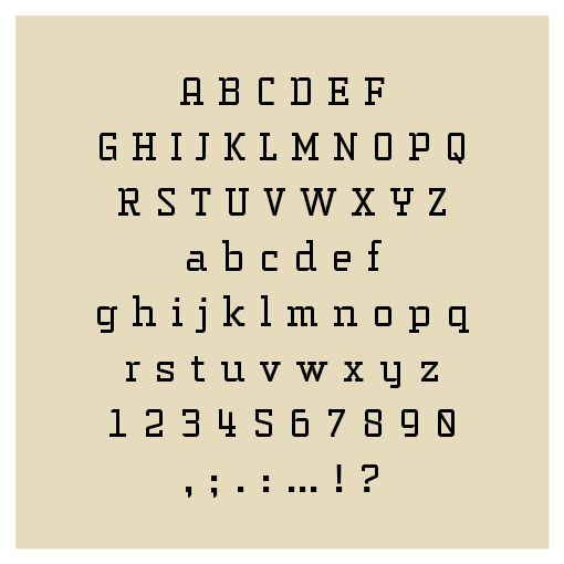
And this is where I got now. I`ve drawn all the letters out of a very simple grid -- as you can see for sure -- and I decided not to adjust too much (I feel, doing that would work against the spirit of this kind of typeface -- maybe I am wrong, what do you think?)
I`d love to have some opinions on this. Here I show you some .jpgs and a .pdf file to criticise the curves.
I`m looking forward for any comment.

| Attachment | Size |
|---|---|
| opletalova.pdf | 455.7 KB |
