I had a lot of doubt if I dared asking for critique in here, so please be gentle ;)
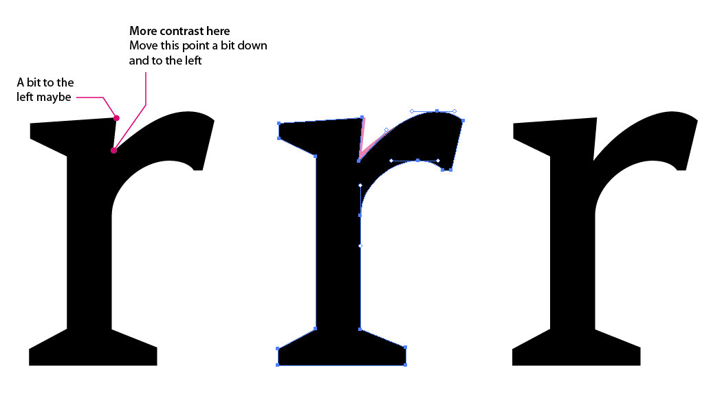
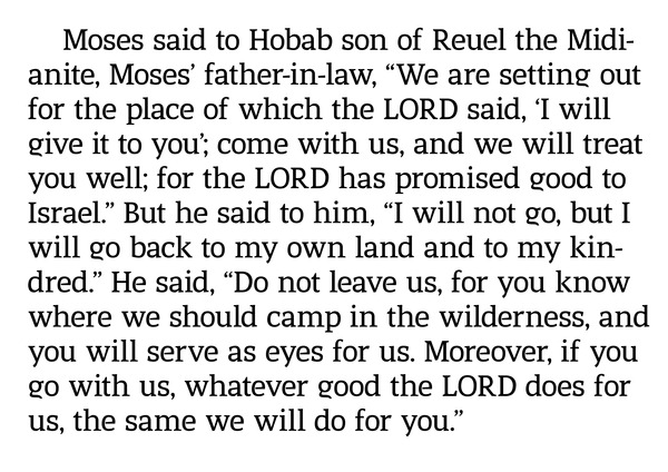
I use fonts a lot, never designed one though, so wanted to give it a shot to learn a little more about the details, what makes it more legible etc.
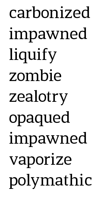
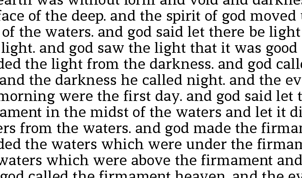
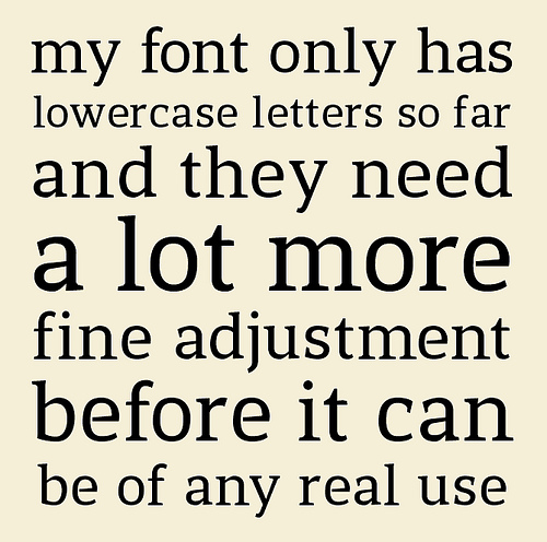
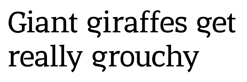
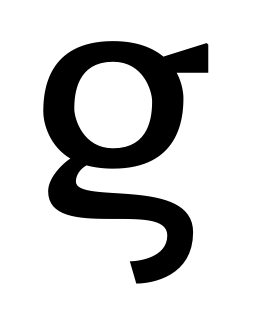
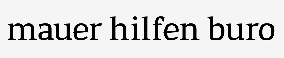
This is a shot at creating a legible small size font - very early in the process. I think especially the "e" needs a redo.
Care to give any comments to help me get further? Or should I just delete and start over?
| Attachment | Size |
|---|---|
| serif.png | 21.88 KB |