
Hey y'all -
Do you prefer a single-story, handwritten kind of "a"?
Or a double-decker, typographic style "a"?
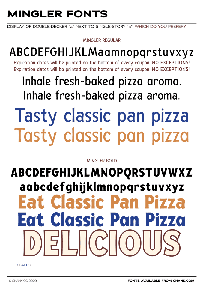
I'm working on an update to my old Mingler font.
It's been used in pizza commercials and ads for a
few years now, but now I get to give it a facelift
and re-issue it at my site soon.
I wanna change the "a" and I could kinda go either.
But I'm wondering, which do you like better?
-chank


