Typophile

Unified Creative

This thread ran to 2 pages of replies and only one was recovered, so replies are missing.

Unified

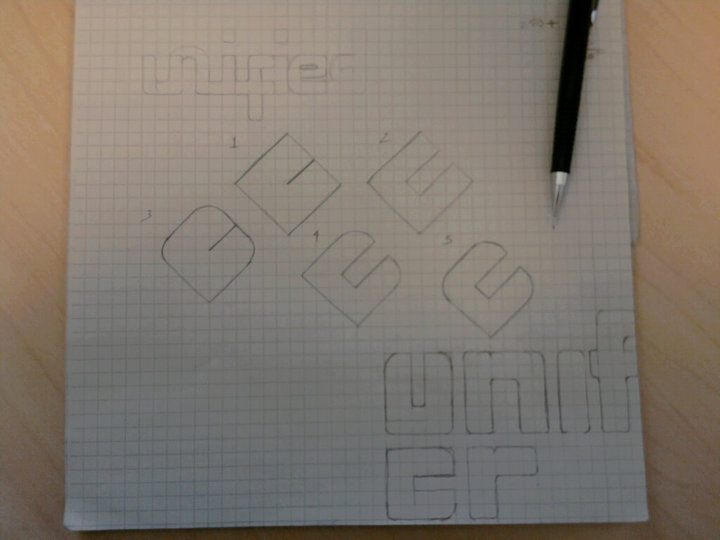
Hello everyone, I've working on personal project. I'm attempting to create a logo for concept I have in mind. The idea is quite simple. You have talent in graphic design, copy writing, photography, art direction...etc. UC exist to help create a working live network for all creatives new and experienced. You create your network based on your desired goals. You create your own team of qualified professionals. The concept is in it's infant stage. Below is what I have in mind. The general idea is to create a sense of togetherness, workmanship, bonding, team. With that in mind, gloves off, bring it, but be constructive. Much appreciated.
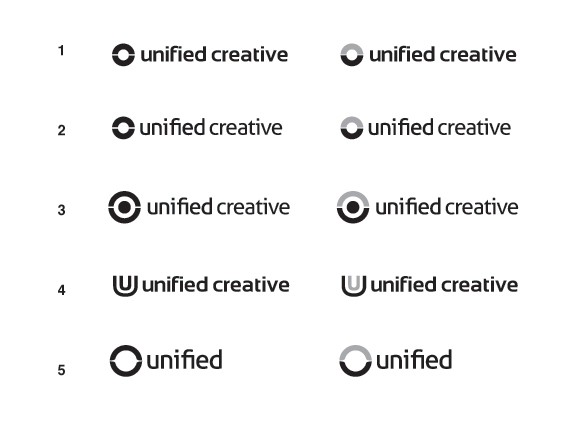
Purely from visual perspective my choice would be 1R with a bit smaller and lighter type.

With regards to the mark - I can see U in the ring-based marks, but I was also expecting to see C there as C's circular shape is begging to be utilized in the mark. Having said that, I really like the 1R/2R mark. It is very simple, nicely balanced and it would work great in a variety of color pairs.

Given your audience and the aspiration behind this, I think that a conceptually stimulating solution is mandatory. You're not necessarily far off.. I just expect to get an 'a-ha' moment given the description.

I agree with epsilicon that it'd be nice to see both C & U in the mark, and so I urge you to keep thinking about the mark and try to embed it with meaning; the typography selection can flow from there..

Outside of all this, I prefer the weight / font seen in 2R & 5R for the record.

Good luck!

Logowise i agree with CGI that more of an 'a-ha' would be good.
Of the ones there 1 speaks to me the most.
Also deffinately not 4, it is too sexual (if you didn't see it at first you will now!).
Typewise i like 2r - the un pairing seems to reinforce the concept.

The logomark needs to be strong; it's still too nondescript for a good conceptualized company/agency.

No 4 sexual? I can only see double boiling..

nagfa

thanks everyone. more updated versions coming soon.

Hello again. been busy, but i'd like to get some feedback on the mark. what do you read? And does it work? Is this closer to the "ah-ha" moment? =)

I see a cropped swastika.

damn. i feared something like that. do you think it's more apparent in the top one?

I read LIC.

:D

okay, back to the drawing board. thanks. i'll be back. =|

Is this to generic? and do you get it?

It feels a bit generic to me, slightly predictable or unimaginative. I don't know if something as simple as maybe a word mark with the I in unified being a number 1 to give the "unified" and collective feel would be more appropriate?

nice. i like that idea. i felt it was a bit to generic. thanks.

I'd make the U in U symbol more geometric and rotate it 45 degrees clockwise which would give it some life and it would work for both U as well as C.

No problem, let me know if the idea works or not :)

here are some earlier sketches I did. some are tilted in the 45 degree angel. what do you think about the bottom sketch?

bottom sketch?

Looks like they all heading in a different directions...not very unified IMO.

so the fact the graphics are coming together or grouping is not an idea of unified? hmmm. okay. i'll keep that in mind. thanks jakes.

@ litera: what do you think about something like this?

another sketch. thoughts?

perhaps an 'fi' ligature?

okay. i like that too. i'll try that out. thanks penn. designing your own logo is torture. =)

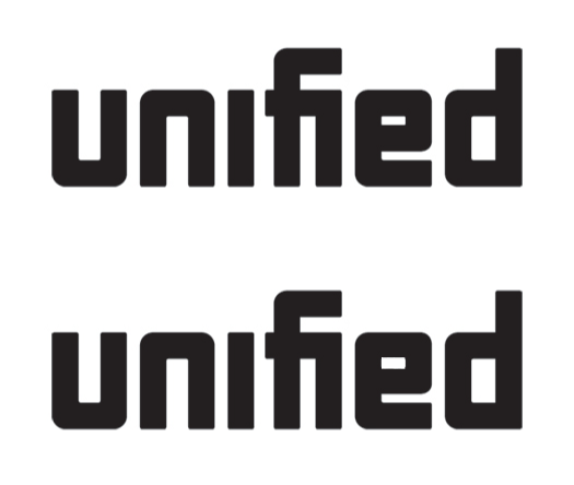
an attempt a 'fi' ligature. what do you think? Does it read well?

Hm... what's the smallest this will appear? I'm thinking the fi ligature may get lost at small sizes, and together appear as a single capital A. I do think having the entire crossbar of the f is better for clarity.

Perhaps if you returned to the design before the ligature, and simply terminate the top of the f before it curves downward? If you really want a ligature there, you could also lift the ascenders one "block" up and link the crossbar of the f to the top of the i. But I think an f that doesn't curve down is much nicer.

Yes, be careful about coming down too far with the arm of the 'f'. Using the grid is fine for sketching ideas, but don't be afraid to break it if you need to. You might not necessarily need to go up one whole block with the arm of the 'f'.

I like the thought of the ligature representing the 'unified' aspect.

i'll update later today. i like this approach so far. thanks.

I think I like the top one. Does it read right?

Now it looks like an »h« to me.

what about a squarish "U" containing a squarish "C"?

The top line is definitely better — keeping the height of the 'i' the same as the other. I think the context of the ligature will quash all misinterpretations of it as an 'h'. Alone it might get confused, but where it is, I think it will be fine though you might extend the height of the stem of the 'f' above the crossbar.

You might also play around with other connections between the 'fi' ligature, more along the lines of your first go (just not descending so far with the top arm of the 'f').

--
penn

Yeah, I don't see an h without looking for it. Such an h would be really out-of place given the style established with the other letters. I also agree that the top one is better.

Although, I notice that the curves in the u and n are much softer than those in the f, e and d. The join at between the f crossbar and the i makes sense as a sharper angle, but rounding out the arm of the f, the e, and the d might be worth a try.

agree. i too like the top one. i'll make some adjustments. thanks. stay tuned. =)

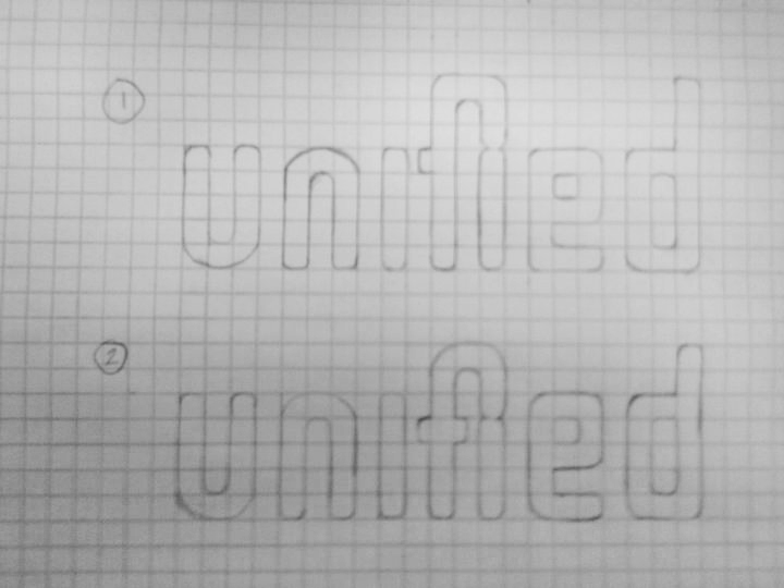
Hey everyone. I've narrowed it down to these two. Thoughts?

The top definitely wins for me. Much more unique and unified than the bottom. It's a great solution.

You might open the counter of the 'e' more by thinning the horizontals a touch.

--
penn

Seconded.

Thirded.

awesome. thanks everyone. i like it. now on to refinements. Penn, i'm trying more and more to understand the lingo, but what do you mean by opening the counter of the e and thinning the horizontals?

Here's a gif that'll illustrate better than I could explain.

haha, love the animation :)

I like the first one as well. I might try and make it a bit softer right now I think the type has a bit of a hard quality. If it was softer it might create a nicer flow between the letters. Or adding some little detail to the letters might work as well.

Other then that it's very nice.

nice. thanks penn. i figured it was something like. i too love the animation. =)

What about trying to visually "unify" the type? And to get an icon out of the "un" pair of letters? I attach some quickly done drafts, just to explain the idea.

i tried a similar execution like that in my earlier sketches (not posted here). i was having issues incorporating the "ied" combination, but like the "UNI" section of it. one way i got around it was flipping the 'e' so the 'i' and 'd' could connect more fluidly. i'll keep it in mind. thanks luca, much appreciated.
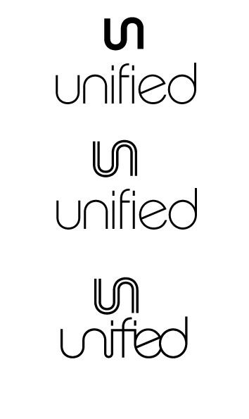
@kattttor - do you mean make the corners more round?

yep that's what I meant. Feels a bit like bricks to me right now. On the 'U' for example the bottom corners look fine but the top ones feels a bit too hard. I get a Soviet Union in the second world war feeling from the whole thing.

gotcha. love refinements. =)

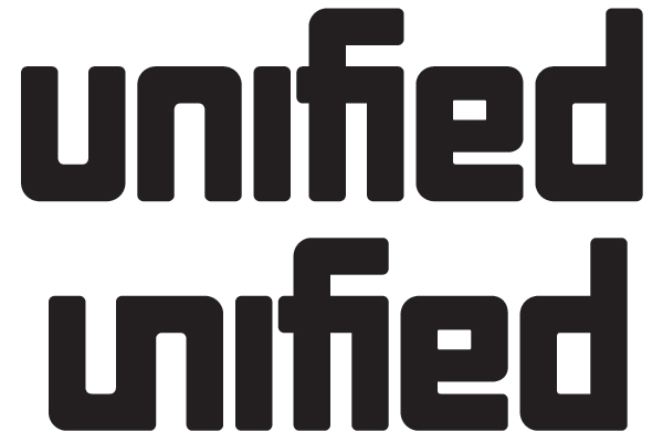
thoughts?

1st. I like it a lot. Got lots of character and yet not overdone.

2nd can be parsed as Sified, and the concept is a bit too trivial and boring ("it's unified so let's unify letters" - duh :))

U feels too heavy around the bends. Not sure what can be done about except for reducing the horizontal stroke:

Also, I'm trying to understand if there's a system to using curved vs. straight inner corners. There's one radius used in U and N; E and D use smaller one and there are some straight ones sprinkled all over. I am guessing the straight corner is where two strokes meet (as opposed to a rounded corner where the stroke merely bends to change its path). But in this case E appears to consist of 4 strokes - L shaped one, two horizontals and one vertical... not sure if I am explaining it clearly, but I can elaborate. With pictures :)

So, maybe to expected of a solution for #2? Unifying another set of letters is to much?

- Straight vs Curved inner corners is applied to U-N-E-D. 'D' sure looks smaller, hmmm, i'll take at that It maybe an oversight on my end.

- Straight no-curved are applied to inner D and FI ligature. Felt this would be much if I rounded every intersection. Staight seem to fit best.

- Heavy bends, i'll look at the again. I don't think I want to round this out more, I kinda like the block feel I get from it. I do however feel it does look heavier in this area.

thanks apankrat.

Yep, top one for me as well. Connecting two sets of letters would be too much of a *nudge nudge wink wink* to the idea.

I too like the blockiness you had with the previous version. It's just a bit too round for me now. It also introduces the inconsistencies Alex talked about between the harder corners of the bowls in the 'e' and 'd' and the softer corners in the 'u' and 'n'. You need to pick one direction and make each corner consistent with one another.

in addition to the points made above (top one goer!) I really think it needs to be rounded off some, not necessarily heaps, just some.

Captured from web.archive.org on 21 Aug 2013. view this capture