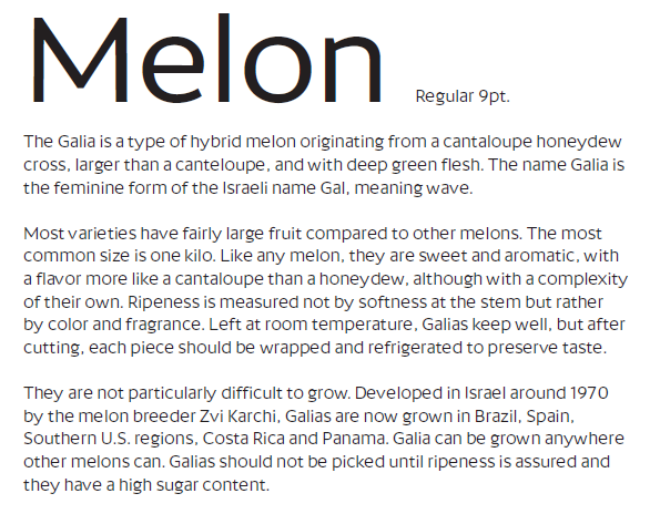
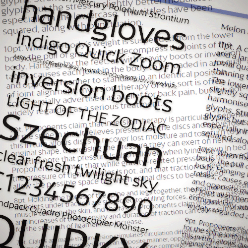
So this little one sprung out of the experiments with Mint and Mode. It struck me on the bus to try a stripped-down sans with just the underlying structure of the other two, and none of the experimental features such as active counters, flared strokes and rounded terminals.
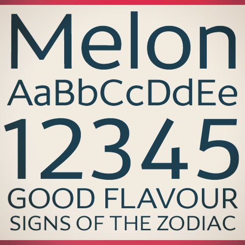
The result is a rather clean (bland?) looking font that doesn't do too well in running text due to its large x-height and rather oversized counters. I did the numbers from scratch as they weren't somehow too transposeable. Some of the glyphs have been slightly reinvented too (b, e, t).
I can't quite tell if this reminds me of some other font. It's a bit like Gill Sans in uppercase, Meta or Kievit in lowercase, and there seem to be hints of Bliss, Cosmos and Trebuchet too. B and D look a bit Helvetican. I'm not sure if all those things make it look like a jumbled mess or a harmonious blend, but I'm sure the Typophiles can answer that ;)
| Attachment | Size |
|---|---|
| Melon 1.pdf | 419.92 KB |
| Melon2.pdf | 394.72 KB |
| Melon 3.pdf | 441.91 KB |